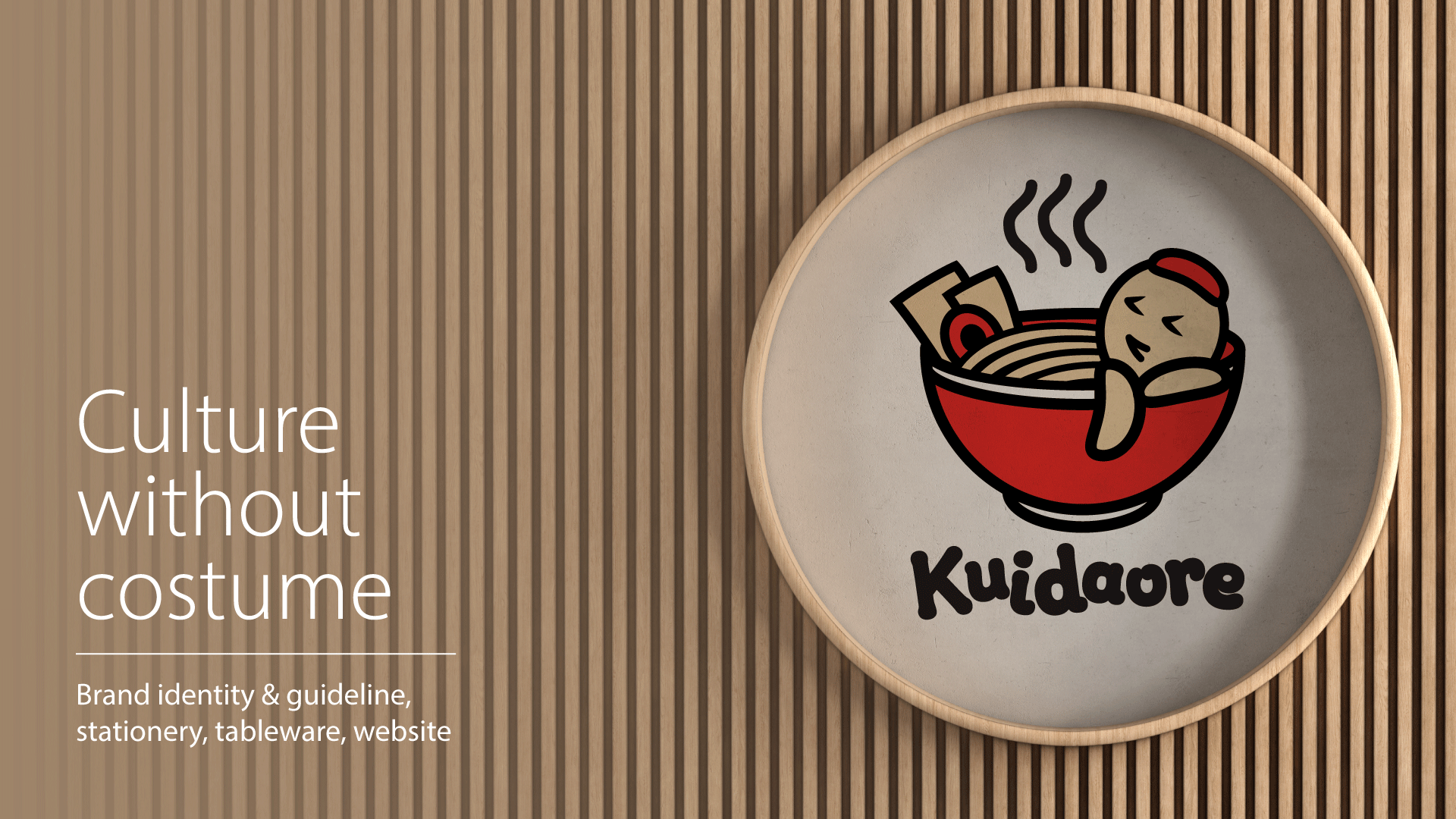
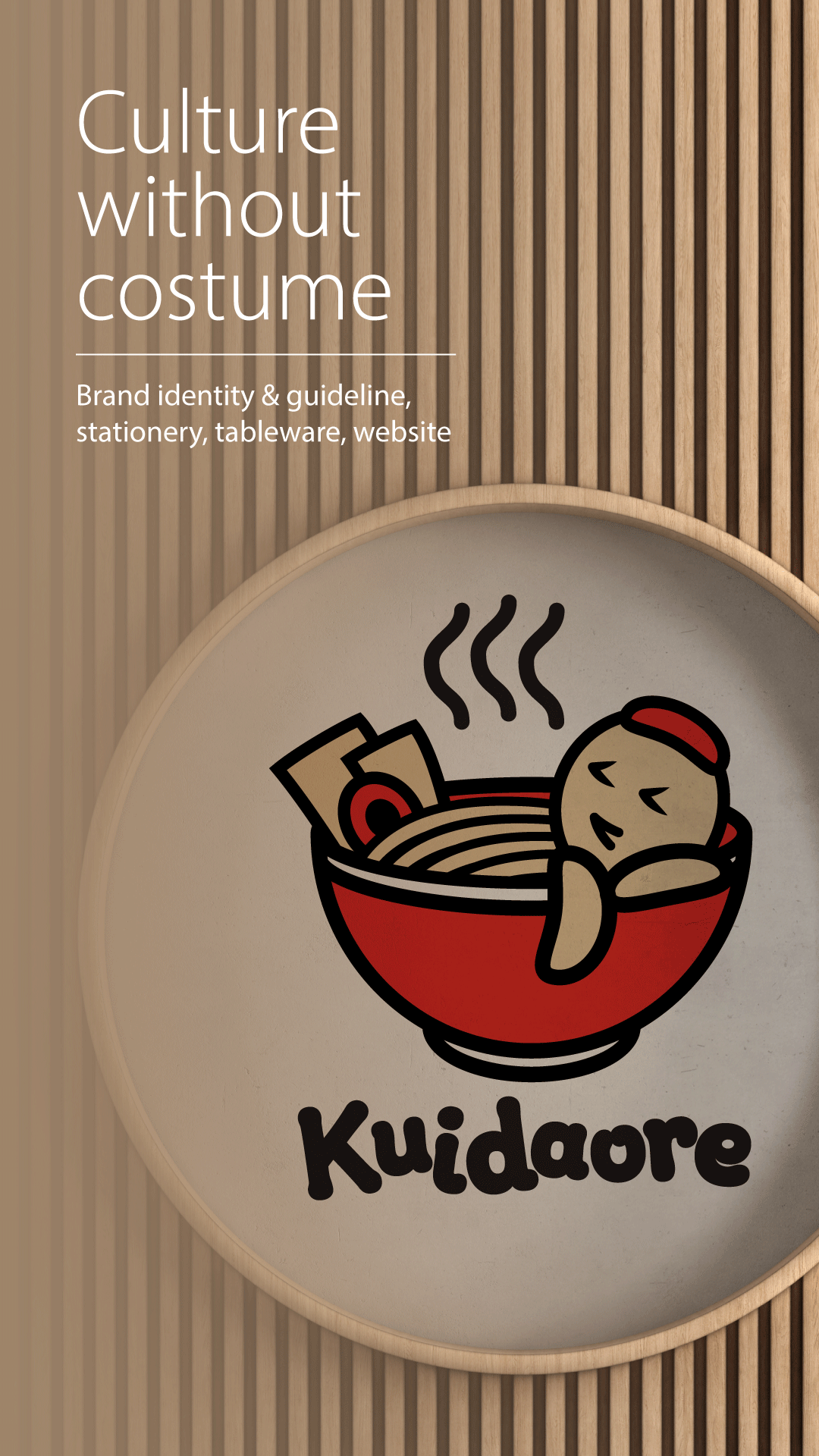
Kuidaore needed a first-touch identity that explains a culturally specific name. The goal was to translate “food immersion” into an instantly readable symbol and deploy it consistently across core touchpoints.
Non-Japanese audiences cannot decode “Kuidaore,” and the old wordmark offered no visual cue. The system had to work at small sizes for avatars and favicons, while scaling to signage and print without losing clarity.
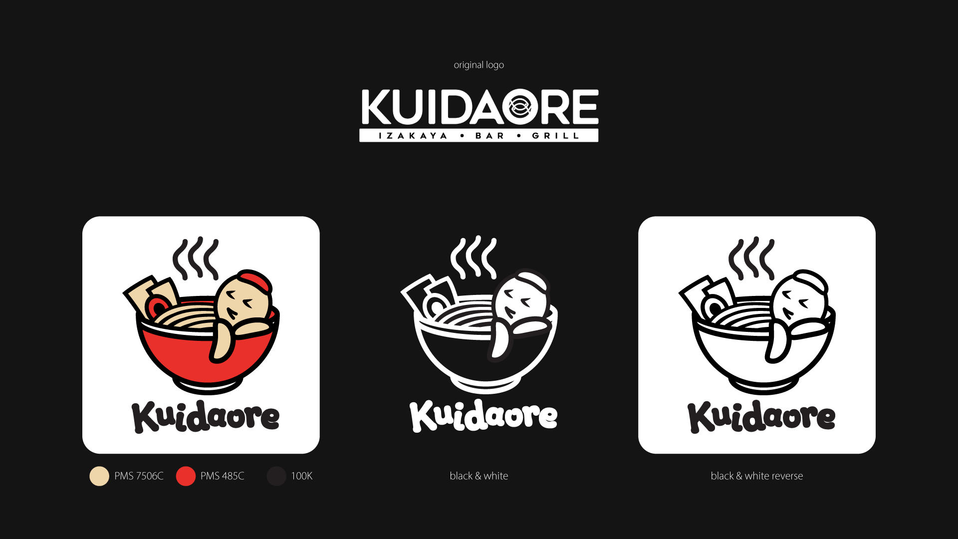
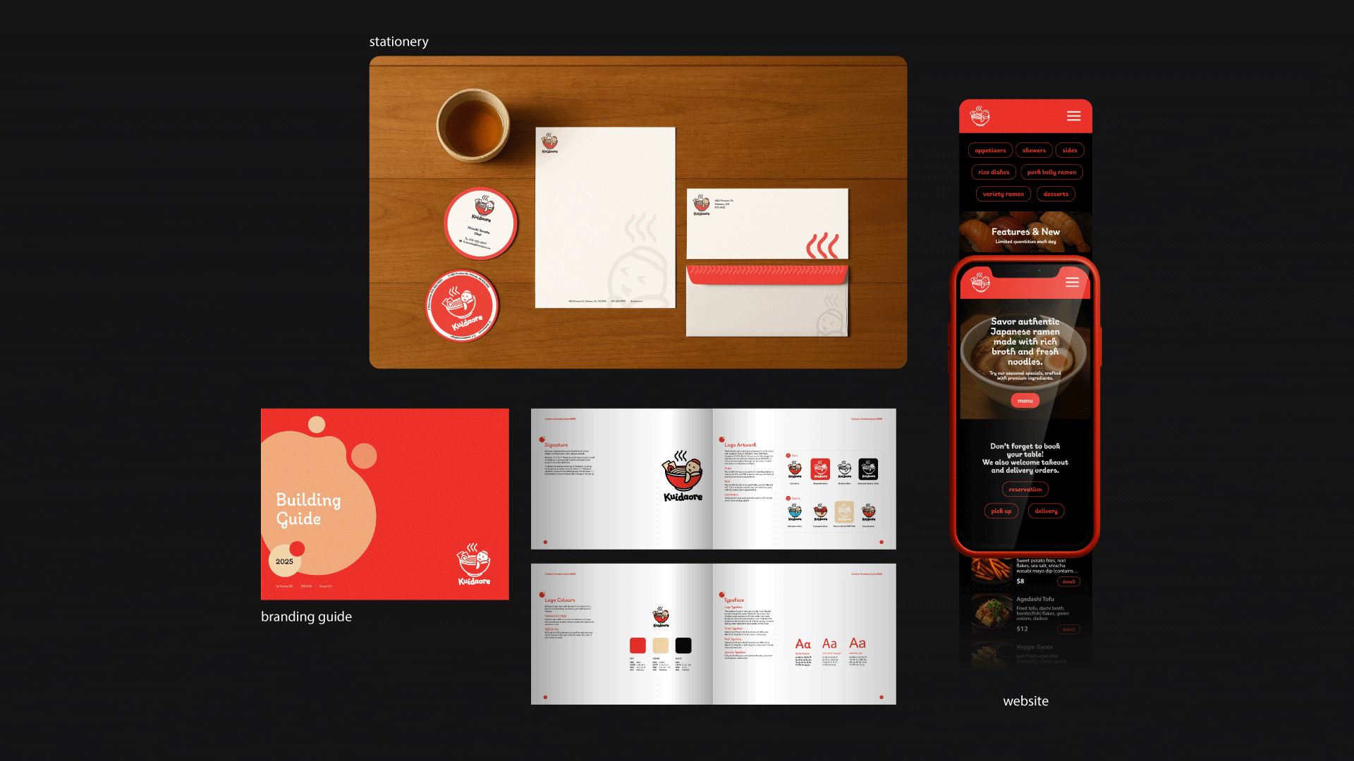
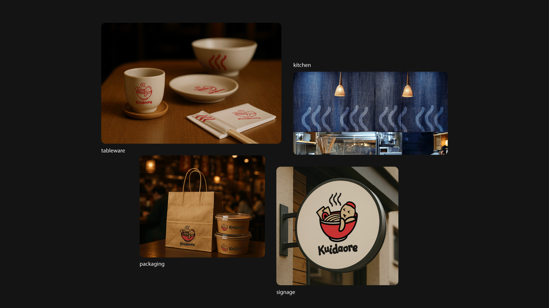
Built a character mark that visualizes “immersive eating” as a hot-spring ramen bowl scene. Defined modular logo variants, a simplified symbol, and strict color/type rules, then applied the system to stationery, brand guide, and website UI.
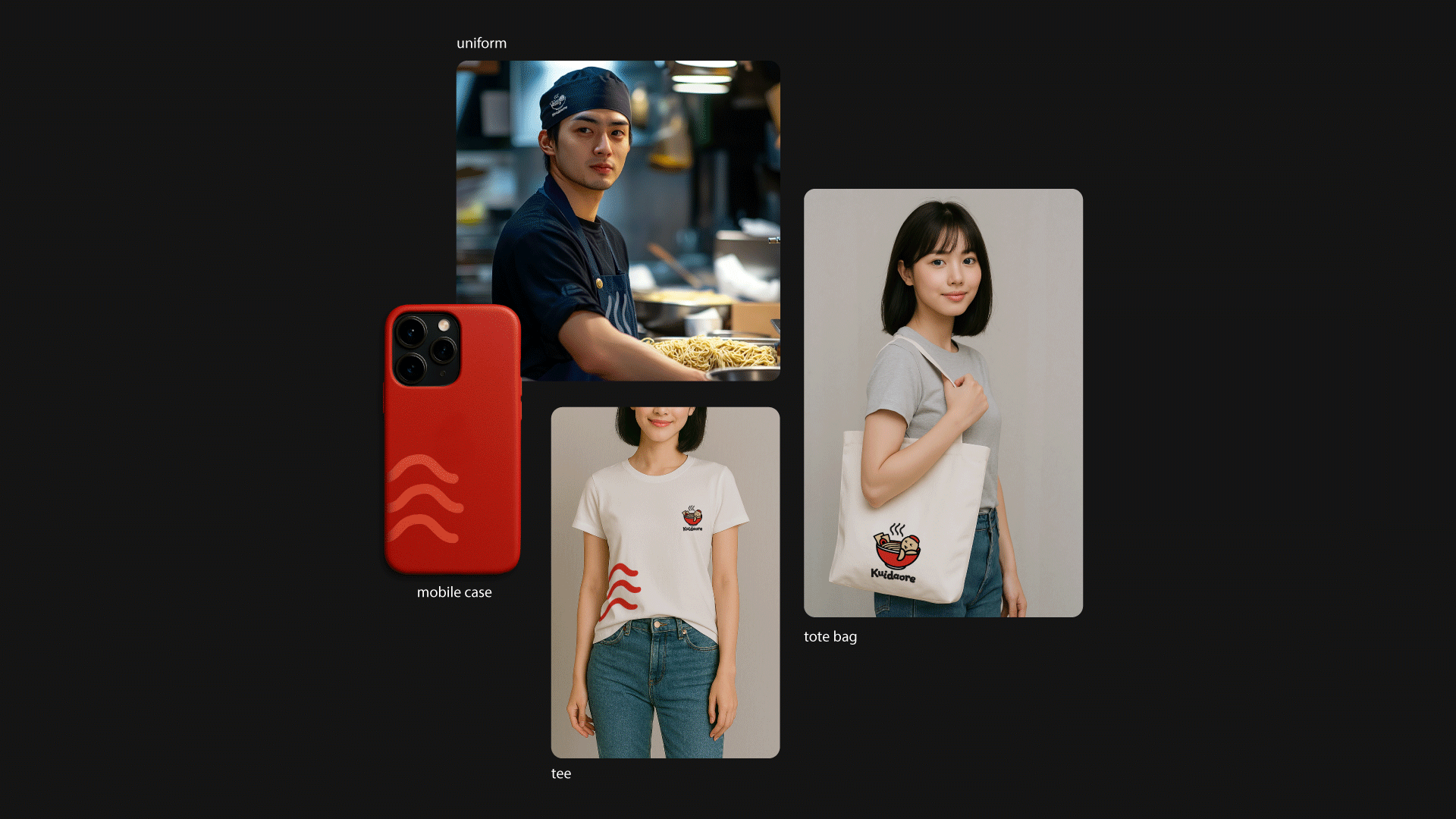
Delivered 3 logo lockups, a 20-page brand guideline, and a full stationery set (letterhead, envelope, business card, coaster). Extended the system to uniform, kitchen curtain, tote bag, tee, and delivery packaging for consistent deployment across touchpoints.