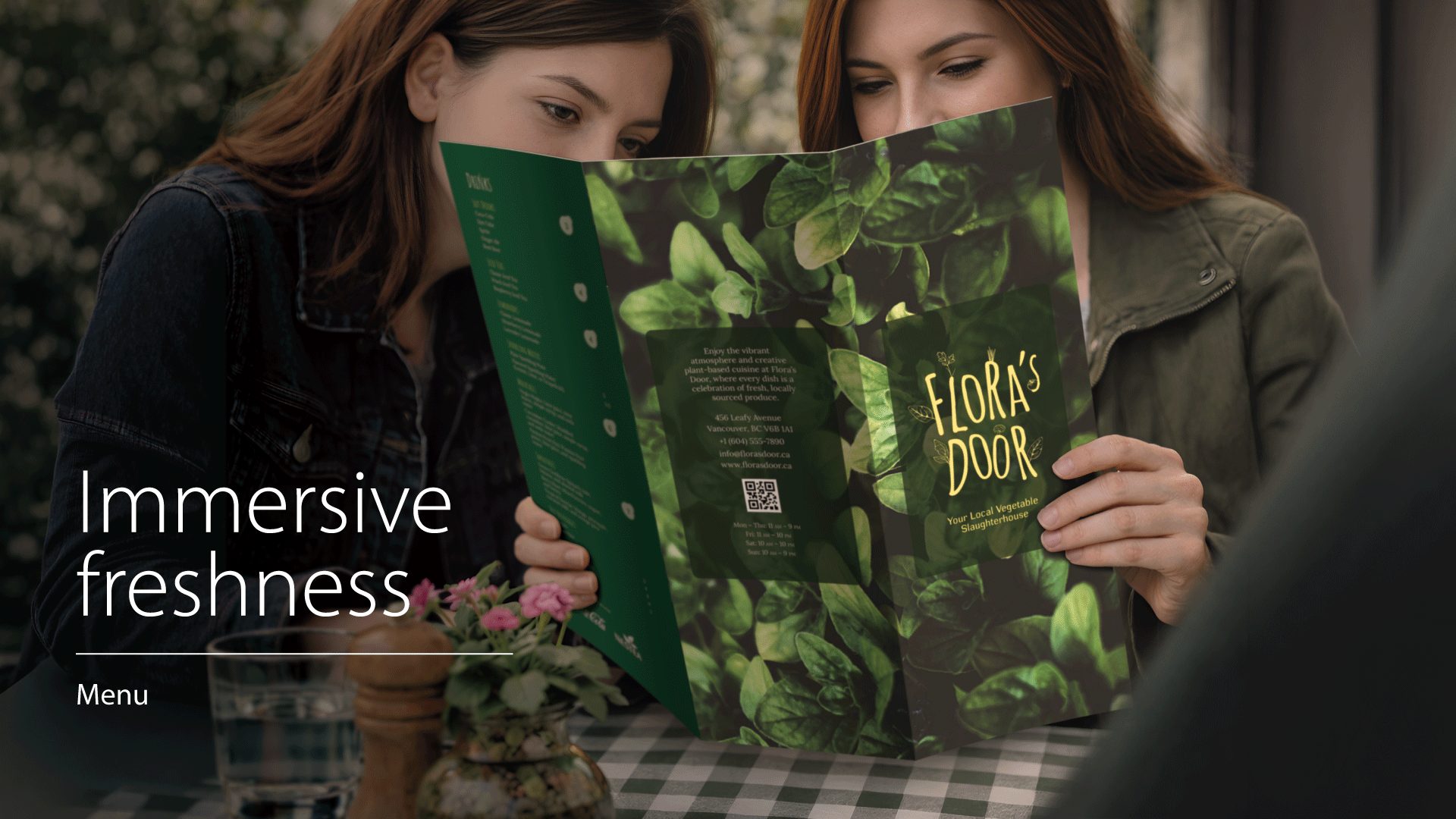
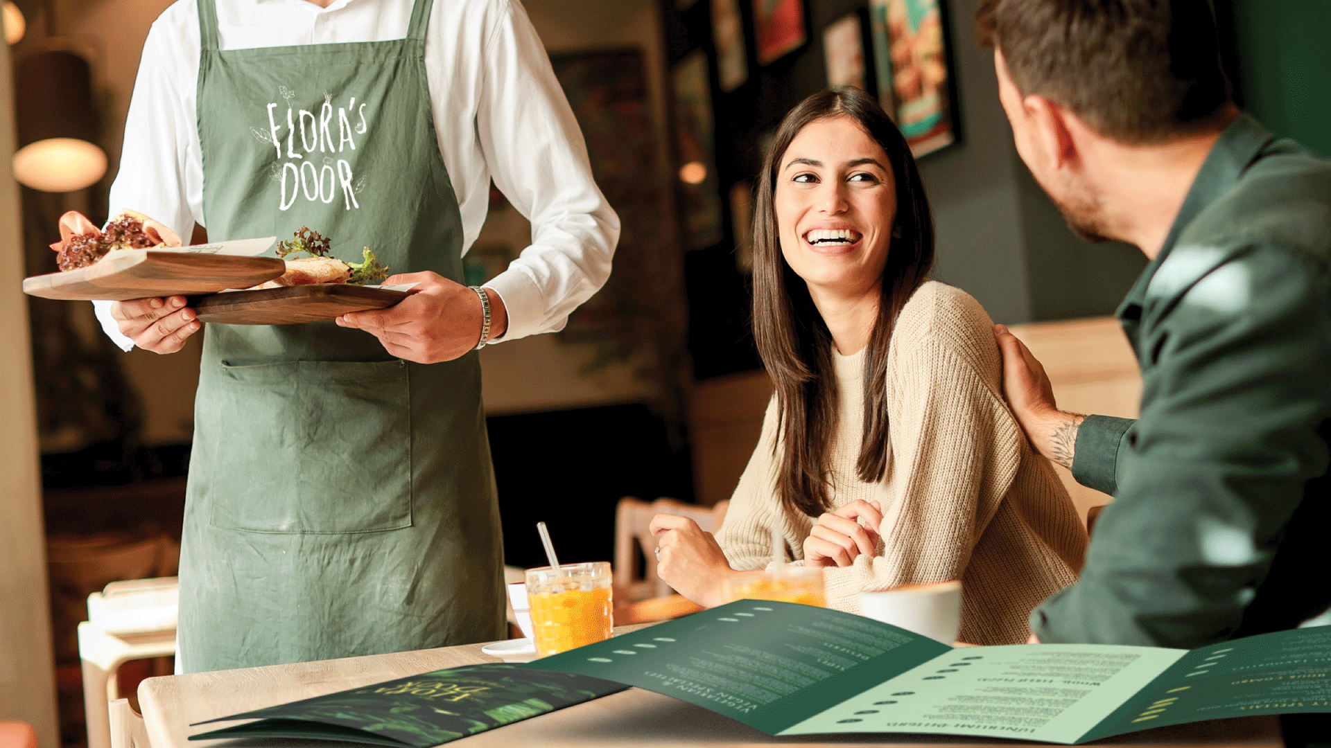
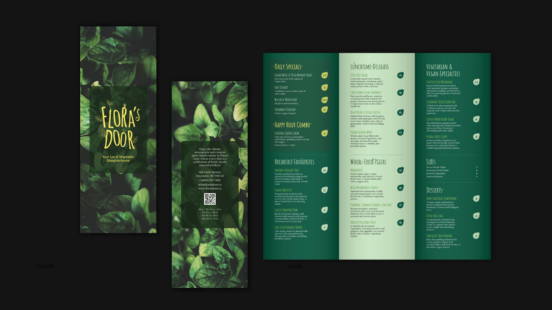
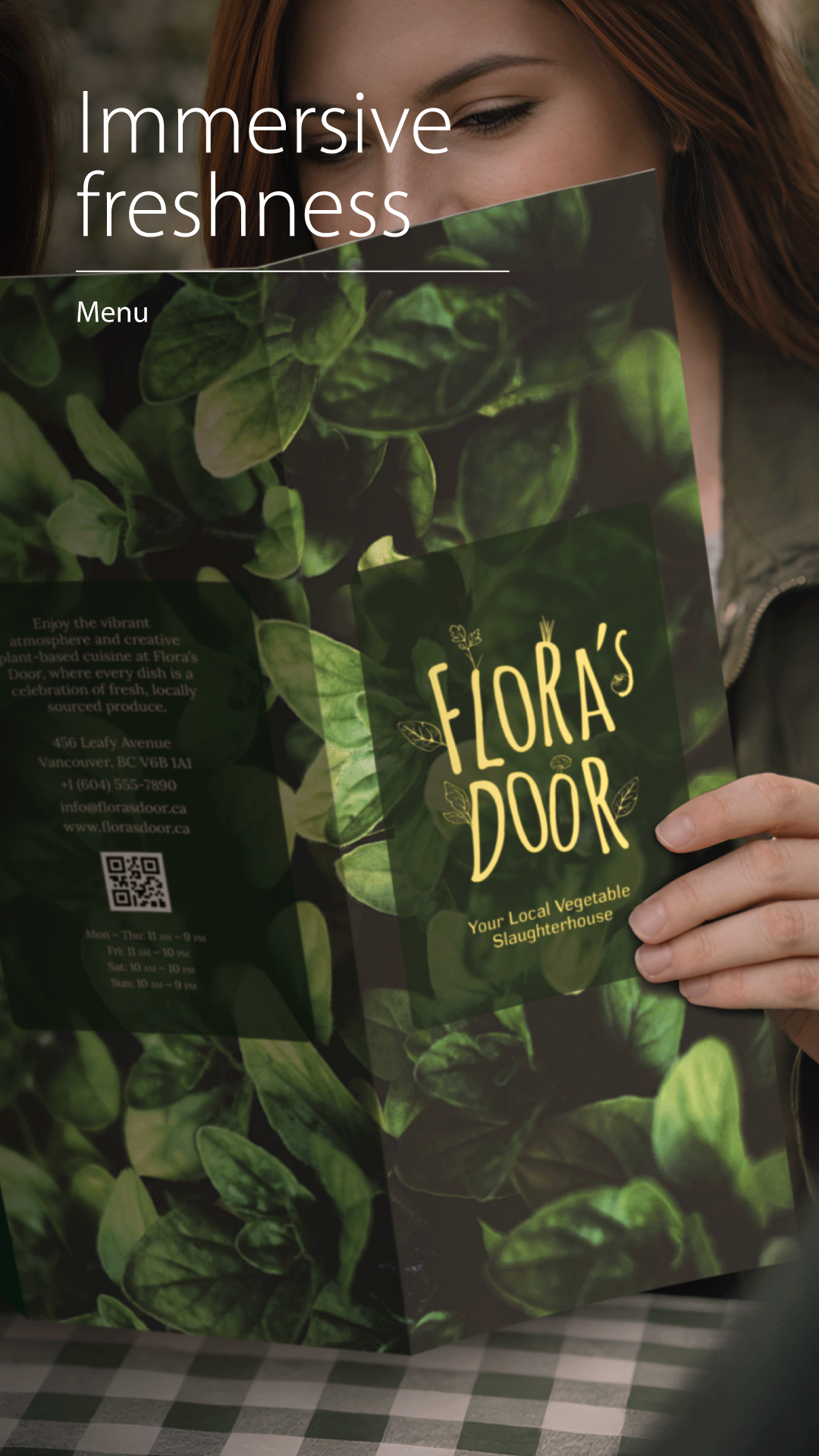
Flora’s Door positions itself around fresh, plant-based food. The menu needed to communicate variety quickly while keeping a natural, handmade tone through type and imagery.
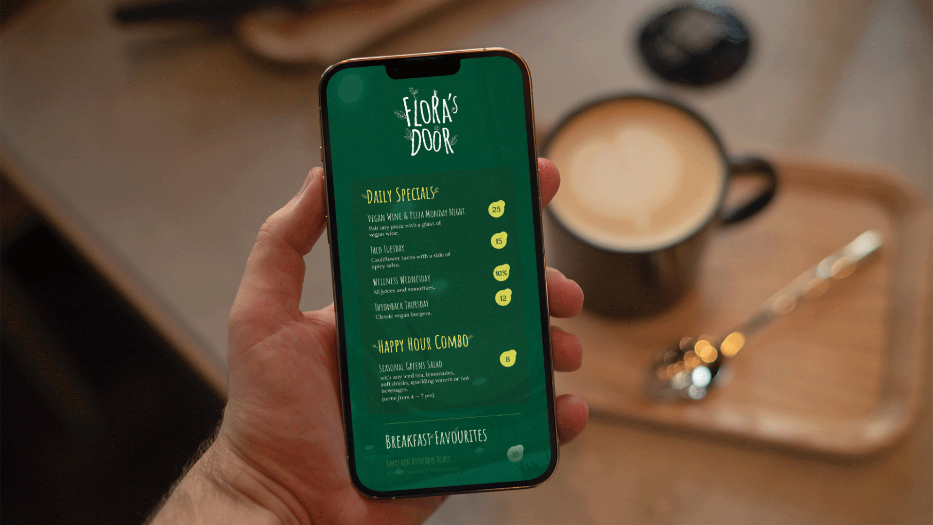
Menus are read under time pressure and poor lighting. The layout had to keep category structure, item description readability, and price visibility consistent across six panels without visual noise.
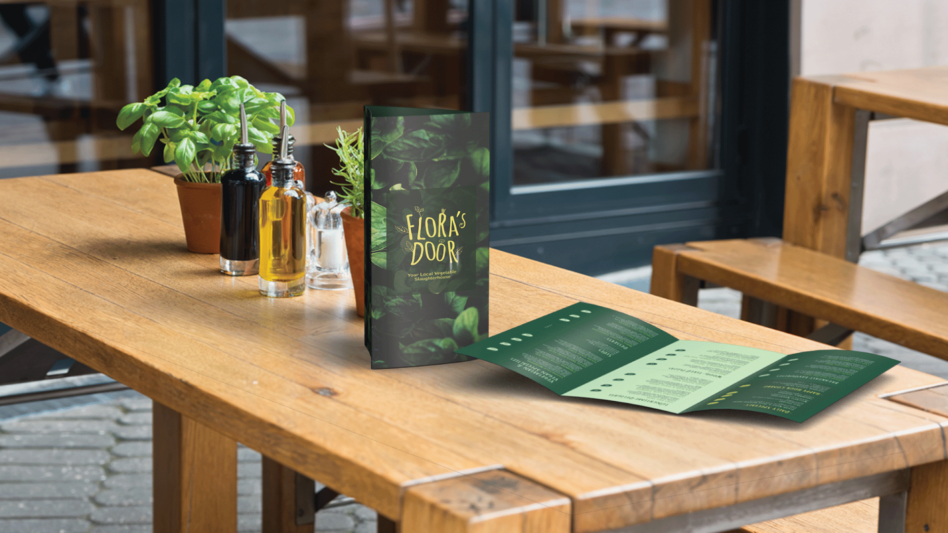
Set a strict type system: Amatic SC for headings/logo and Lora for body copy to balance personality and readability. Built a tri-fold (15” × 8.5” panels) with defined pagination, then used close-up vegetable photography and a restrained green palette to anchor “freshness.”
Delivered a print-ready, table-friendly tri-fold menu that groups content into clear sections (Daily Specials, Breakfast, Lunch, Pizzas, Specialties, Drinks) with repeatable hierarchy and consistent price markers for faster scanning.