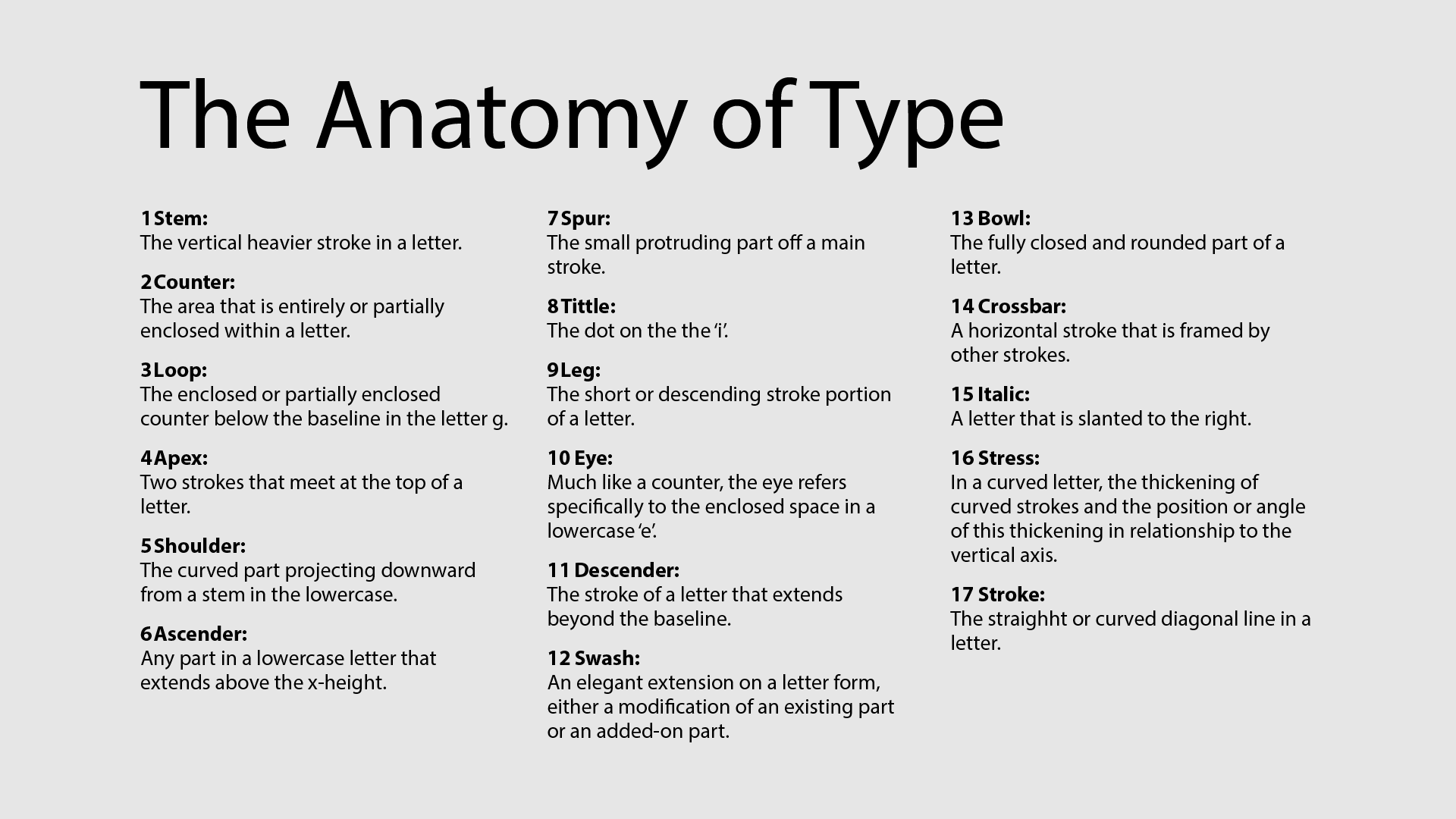

I began by selecting letters from the names Logan, Hailey, and Rachel, then identified distinctive anatomical features within each. These include elements like stem, loop, apex, spur, and swash. By isolating these parts, I built a foundation for my poster to explore type anatomy in a clear, meaningful way — combining familiar names with technical structure.
I marked each highlighted part of the selected letters and matched it with the correct typographic term — such as stem, counter, loop, and apex. This process helped clarify the function of each component and ensured I understood how different letterforms are structured and described. It also strengthened the educational purpose of the poster by pairing visual reference with accurate vocabulary.
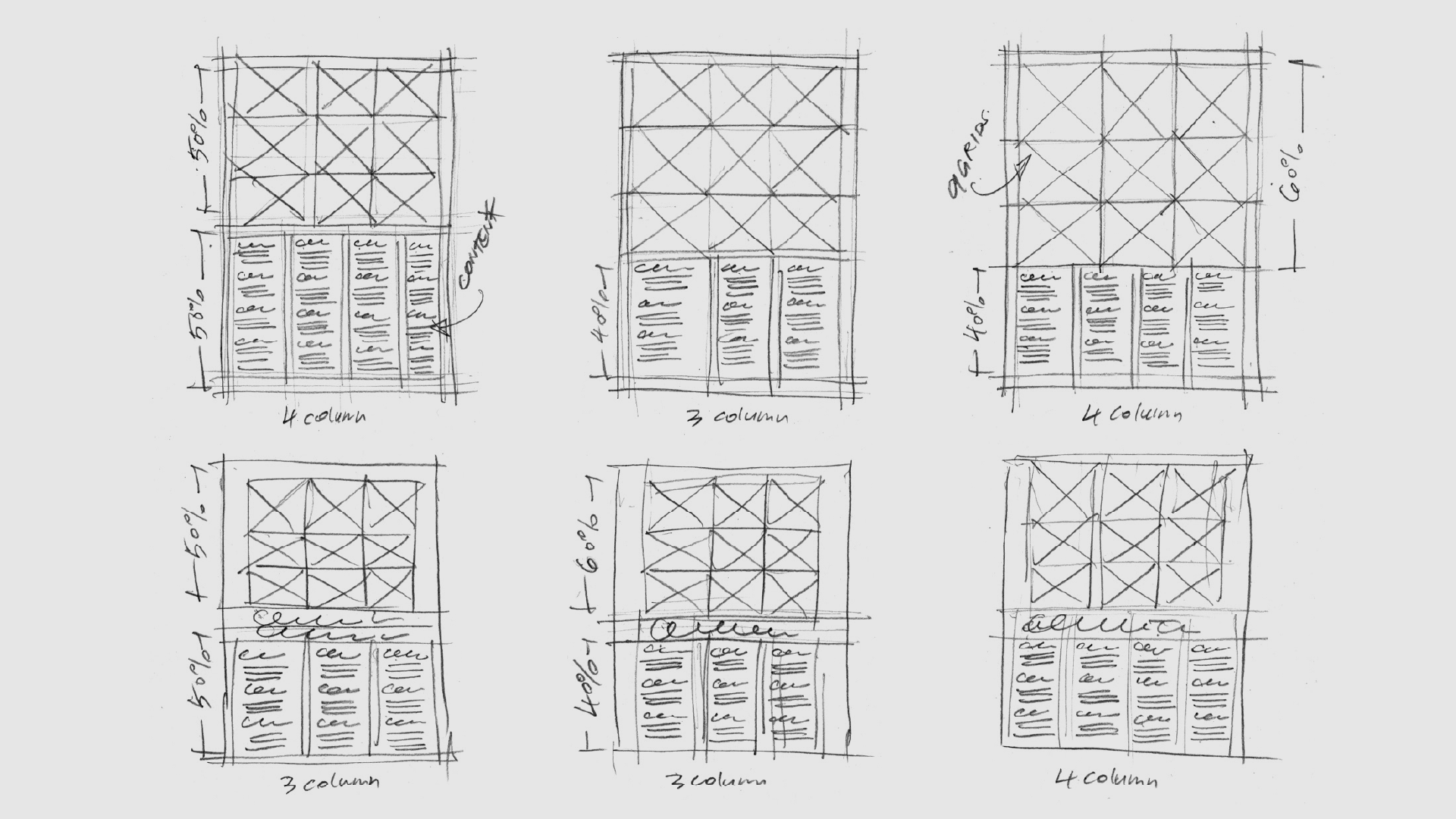
In this step, I explored multiple grid layout options, testing variations in column count, proportion, and content placement. After comparing visual balance and readability, I selected the one that best supports both the nine letterform examples and the descriptive text — ensuring clear structure, visual rhythm, and a strong typographic hierarchy for the final poster.
This is the final poster layout, designed using letterforms from Logan, Hailey, and Rachel — 3 names embedded as a hidden message. Each square isolates and highlights a key typographic feature using black and cyan for contrast. I applied a structured grid to balance clarity and rhythm. The bottom section clearly defines each term, completing a poster that combines visual precision with a subtle personal layer.


