
Firstly I explored 3 serif typefaces: Marion, Victorian Orchid, and PT Serif, each chosen to evoke a historical tone appropriate for Amelia Earhart and Malcolm X. I also selected suitable reference images provided by the teacher to support the documentary tone and historical context.
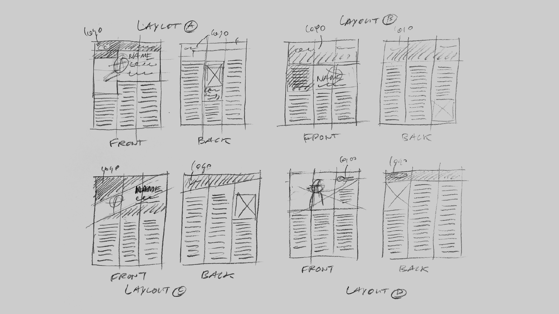
Then I began by sketching 4 layout options based on a 3-column grid, carefully planning the visual hierarchy, logo placement, and text-to-image balance to ensure a clean, readable design consistent with Biography.com’s editorial tone.
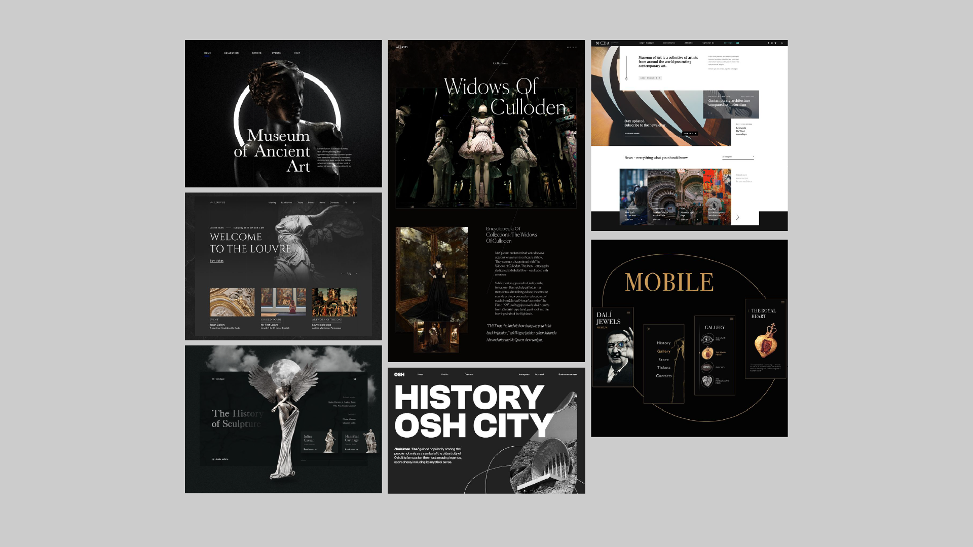
Before composing the layout in InDesign, I researched design references focused on dark backgrounds with high-contrast headings. I adopted a colour arrangement of 60% dark grey, 30% light grey, and 10% dark red to achieve a balanced and dramatic visual tone.
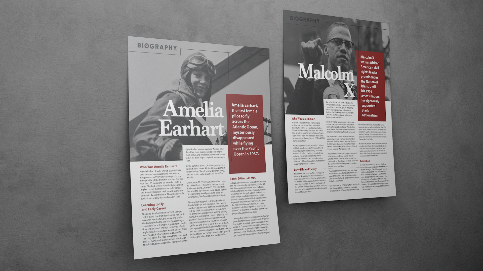
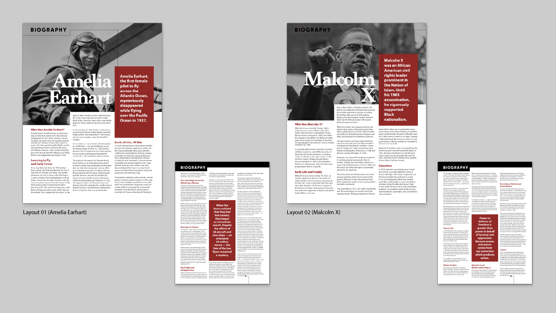
My final layout applies clear visual hierarchy and strong contrast. I used a bold black-red-white palette to create impact and clarity. I selected documentary-style typefaces to reflect the historical tone, and structured the content with a consistent 3-column grid for balance and readability.


