


To begin my comparative analysis of Essonnes and Linotype Didot, I studied the history, typographers (James Hultquist-Todd and Adrian Frutiger), and design intent of each typeface. I mapped out the project sections, including origins, glyphs, and usage examples. Using a 4x2 grid system, I planned the structure of each spread to ensure clarity and consistency across all pages before moving into production.
I designed each spread with a clear visual system: Cyan represents Essonnes and Yellow represents Linotype Didot. The left page delivers written analysis, while the right page shows visual examples. I chose a dark background with white text to maximize contrast and ensure readability, while the color-coded accents allow readers to easily associate content with its respective typeface. This consistent structure helps clarify comparisons throughout the document.
For the “Instances of Family” section, I focused on precision by carefully applying the correct font weights and stylistic sets for both Essonnes and Linotype Didot. Each text sample was double-checked to ensure accuracy, as even a small mistake could compromise the comparison. This proofreading process was time-consuming but essential for maintaining professional standards.
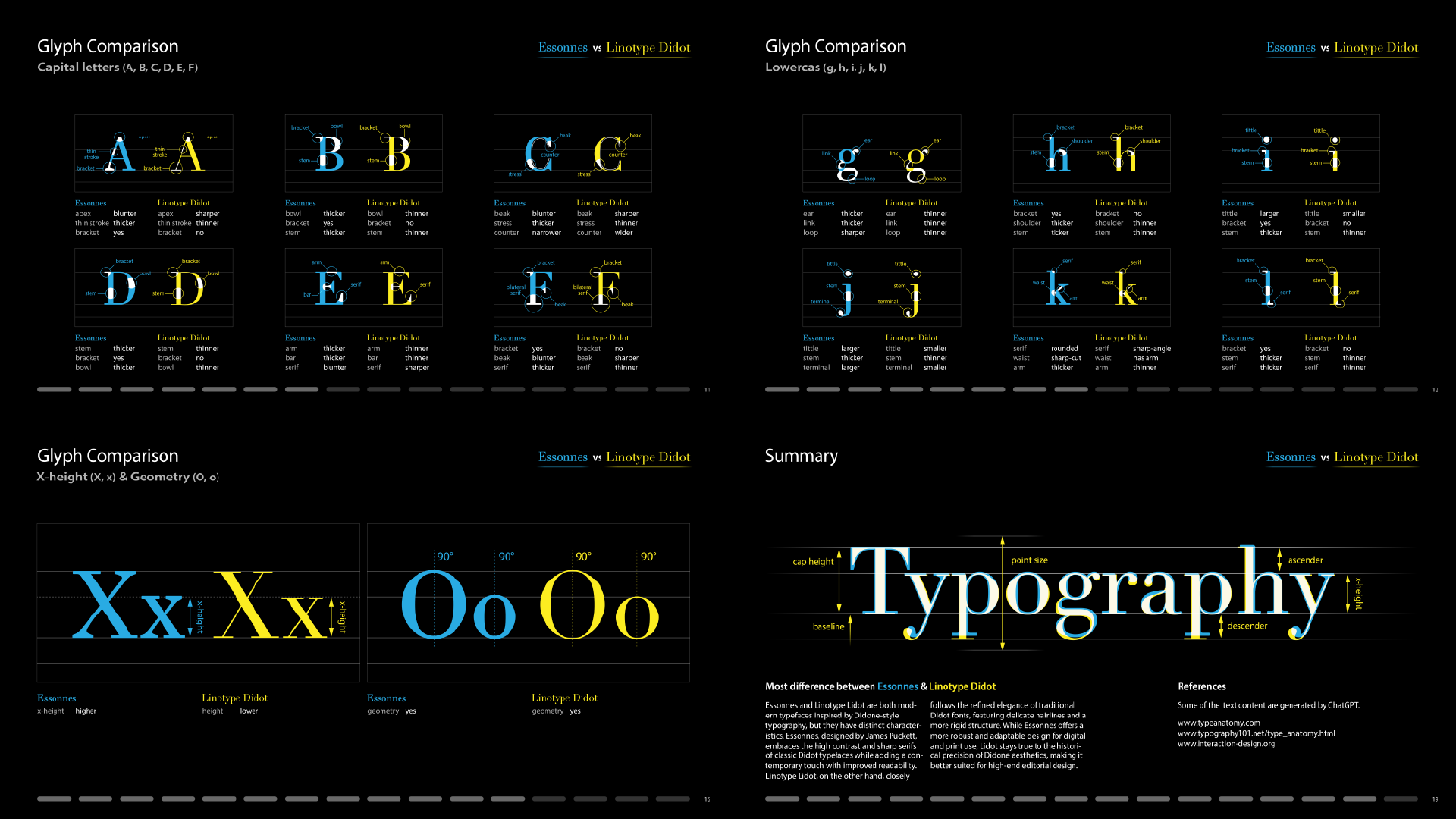
The Glyph Comparison section required the most effort. I used Illustrator to highlight subtle differences between corresponding letters in Essonnes and Linotype Didot. By importing multiple artboards into InDesign, I ensured consistency across all visuals. This step involved detailed artwork, careful labeling, and extensive proofreading to guarantee typographic accuracy. The most practical experience I gained from this assignment was learning how to organize content clearly and build a logical reading system that guides the viewer smoothly through the comparison.