
In the research stage, I identified the target audience as Ottawa-based youth aged 12–18, particularly those active in school or community bands. I analyzed similar local events, such as the Ottawa Jazz Festival, and created a mood board, logo sketches, and key visual concepts to shape the direction of the Junior Jazz Band Festival branding.
For the key visual, I developed 5 abstract jazz musicians, each paired with a signature instrument and rendered in bright primary colours (yellow, pink, cyan, green, and purple). This energetic illustration style resonates with the youthful target audience. The logo merges a saxophone, trumpet, and musical note into the letter “J”, representing “Jazz” playfully and clearly.
After finalizing the abstract illustrations, I expanded the design into various formats (poster, emailer, web banner, and feather banner). I used a solid black background to highlight the circular composition of the 5 musicians. To ensure legibility, I printed the poster at full scale and tested font readability in real-world size.
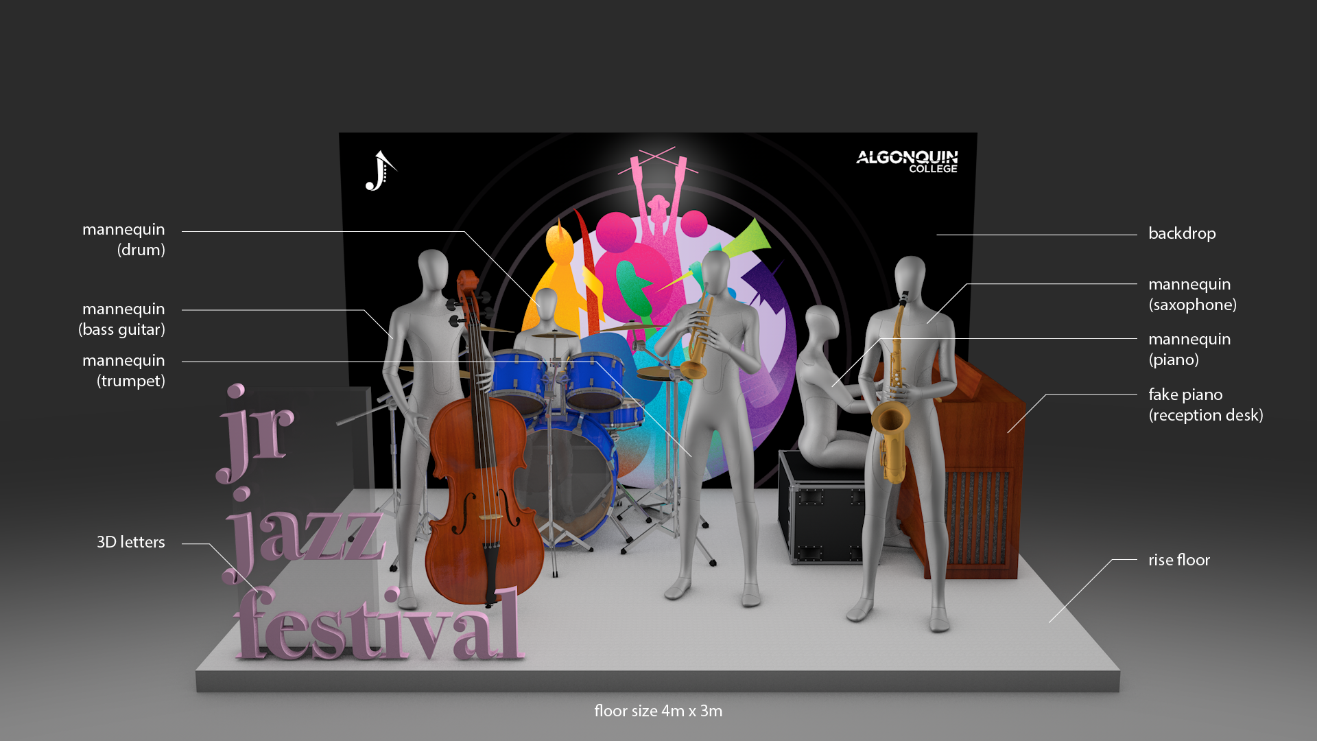
For the booth design, I developed my own layout instead of using the provided template. My concept is a live band performance setup with 5 mannequins holding instruments to echo the key visual. The backdrop adapts the poster artwork, and I added 3D letters spelling out “Jr Jazz Festival” for branding and photo opportunities. Visitors can stand among the mannequins to take selfies and share on social media, enhancing engagement and exposure.


