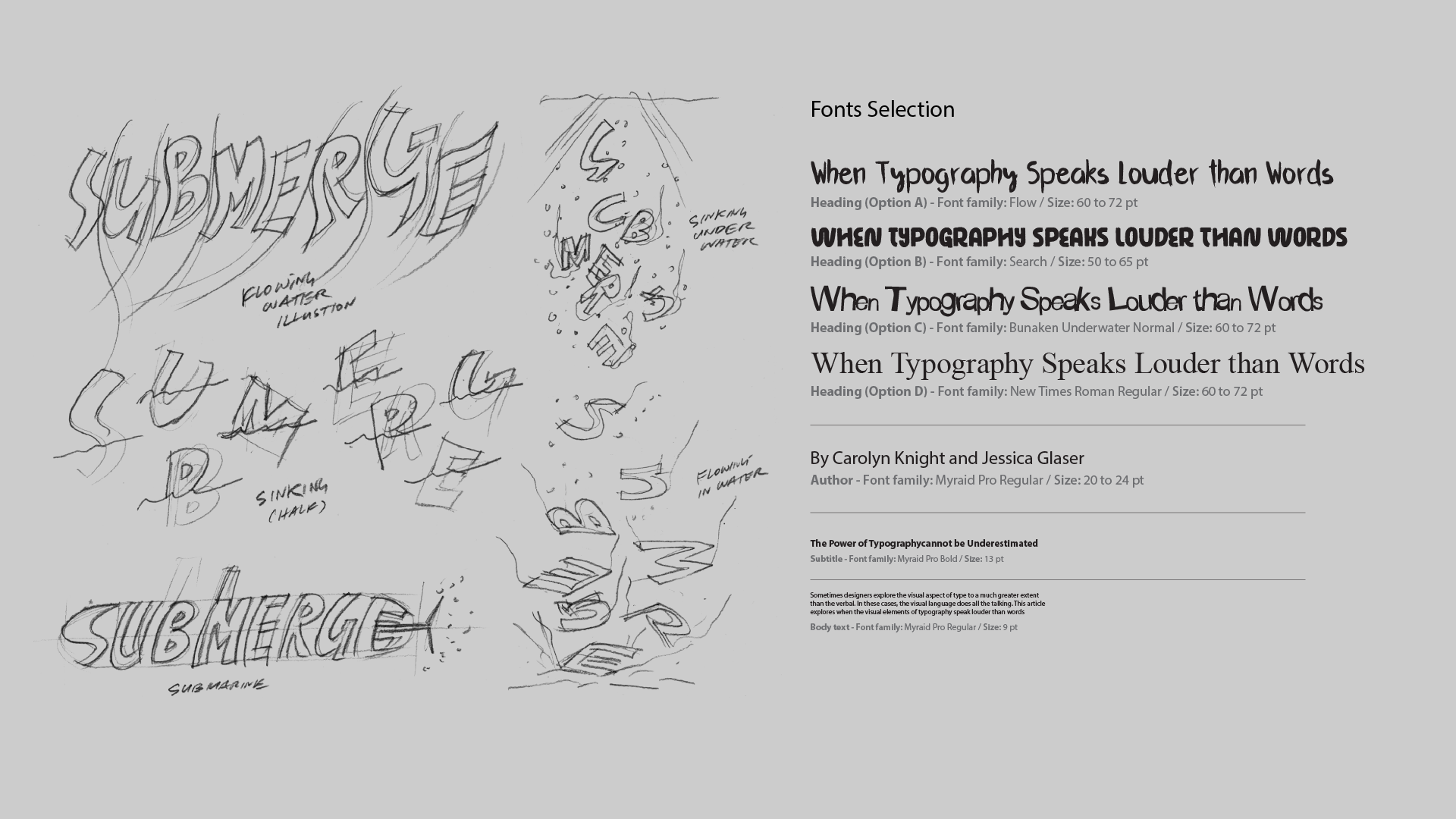

In week 1, I developed the concept “Submerge” through mind mapping and a mood board that explored emotions like fear, weightlessness, and isolation. I began sketching headline ideas using Illustrator and Photoshop, while preparing multiple typographic grid layouts for early feedback and direction.
In week 2, I began sketching the word “Submerge” with concepts like flowing water, sinking letters, and submarine references. I also explored 4 typeface options for the headline, comparing how each conveyed the mood and visual dynamics of the theme most effectively.
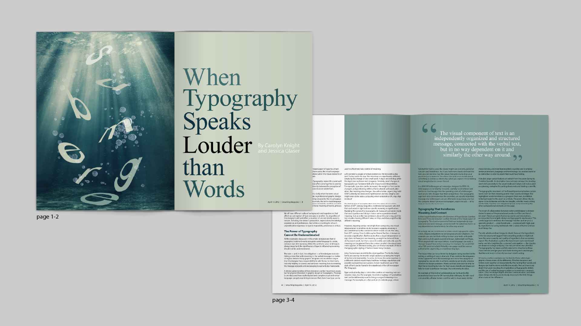
I developed 2 layout versions based on the concept of sinking letters. The left design uses a photo-based underwater scene for stronger visual impact, while the right uses type-based line art to represent movement and bubbles. Although I preferred the right version personally, I chose the left layout for its clearer communication and emotional strength, then completed the full spread using InDesign.
The final layout uses a cohesive color palette drawn from the underwater image, applying analogous hues to unify the entire spread. I chose New Times Roman for its elegance, pairing it with varying shades of cyan to evoke a calm, immersive, and sophisticated tone throughout the design.


