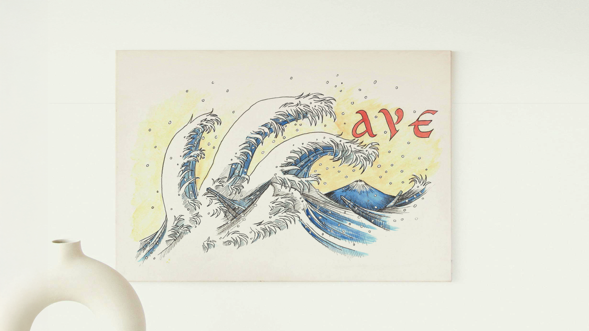

I chose Roman Uncial for its bold, rounded structure, then explored visual objects that echo its capital forms. I matched Tulip with “T” for its tall stem and bloom, Samurai with “S” for armor curves, and Wave with “W” for fluid motion. Each pairing builds on visual similarity while enriching meaning through symbolic association.
I chose Wave as my word and used the capital “W” as the focal point. Inspired by Ukiyo-e aesthetics, I translated the letterform into dramatic wave shapes, referencing the style of traditional Japanese woodblock prints. The flowing lines and cresting forms turn the “W” into both letter and image — capturing movement, power, and cultural texture within a typographic frame.
Taking my professor’s feedback, I redrew the wave to mirror the form of the capital “W,” aligning composition and letterform. This reversal strengthens the visual integration between text and image.
I retained the Ukiyo-e aesthetic in structure, then brought it to life with watercolor — adding depth, movement, and atmosphere to the illustrated capital. The final piece now reads as both word and artwork, unified by gesture and style.


