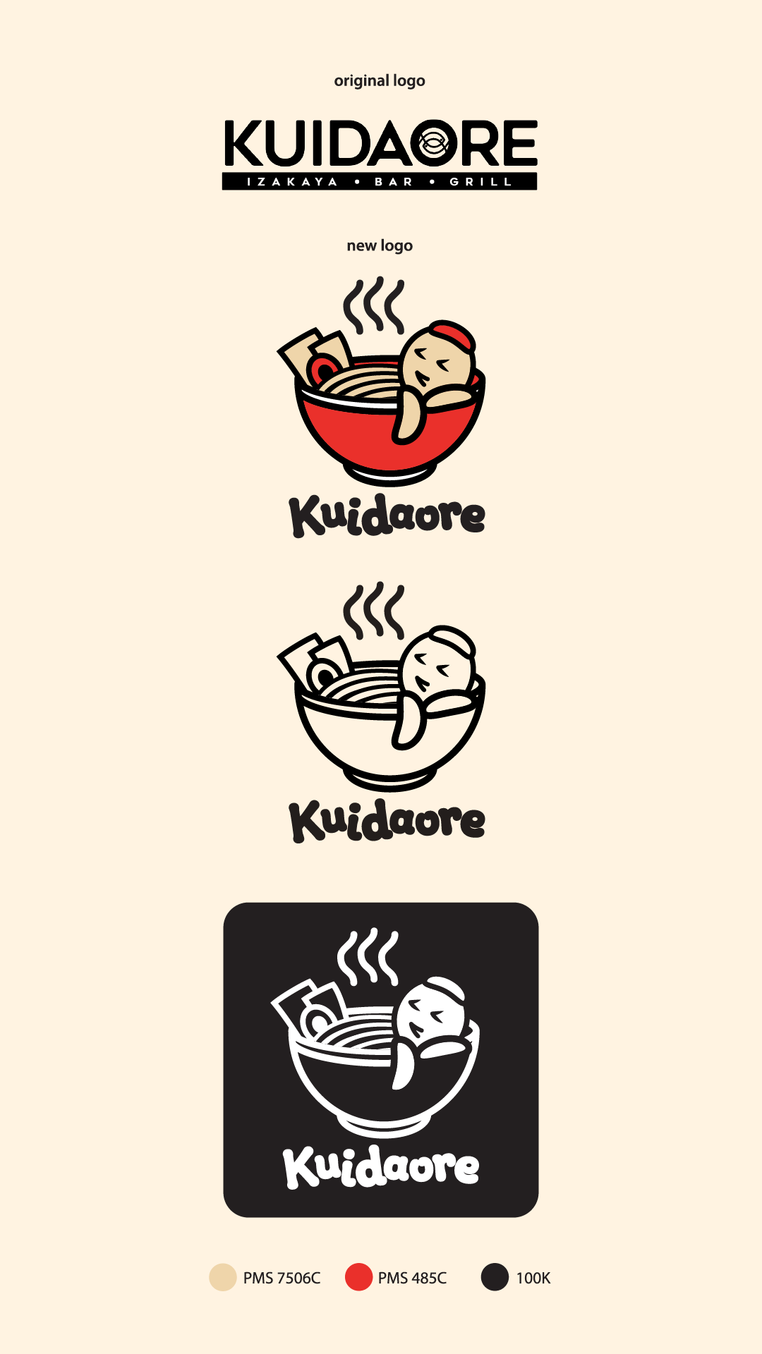
For the research stage, I selected a Japanese ramen restaurant called Kuidaore. The word “Kuidaore” (食い倒れ) means “to bring oneself to ruin through extravagance in food,” which reflects a deep cultural passion for indulgent dining. I started by studying the restaurant’s background, marketing position, and competitors, as well as identifying its target audience. Based on this research, I created a mind map and built a mood board to help brainstorm visual directions for the redesign.
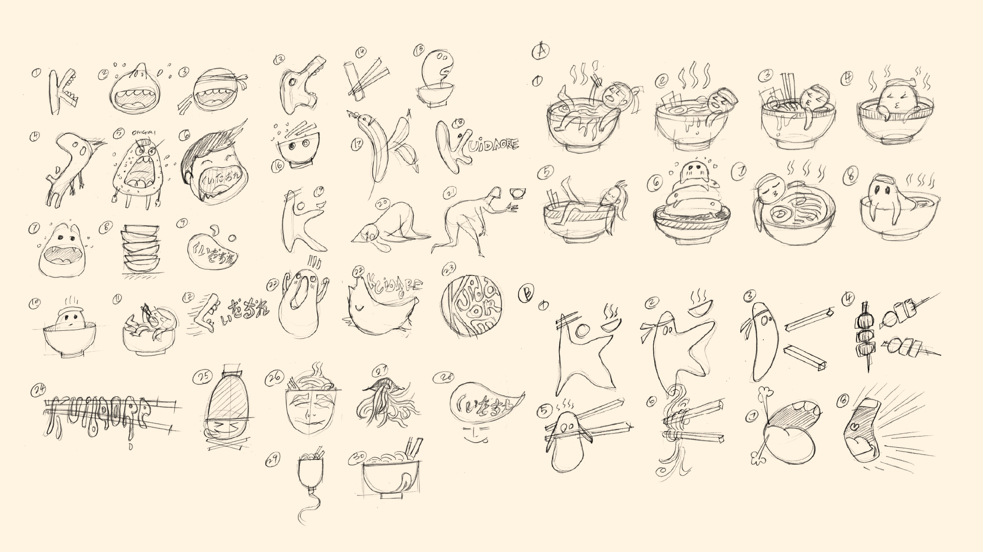
For the 2nd step, I sketched 30 initial logo ideas based on research and creative direction. After peer critique, I selected 3 promising concepts and developed 10 variations for each. It was a tough process, especially around the 20th sketch, when fresh ideas became harder to generate.
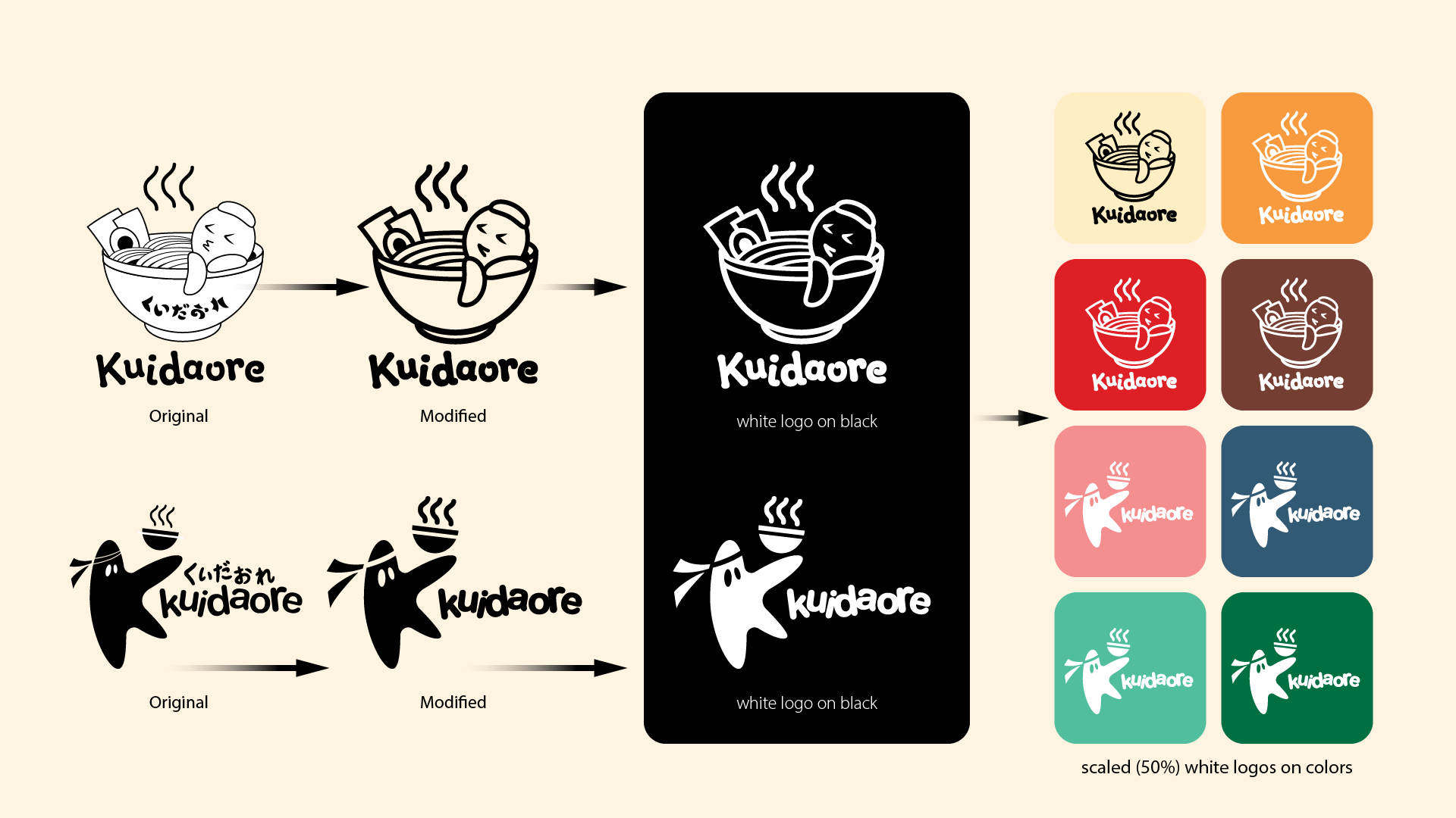
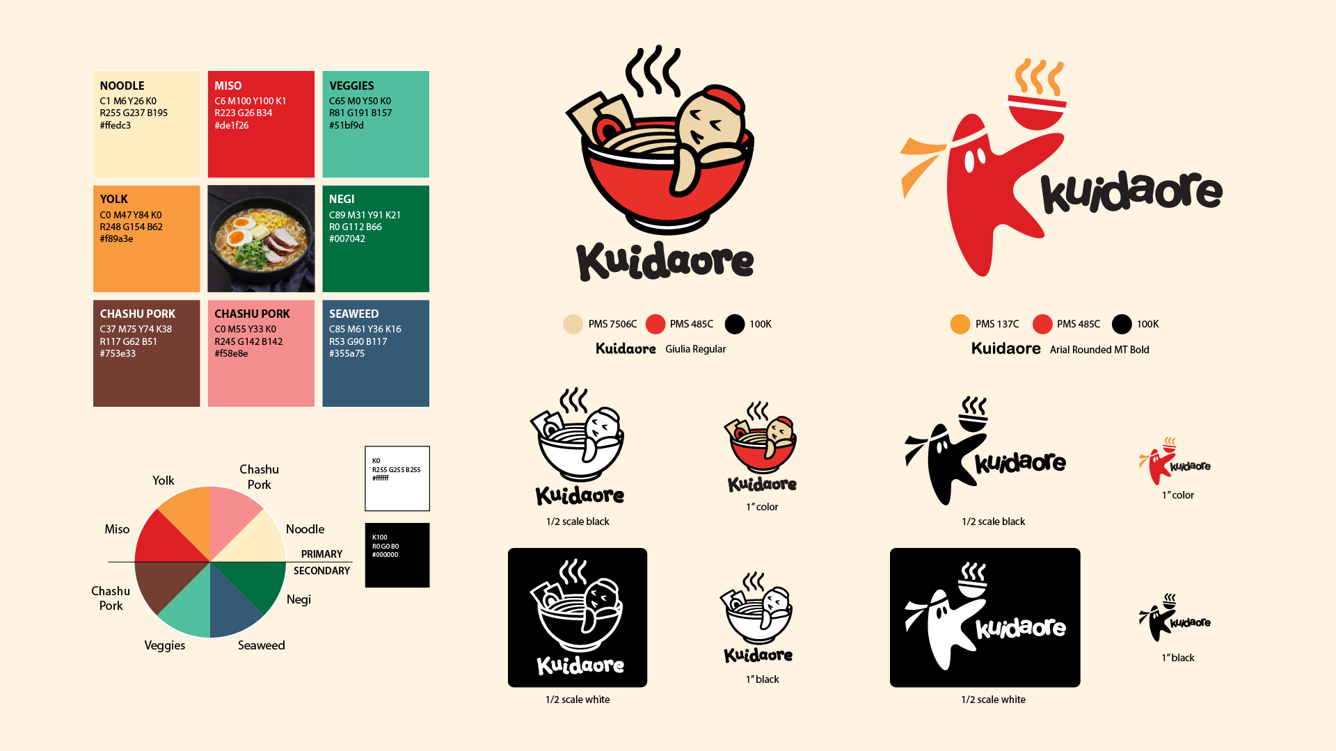
For the 3rd step, I selected 2 logo ideas and refined them in Illustrator. I created black and white versions, reversed versions, and tested them on colored backgrounds to check versatility. Peer critiques helped ensure the logos worked well across different applications. I added colors to the refined logos. I sampled tones from a traditional ramen photo and tested various combinations. Red, orange, and black became the primary palette. This scheme enhances appetite and expresses the brand’s bold and warm personality.
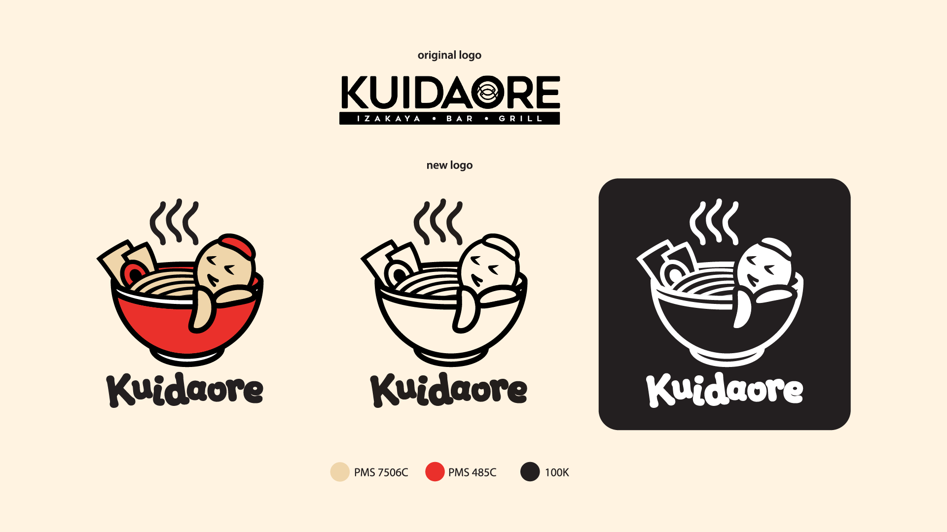
Concept 01 uses a playful character enjoying ramen like a hot spring to express the immersive joy of eating. Concept 02 transforms the letter K into a dancing figure holding ramen, symbolizing food enjoyment. Primary colours: red, orange, yellow, were inspired by ramen ingredients to stimulate appetite. Rounded fonts (Giulia Regular) support a relaxed, casual brand tone. These logo (especially option A) can fully reflect the philosophy of Kuidaore: to bring oneself to ruin through extravagance in food.
