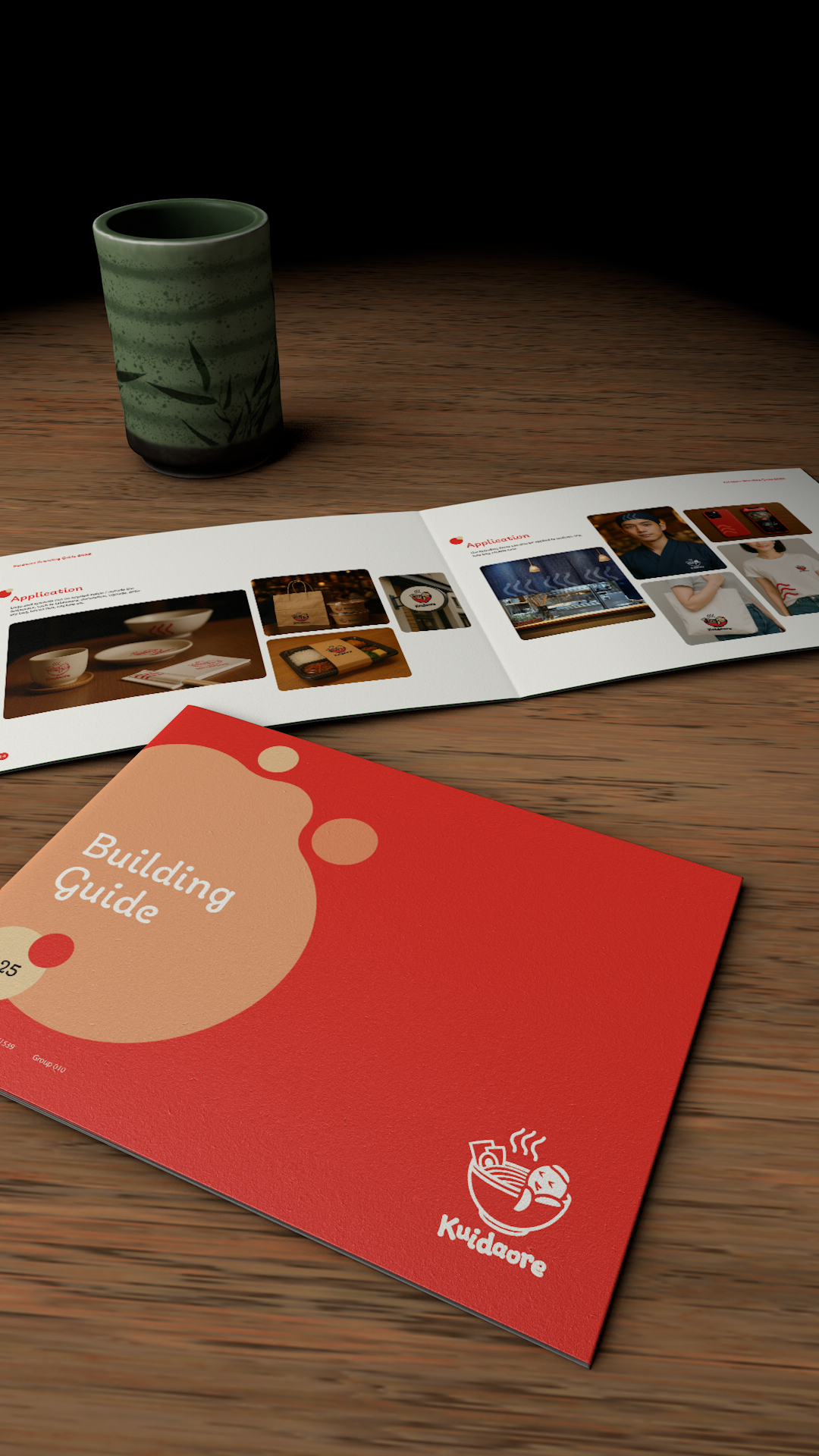

This was my first time organizing a logo into a standardized branding system. The biggest challenge wasn’t creativity, but understanding how to follow professional standards. It was a practical and valuable learning experience. I used the brand’s primary red on the cover to enhance impact. The layout followed a 3x2 grid, placing explanations on the left third and visual examples on the right. I intentionally left generous white space to keep the design clean and avoid distraction.
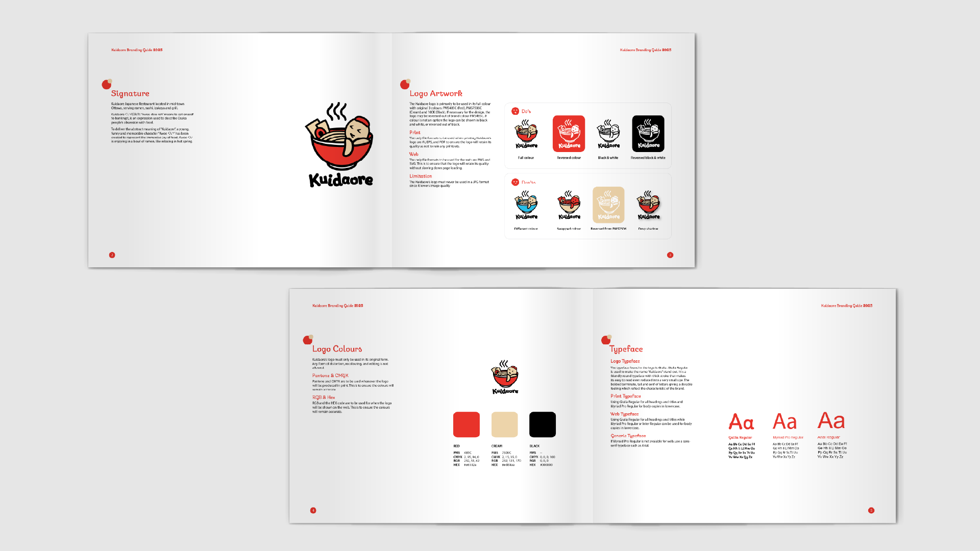
This section introduces the brand’s core visual identity. The signature page highlights the Kuidaore logo’s symbolic meaning: immersing oneself in joyful indulgence, depicted through a relaxed mascot in a ramen bowl. The logo artwork page defines its proper usage in colour, black and white, and reversed styles, with clear do’s and don’ts. The color palette focuses on red, cream, and black, ensuring strong contrast and appetite appeal. The typeface section presents a cohesive set of fonts: Giulia for logo, Arial for digital, and Minion for print. Together, these elements form a consistent and versatile brand system.
This section outlines critical usage rules to ensure the Kuidaore brand remains visually consistent. Backgrounds & Contrast gives clear guidance on how to preserve legibility by applying the correct logo variation over different photo styles. Alternate Logo Design presents horizontal versions in full color, black and white, and reversed formats to ensure flexibility in various layouts. The Digital Online Presence page demonstrates how the brand should appear on social media, complete with profile and favicon icons. Logo Reduction sets the minimum sizes for clear visibility, while the Buffer Zone defines safe margins to maintain clarity and avoid crowding.
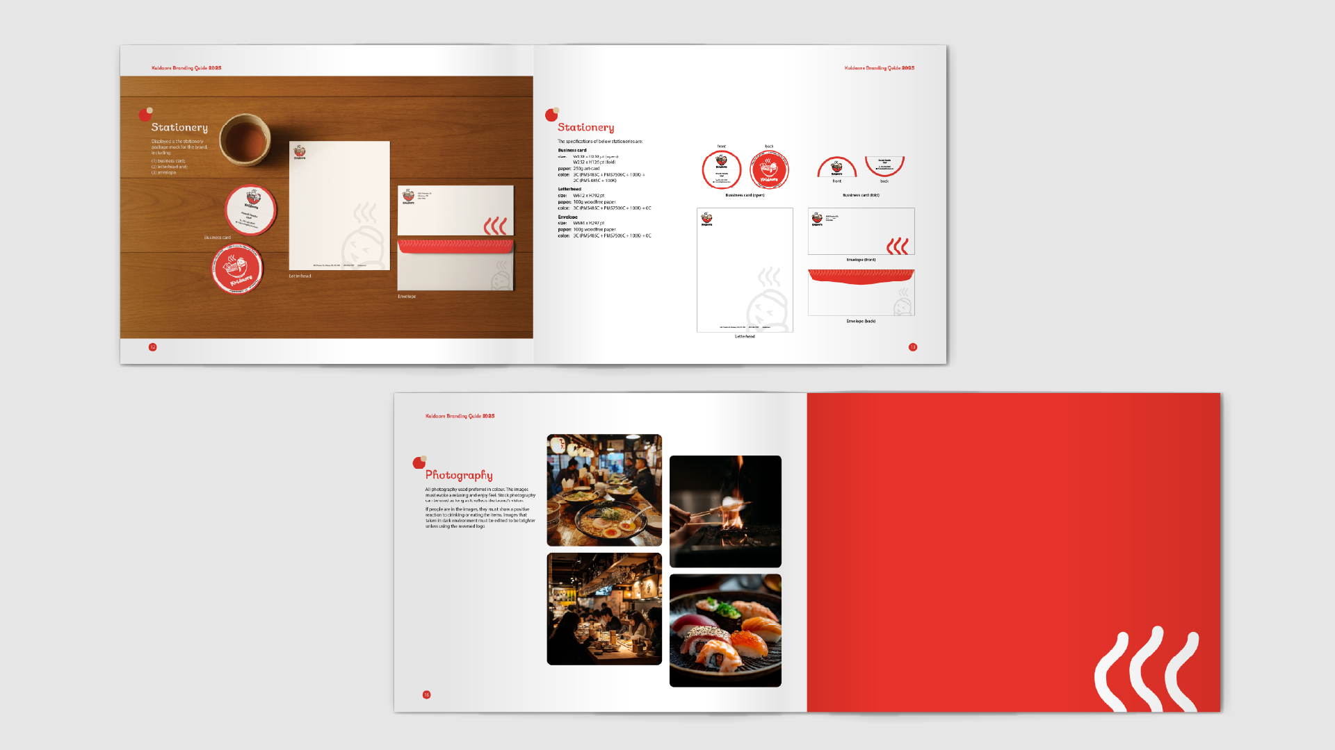
The final section presents the practical applications of the Kuidaore brand across stationery and photography. The stationery set includes a unique circular business card that doubles as a coaster, a clean letterhead, and an envelope featuring playful brand elements like steam patterns. Specifications for sizing, stock, and color modes are clearly listed for each item to ensure consistent production. The photography page sets the tone for brand imagery, emphasizing warm lighting, real-life dining scenes, and appetizing food shots to reflect the joyful, immersive spirit of Kuidaore.


