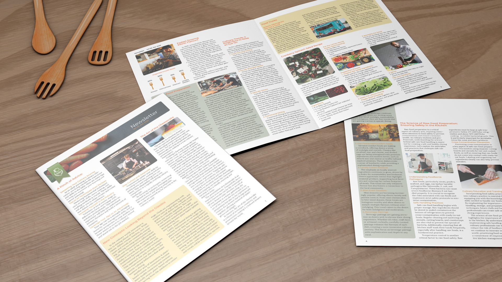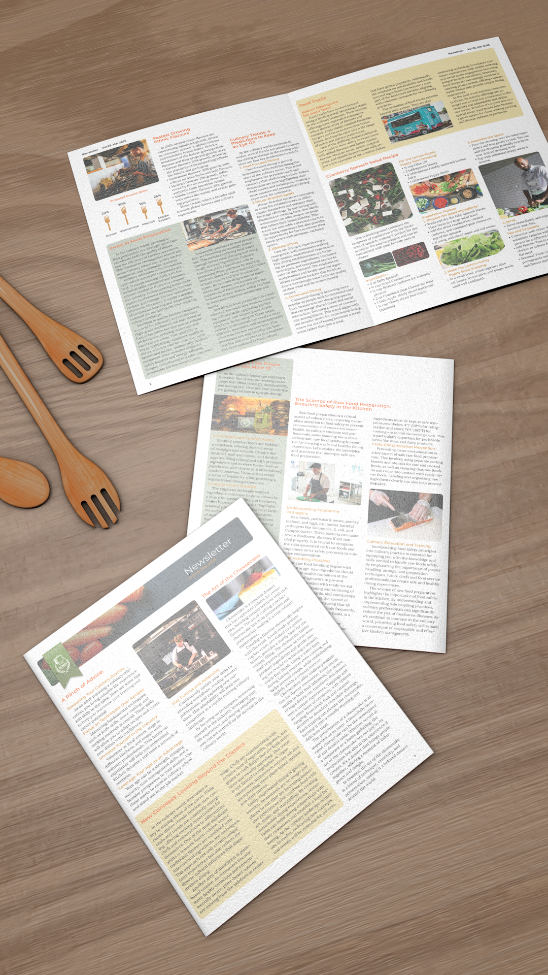

I began by creating a mood board to guide my design direction. I chose Montserrat for headings and folio, and Lora for body text to balance modern clarity with readability. For colour, I used gradients of orange to stimulate appetite and shades of green to suggest freshness and sustainable dining. This combination established a strong visual tone for the newsletter layout.
After reviewing the provided text to match relevant imagery, selecting photos that align with the newsletter’s theme and message. You also sourced high-quality reference images with rich tones and moody atmosphere to establish a clear visual direction.
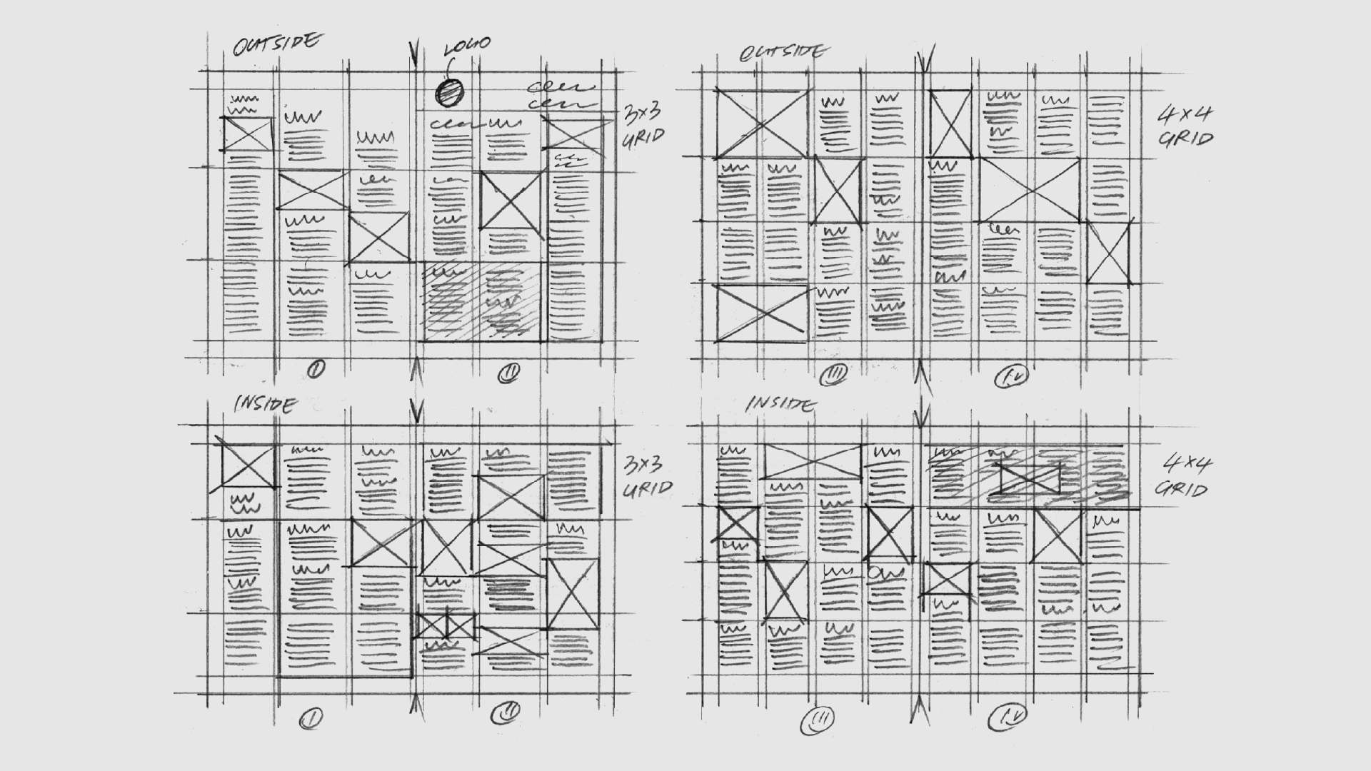
In this step, I explored both 3x3 and 4x4 grid systems to test how well the text content fits across the spreads. The challenge was managing a heavy amount of text while placing each photo meaningfully. My goal was to maintain readability, visual rhythm, and page harmony. Careful distribution of stories and imagery helped ensure both clarity and aesthetic balance.
I used InDesign to complete this layout, focusing on managing heavy text content within limited space. I applied baseline grids to maintain vertical alignment and adjusted spacing to define clear sections. This assignment helped me strengthen my skills in content organization, spatial control, and typographic structure across multi-page layouts.


