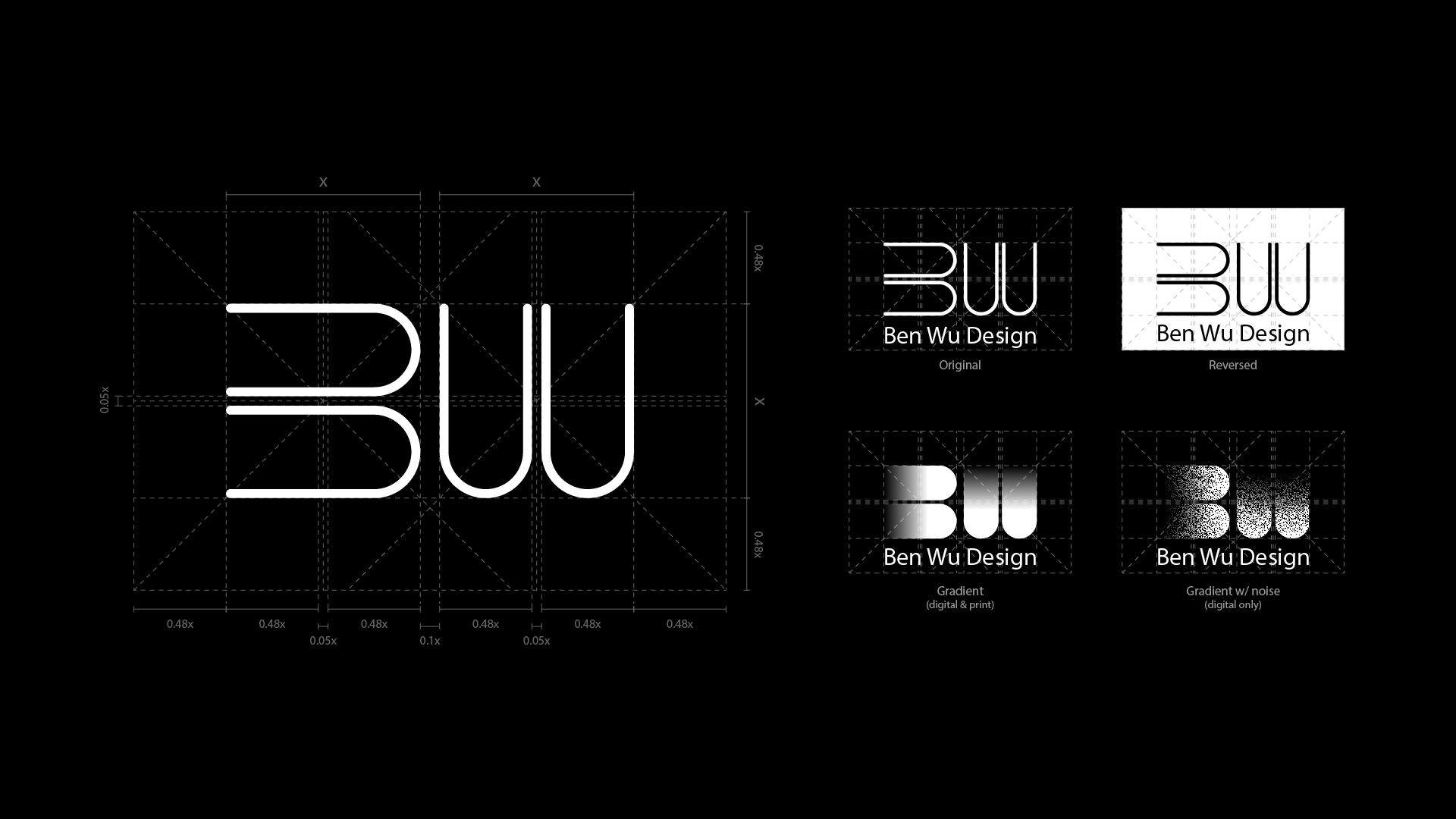
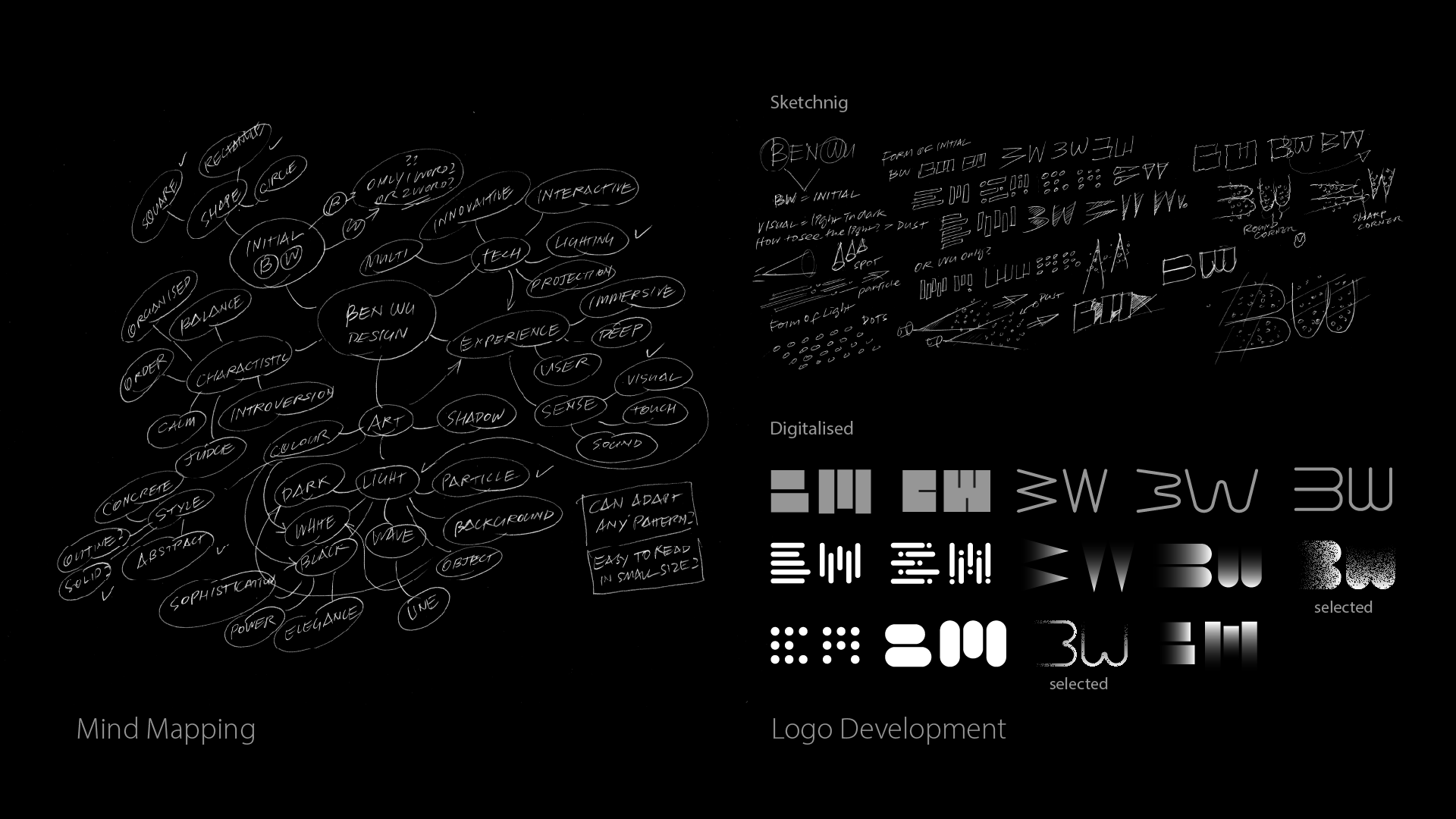

The logo concept began with my initials, “B” and “W,” and an abstract idea of light and particles moving through a dark environment. Early sketches explored how minimal strokes could suggest motion, depth, and energy. This process helped translate an intuitive concept into a structured visual system through progressive refinement.
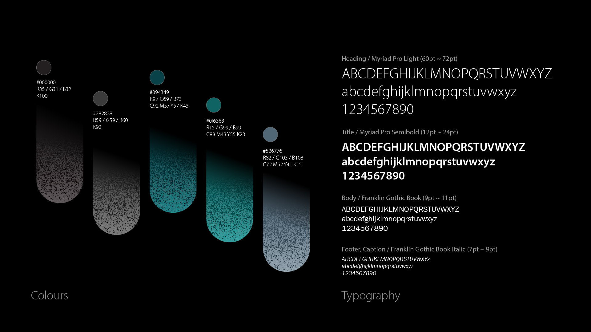
The final logo uses a restrained palette of dark grey and black to emphasize clarity, contrast, and professionalism. Myriad and Franklin Gothic were selected for their clean geometry and strong legibility across sizes. Together, the logo, color palette, and typography establish a calm but precise visual identity.
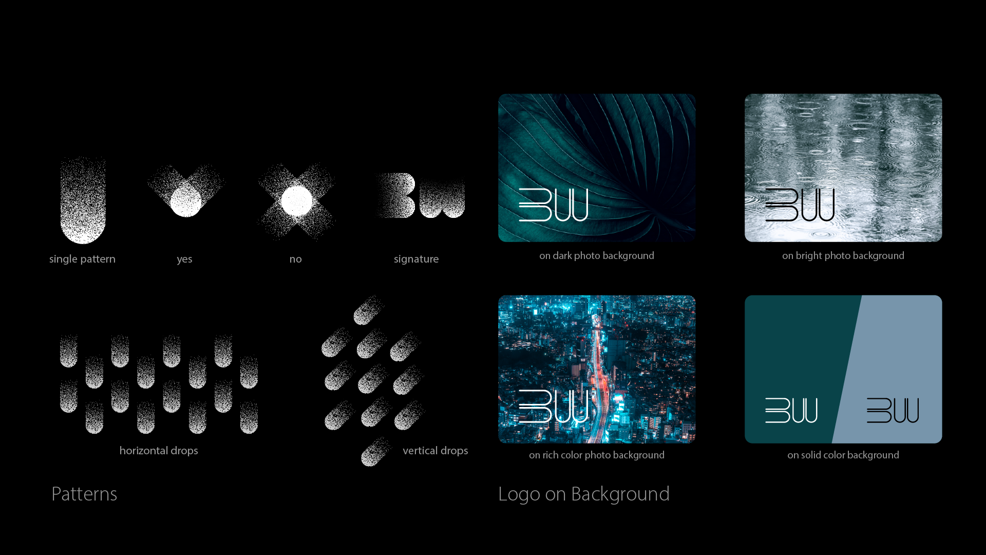
The brand guideline defines logo usage, spacing, variations, and common misuses to ensure consistency. Supporting visual elements such as patterns extend the identity while maintaining control and flexibility. Clear rules allow the brand to adapt across different contexts without losing its core character.
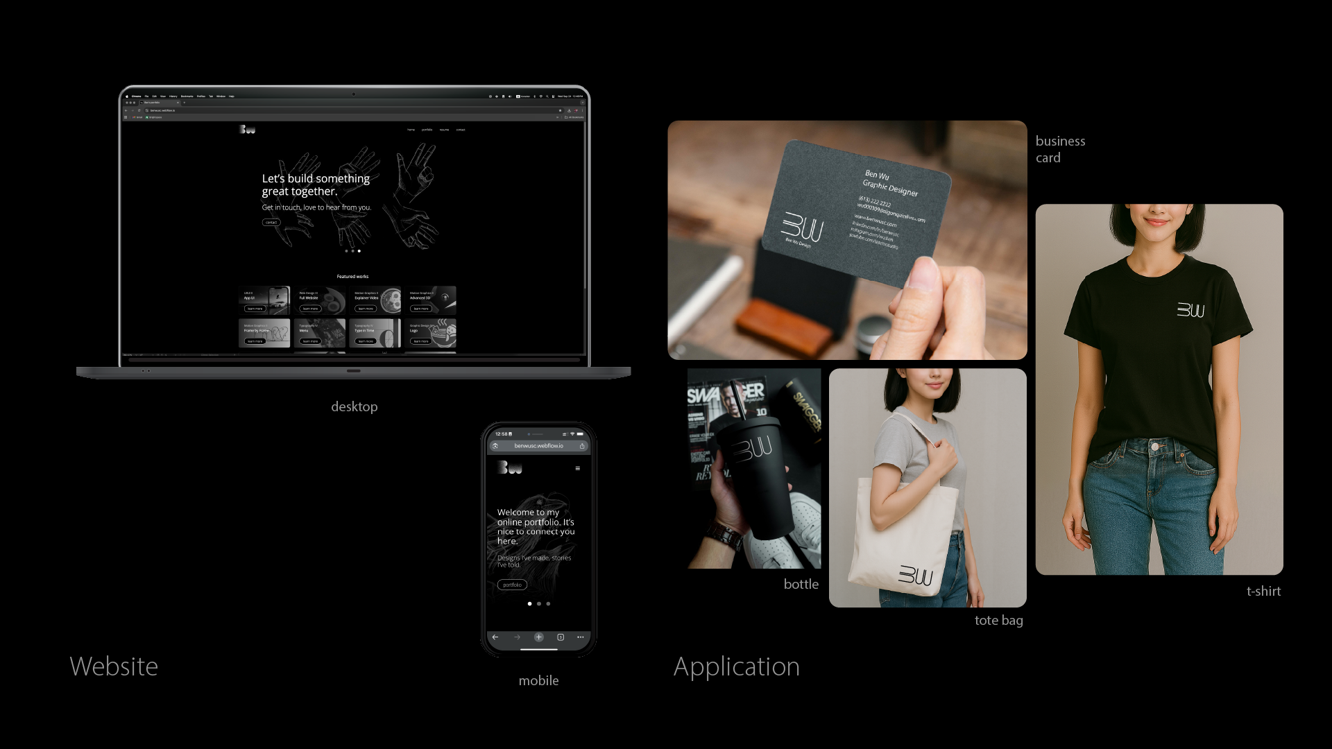
The identity system was applied to a personal website and basic brand materials, including business cards, apparel, and accessories. These applications demonstrate how the visual language functions in real-world scenarios and across digital and physical touchpoints, reinforcing coherence and usability.