
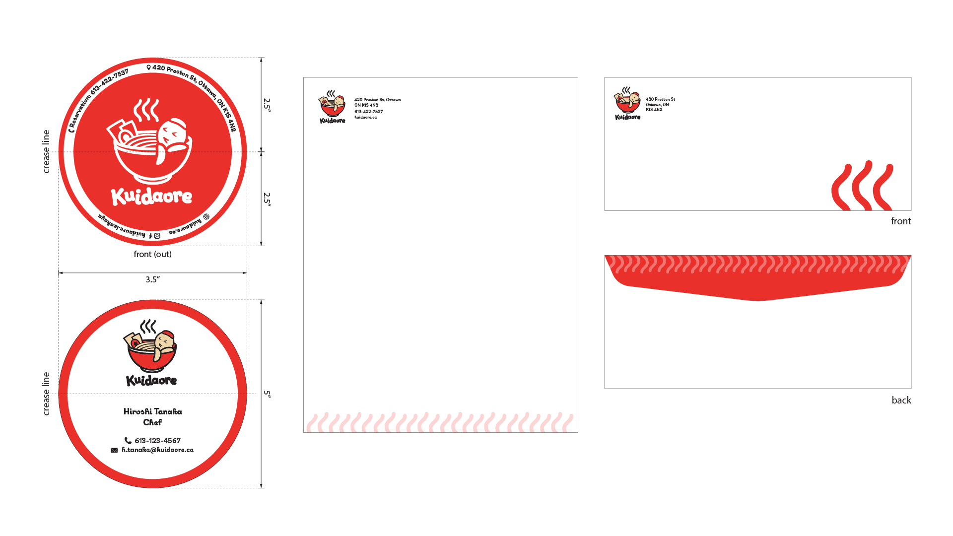

For this stationery set, I reused the branding elements developed in the previous logo assignment. To make the business card more engaging, I designed it as a circular fold-out piece that functions both as a name card and a reusable cup coaster. For the letterhead and envelope, I kept the layout clean and minimal. I applied the “noodle steam” motif subtly along the edges to evoke a sense of warmth and freshness.
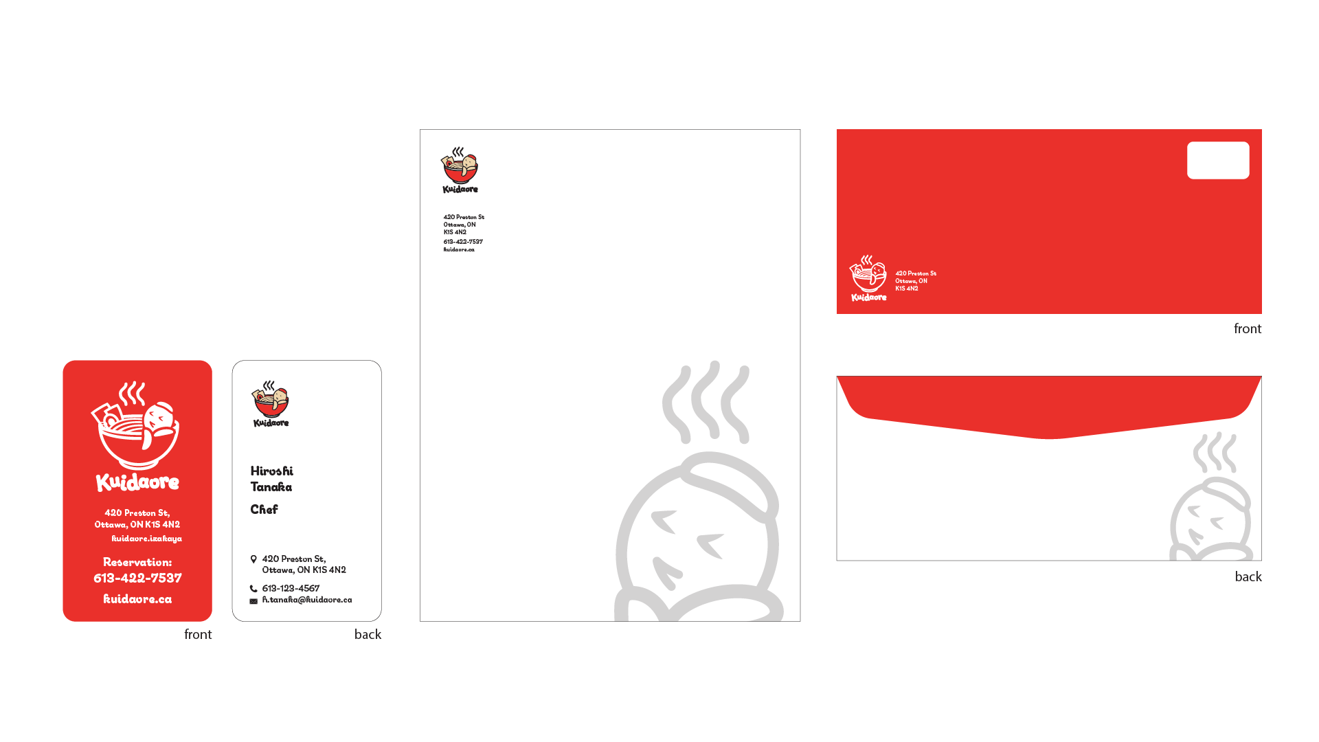
I explored a high-contrast approach by applying full red on one side and clean white on the other. The business card uses a vertical layout to stand out from standard formats. I also featured the mascot from my logo as a subtle background element across the letterhead and envelope to reinforce brand identity and personality.
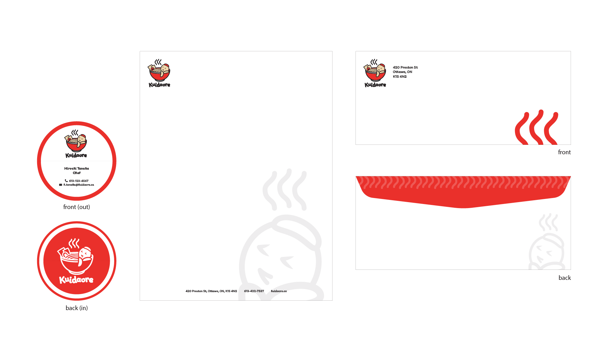
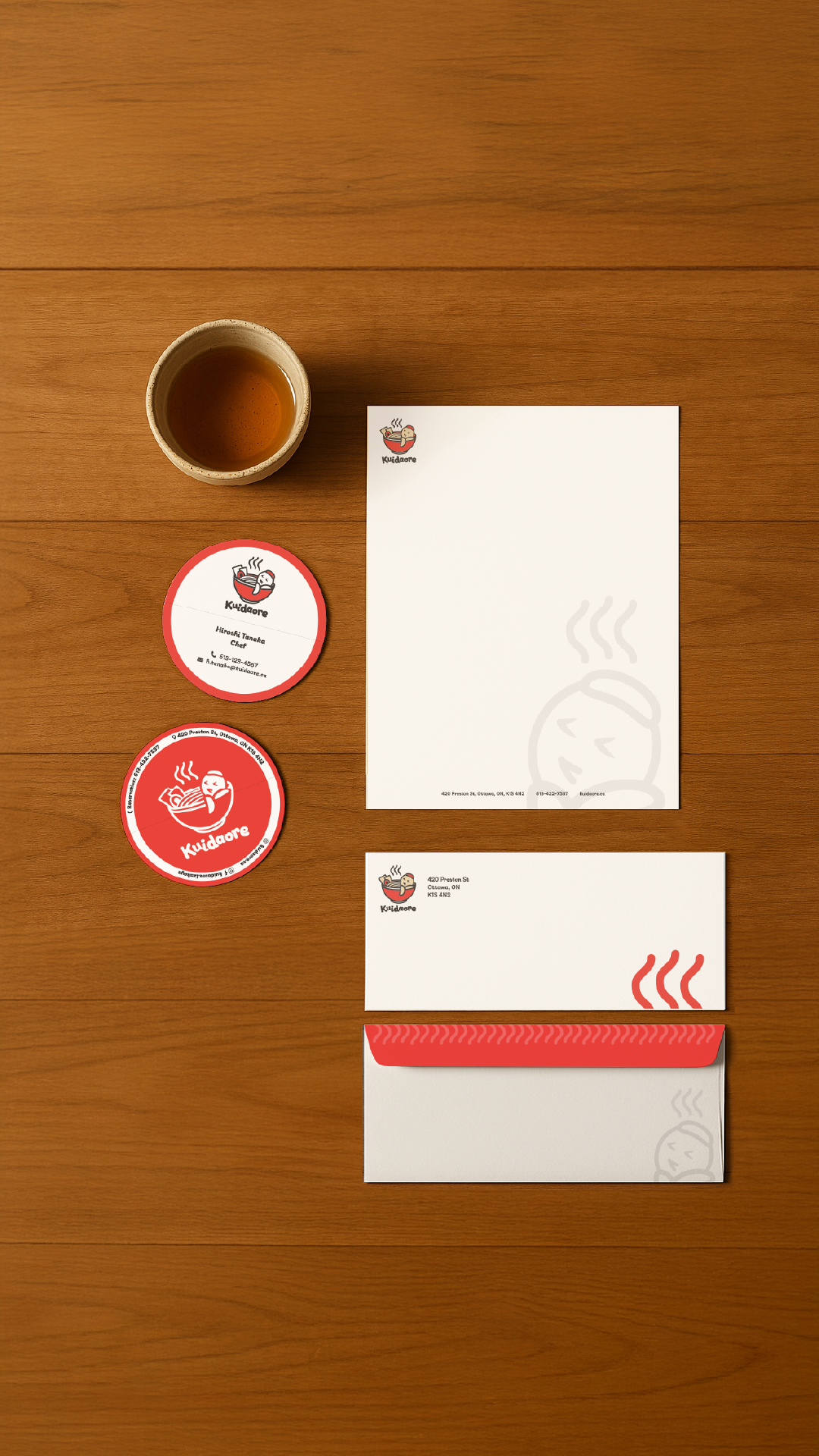
For the final step, I merged the strengths of both concepts to create a unified stationery set. The design is minimal yet full of character, capturing the brand’s essence: enjoyment, fun, relaxation, and a bit of laziness. Each element reflects Kuidaore’s playful and welcoming identity.