

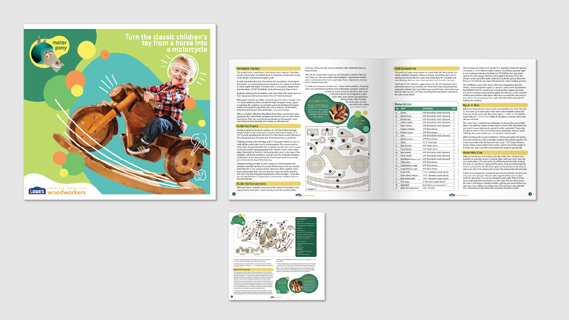

I began by mapping out the page layout to balance text, tables, and diagrams. For the logo, I illustrated a cartoon horse wearing a motorcycle helmet, reflecting the toy’s theme. I tested 3 main colours: blue, cyan, and green: plus black and white for contrast.
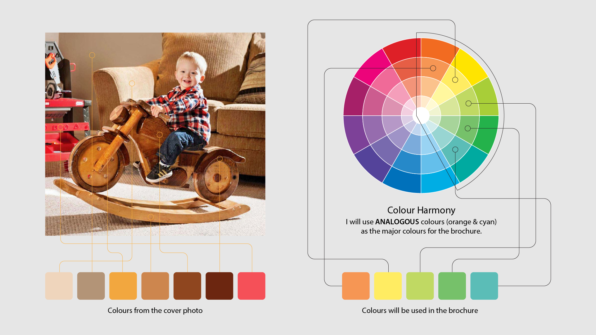
I extracted key colours from the cover image of the child on the wooden bike to build a cohesive palette. I selected analogous colours: orange and cyan, as the main tones for the brochure to create a warm, playful, and visually unified design.
Based on the provided 2D plans and reference sketches, I created a 3D exploded view to clearly illustrate part assembly. Each component is labeled for easy identification, helping users understand the construction process step by step.
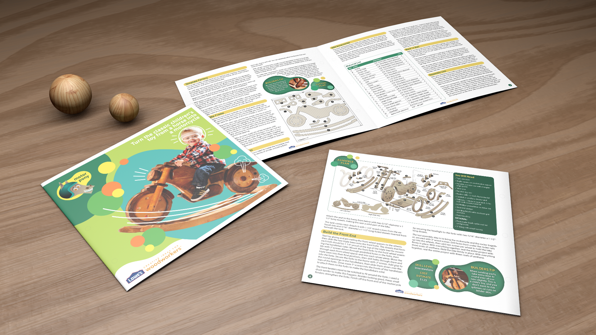
The layout was developed in InDesign using vector assets from Illustrator. The main challenge was fitting all body text within a limited space while maintaining clarity and aesthetic balance. Careful attention was given to managing whitespace and visual flow across the brochure.