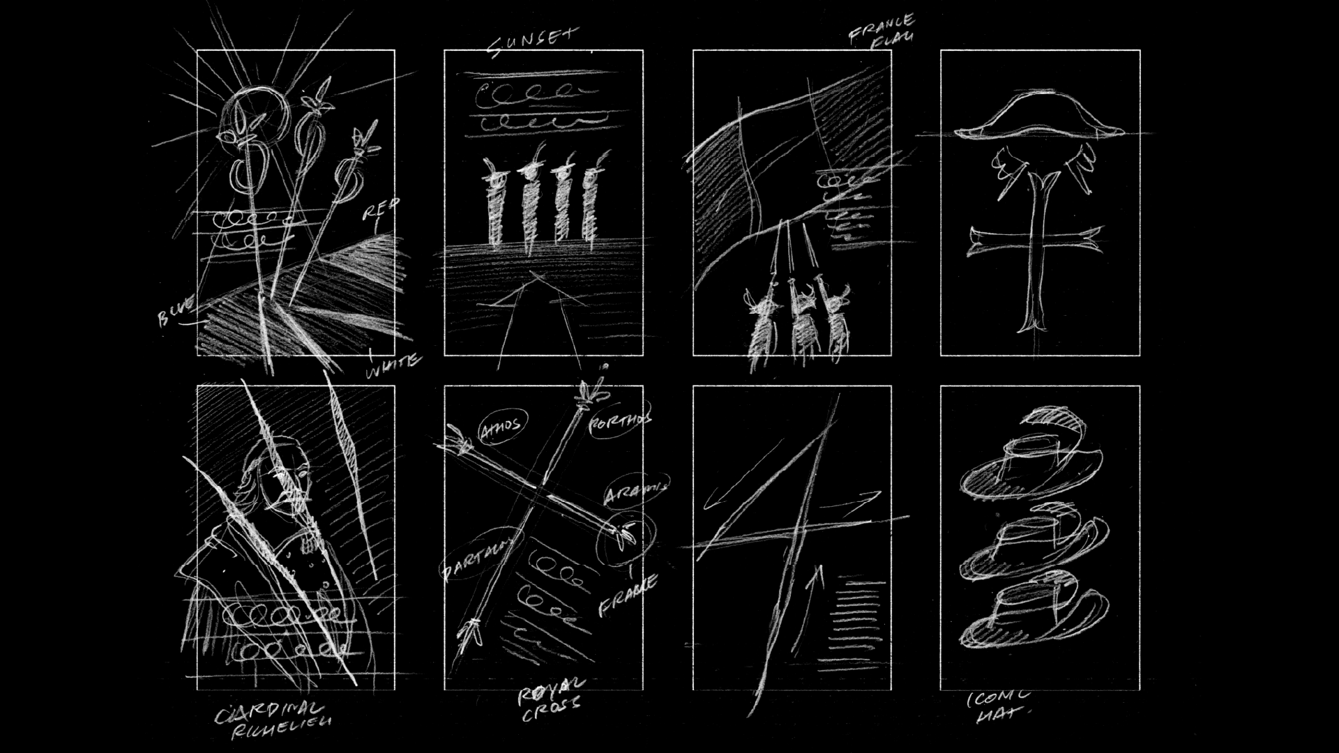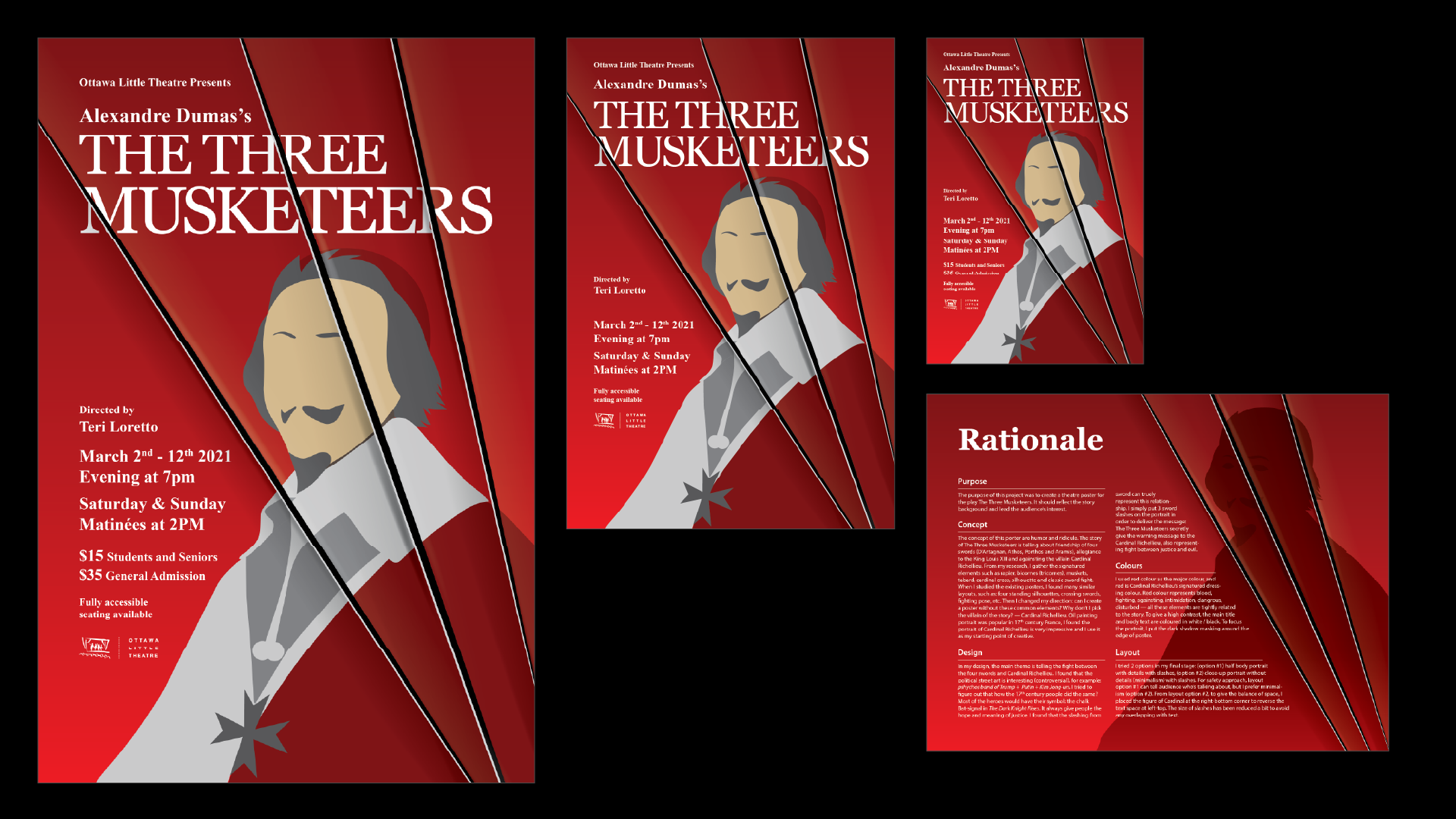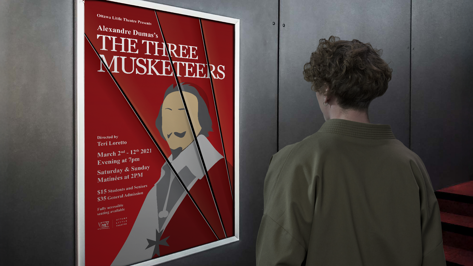
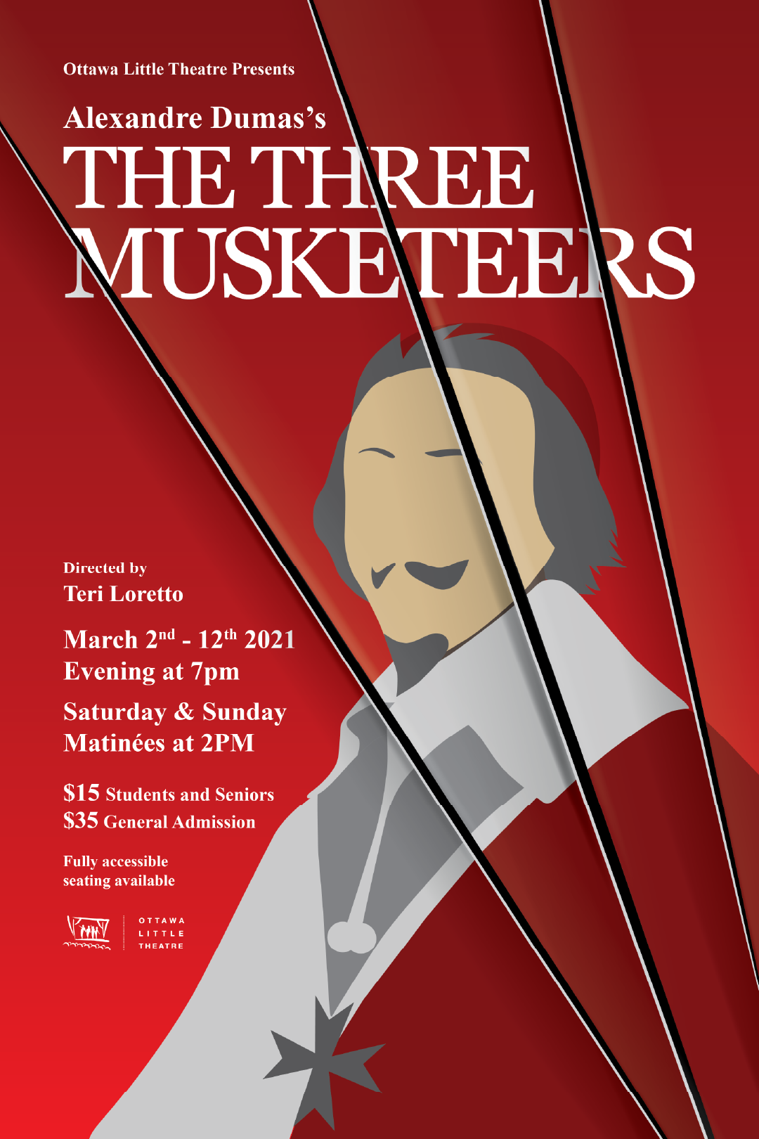
This poster concept focuses on humor and satire by shifting the spotlight from the heroic musketeers to the villain, Cardinal Richelieu. Instead of using overused visual tropes — such as sword fights, heroic silhouettes, or group poses — I explored a fresh angle by highlighting Richelieu’s iconic image. Drawing from 17th-century French oil painting traditions, I incorporated the Cardinal’s portrait as a central visual element. Signature items like rapiers, muskets, and tabards still inform the design subtly, but the core idea is to provoke curiosity and reinterpret the classic story through irony, elevating the antagonist as the unexpected face of the narrative.
In this design, I took inspiration from contemporary political street art, where bold visuals challenge authority through satire and symbolism. I imagined how such subversion might appear in 17th-century France. Instead of depicting the heroes directly, I focused on Cardinal Richelieu, the antagonist, and used three dramatic sword slashes across his portrait to symbolize the musketeers’ silent resistance. This mark becomes their signature—an act of defiance carved into the seat of power. Like the Bat-signal in The Dark Knight Rises, it represents justice, rebellion, and hope. The slashes suggest a confrontation is coming, quietly but unmistakably.
Red dominates the poster, reflecting Cardinal Richelieu’s identity and themes of blood, conflict, and danger. High-contrast white and black text ensures clarity, while a dark edge shadow draws focus to the central portrait and intensifies the dramatic tone.
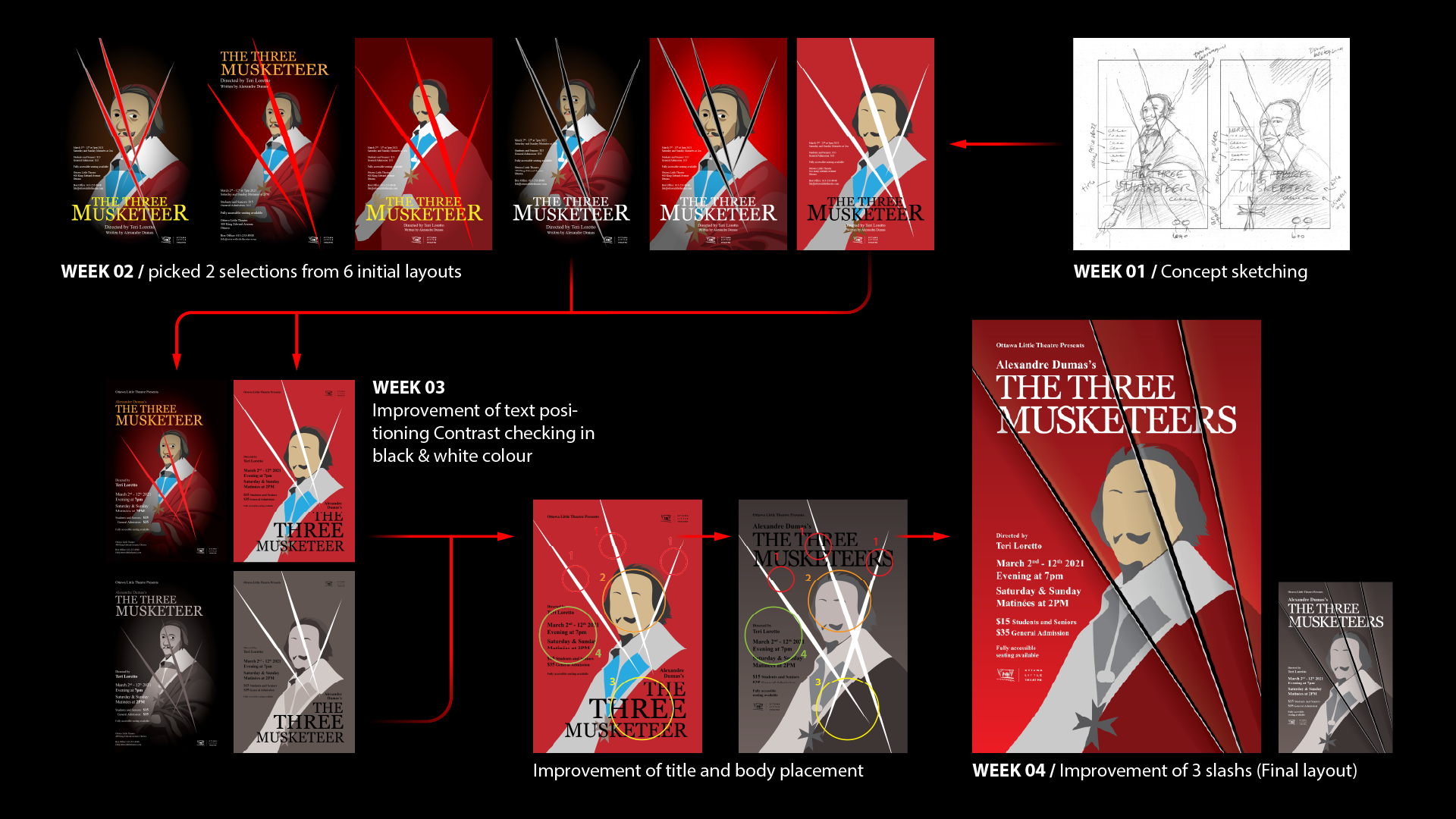
I explored 2 layout options: a detailed half-body portrait and a minimalist close-up. I preferred the latter for its bold simplicity. The Cardinal is placed bottom-right, balancing the top-left text. Slashes were resized to avoid overlapping important information.
