
I started by selecting 2 typefaces to reflect different festival tones. (1) Salvation gives a bold, raw folk feeling, while (2) Abril Fatface brings a more elegant and festive Scandinavian vibe. I created 2 layout sketches based on these directions. One features a hand gesture symbolizing freedom with a guitar, the other takes inspiration from the Northern Lights as visual flow. These ideas guide both my type pairing and image placement.
I researched posters and tickets from folk and rock events for inspiration. I reviewed designs from Woodstock to modern festival layouts. After comparing styles, I decided not to use photography. Instead, I focused on abstract graphic elements that reflect the spirit of music and freedom with minimal visuals.
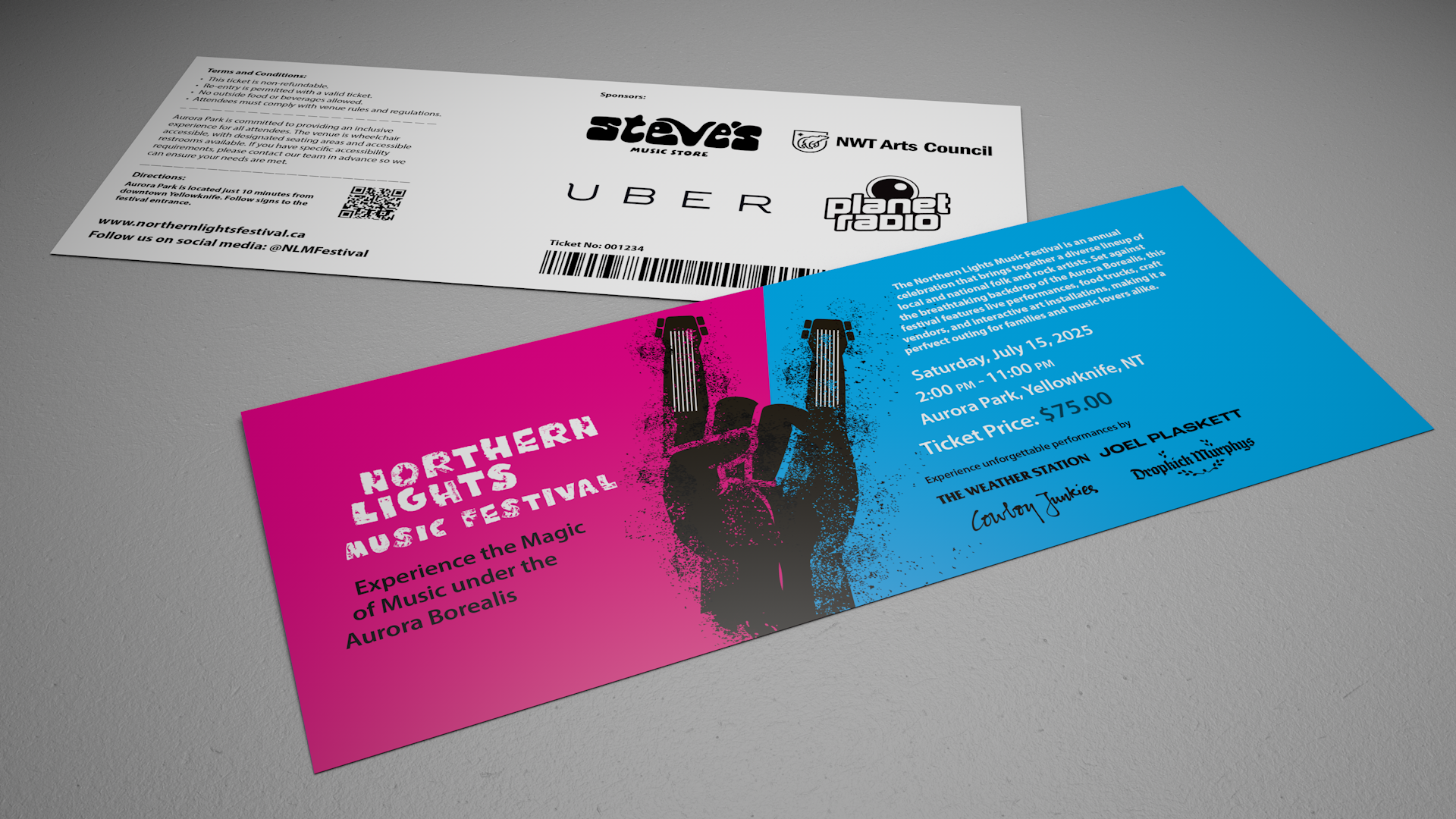
I developed 2 layout options based on my earlier sketches and typeface choices. Layout A uses Salvation (font)with strong colour contrast (pink and cyan) and a bold “hand with guitar” graphic to create high visual impact. Layout B uses Abril Fatface (font) and a curved music staff graphic to reflect the northern lights, with more subtle colours. After comparing both, I found that Layout A communicates the festival’s energy and vibe more effectively.


