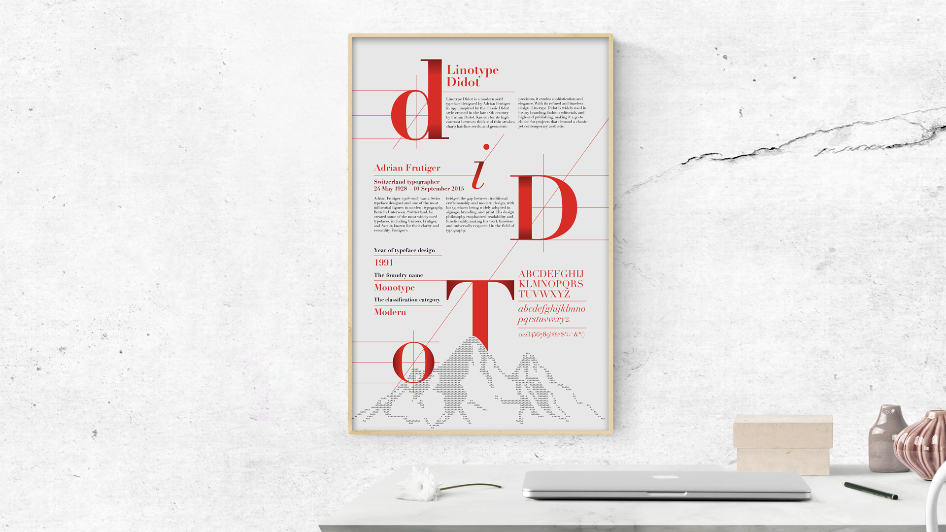

I focused on researching Linotype Didot and its designer, Adrian Frutiger. I explored the typeface’s stylistic origins and Frutiger’s influence on modern typography. To set a conceptual direction, I created a mood board featuring letterforms, numerals, and typographic specimens. I chose red as the primary color, inspired by the Swiss national flag to honor Frutiger’s heritage. I also illustrated the Matterhorn from the Alps as a cultural reference. The collected poster examples guided my visual tone and typographic composition for the next design phase.
I organized my research into a mind map to clarify the relationship between Linotype Didot, Adrian Frutiger, and the broader typographic context. Then I explored 6 layout variations using different grid systems: 3×2, 3×3, 3×4, and 3×6. I added diagonal lines to bring more dynamism and structure. Each design experiment positioned broken glyphs from “Didot” into distinct modules, giving the layout an architectural rhythm. I intentionally separated text blocks to enhance clarity and reinforce visual structure while highlighting the elegance of the typeface.
I created 3 poster layouts in Illustrator based on my earlier sketches. Layout #1 uses a bold red “D” as the main visual anchor, with the Matterhorn formed by repeating “A”s for dramatic contrast. Layout #2 distributes the letters of “Didot” across balanced blocks with a central mountain graphic, achieving order but less visual punch. Layout #3 reimagines the red “A” as the mountain itself, with snow crafted from small “A”s, and all content structured around the diagonal lines of the “A”, making it visually cohesive and conceptually integrated.
Poster layouts #4 to #6 explore new visual strategies. Layout #4 refines layout #2 by enlarging and centralizing the letters of “Didot” with added shading and diagonal grid lines to enhance structure. Layout #5 reverses the scheme of layout #3, making the background red and the large “A” white, testing whether a stronger background boosts impact. Layout #6 introduces a playful twist by composing a stylized portrait of Adrian Frutiger entirely from glyphs, while surrounding it with generous whitespace for clarity and focus.


