
I began by organizing all the images provided by the professor. Using visual intuition and balance, I compared tone, composition, and mood. After careful review, I selected 5 images with the most potential for expressive development.
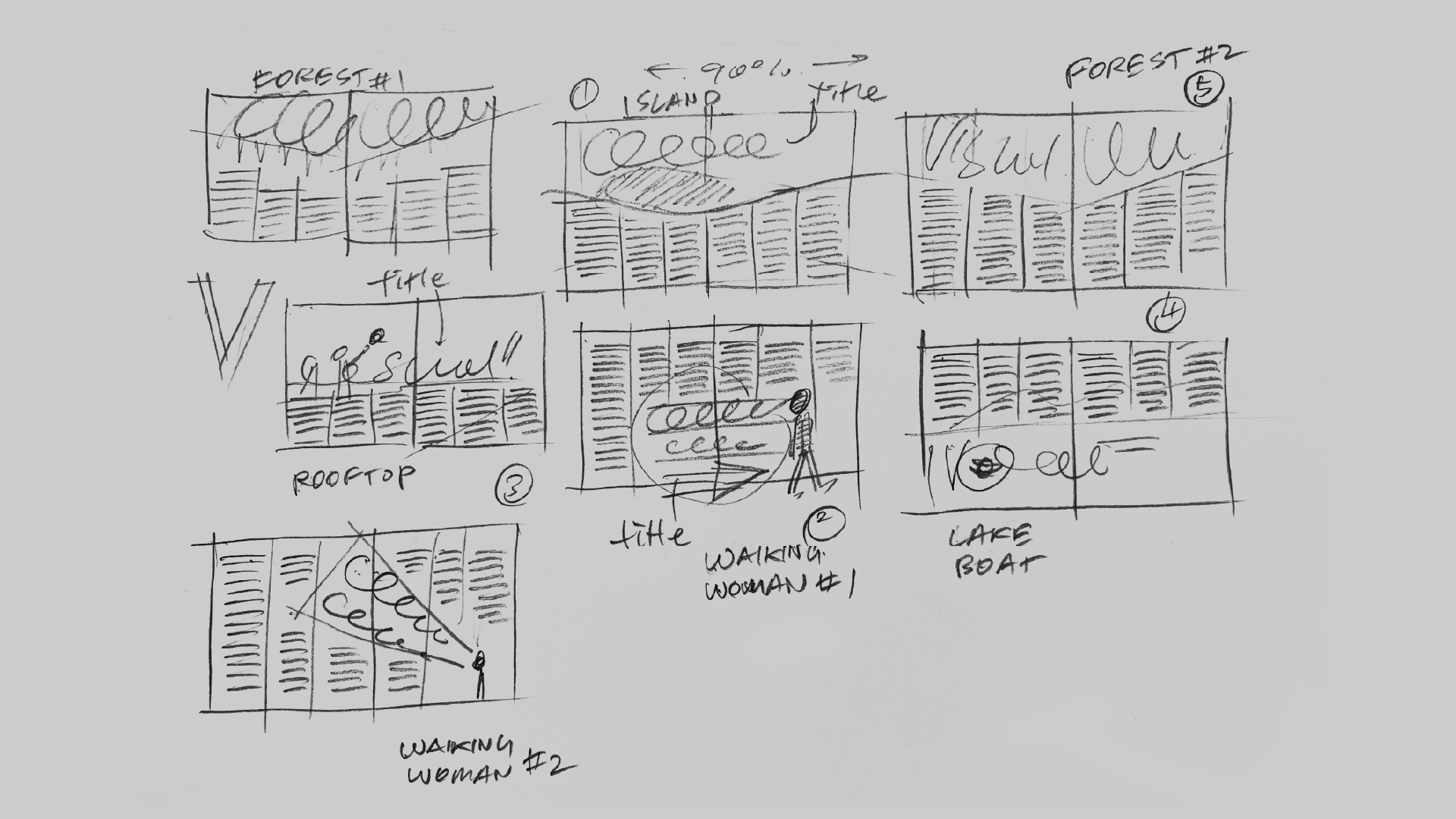
I sketched layout concepts using a 3-column grid, focusing on how text could interact with key visual elements from 5 selected images. Each sketch tested different object placements, text alignment, and compositional tension to achieve visual balance while maintaining clarity in content delivery.
I developed 4 layout options in Illustrator based on the thumbnails. Using the grid as structure, I experimented with type size, hierarchy, and spatial tension. Color choices for heading and body text were carefully adjusted to enhance legibility and ensure harmonious contrast with each background image.
I finalized the layout using the “Island” photo. The calm, spacious scenery inspired a relaxed tone, so I selected “Snell Roundhand” for its gentle flow. I aligned the headline to follow the mountain’s slope and matched the type color with the sky. The main challenge was maintaining both harmony and sufficient contrast across the composition.


