


Branding package with a 2–5s intro and 2–4s lower third. Ensure consistent typography, color, and animation that reflect the brand’s visual tone.

I chose National Geographic as my branding theme. My first task was to study their brand guidelines in detail to ensure consistency and accuracy. I carefully selected the appropriate elements: typography, colour palette, layout grid, and image style, while making sure not to violate any of the official design rules.
After studying National Geographic’s brand guidelines, I created a mood board for the virtual “Science Channel.” I sourced high-quality imagery and footage that reflect the theme of scientific exploration. I kept the original colour palette: yellow, black, and white, and applied the official typeface Verlag. With all assets prepared, I moved on to production.
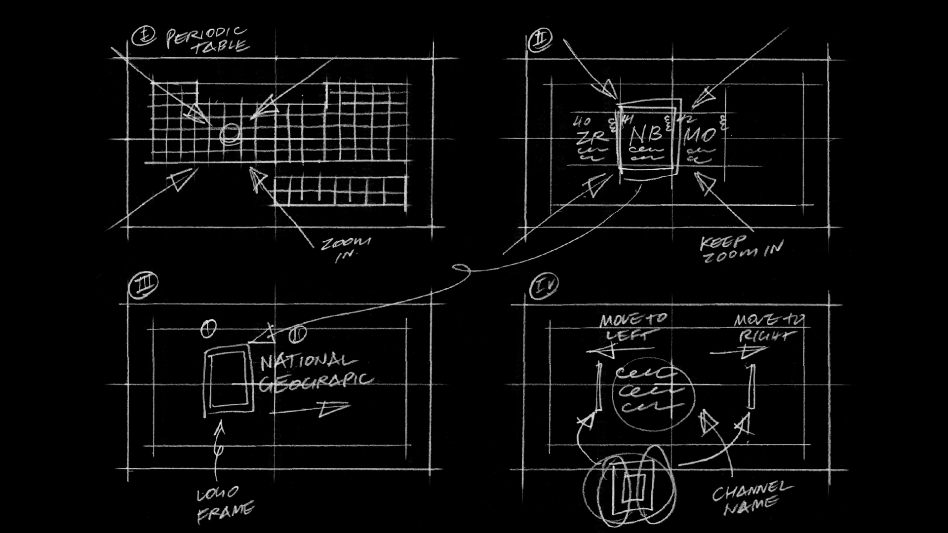
I developed a storyboard based on the concept of the Periodic Table, symbolizing science. The camera begins with a zoom-in motion toward the table, eventually focusing on a single block. I then animate a yellow line framing this block, which transforms into the iconic National Geographic “Yellow Door.” Finally, the brand name slides in to complete the opening sequence.
I created all assets in Illustrator and imported them into After Effects for animation. While the storyboard seemed straightforward, turning it into a smooth animation was challenging. Every small element required careful timing, especially the easing movement. Making things move was easy, making them feel natural took much more effort.