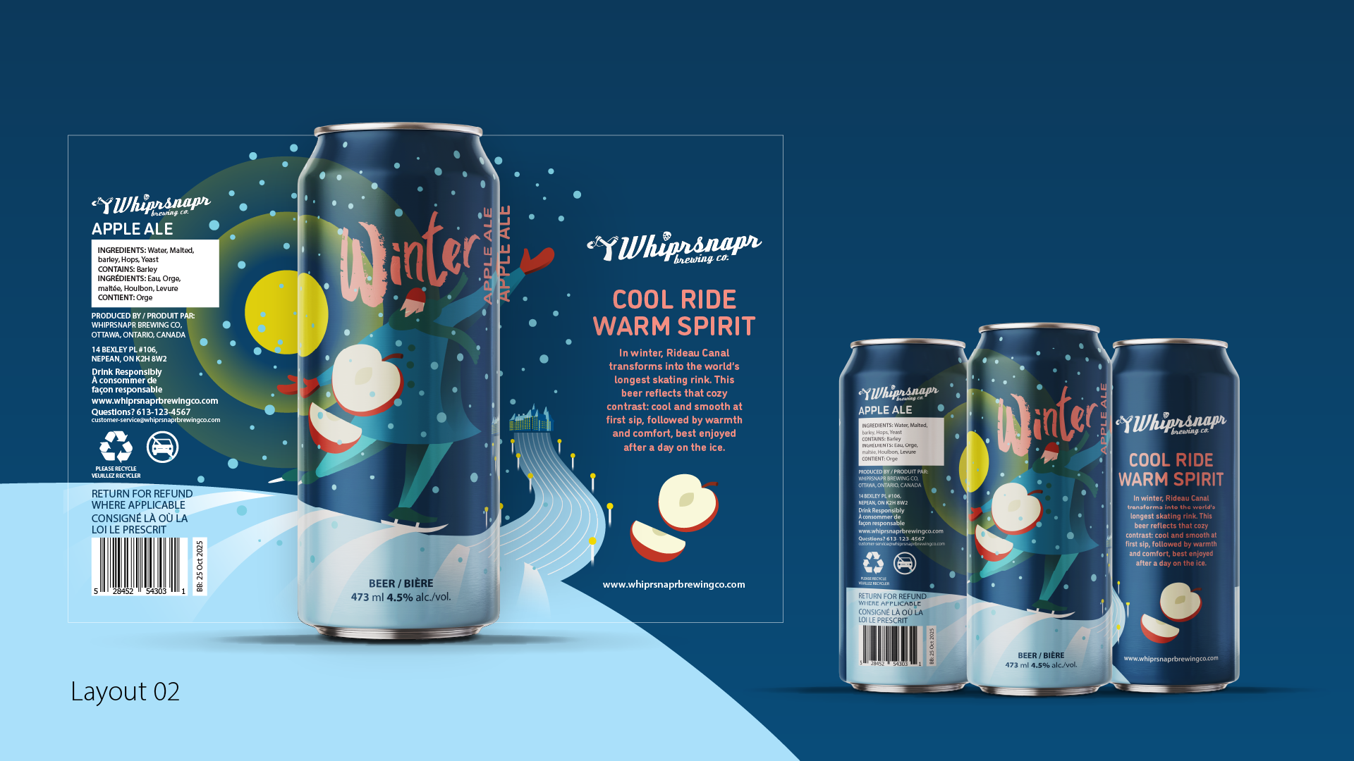
This project explores can label design through the lens of local culture and seasonal identity. Using an Ottawa-based brewery as the context, the objective was to create two distinct yet related craft beer labels that reflect the city’s character. The focus was on concept development, visual storytelling, and translating place-based inspiration into a cohesive packaging system.
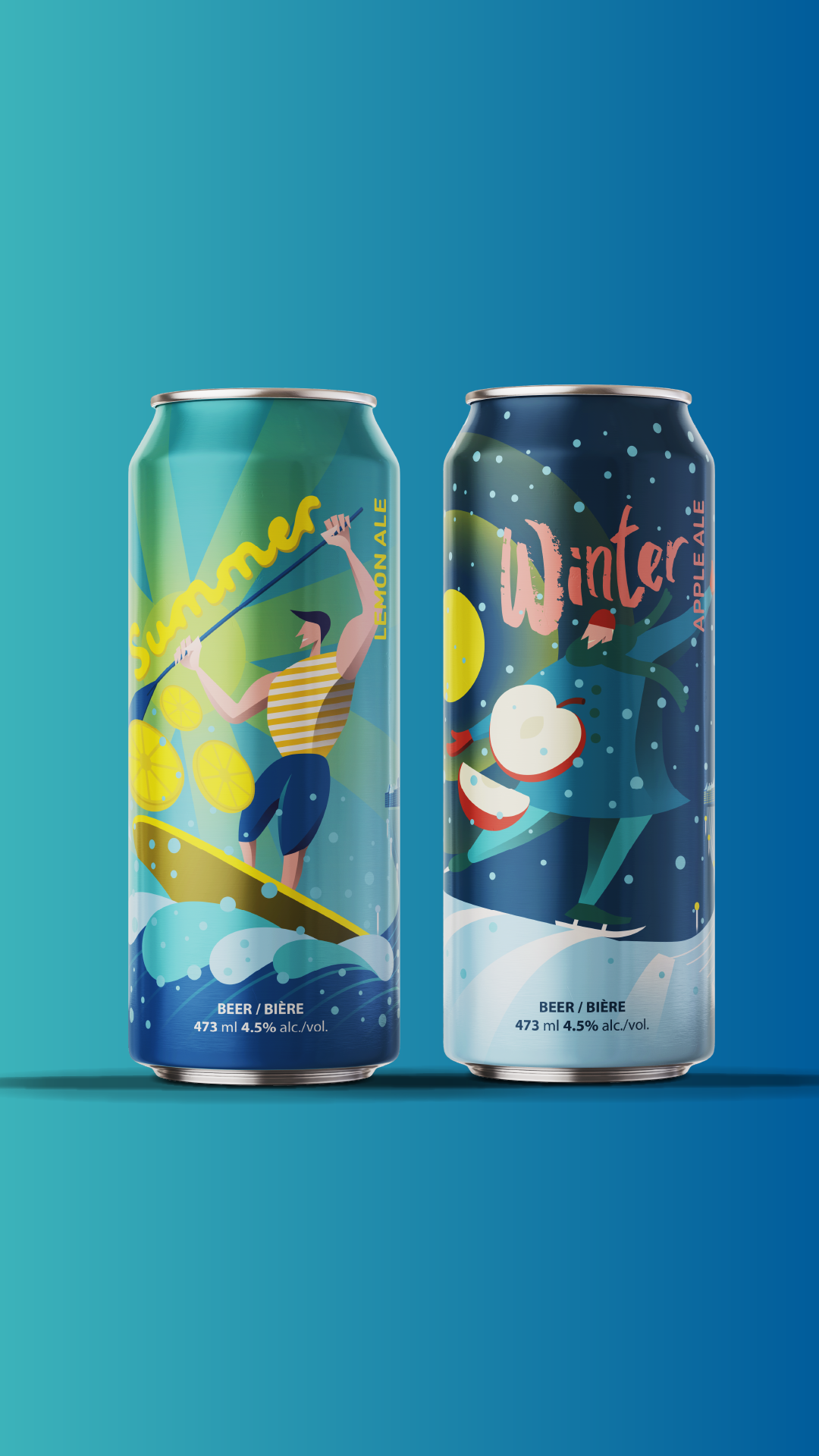
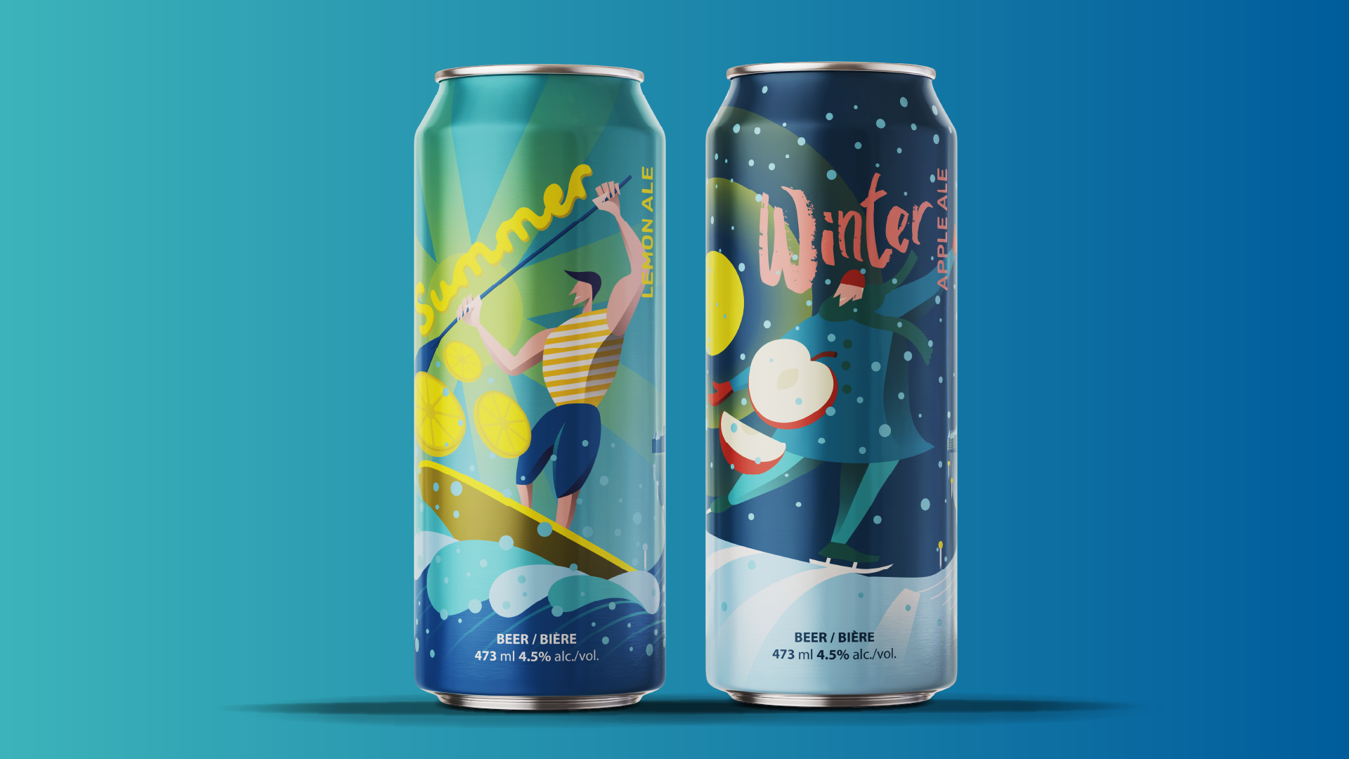
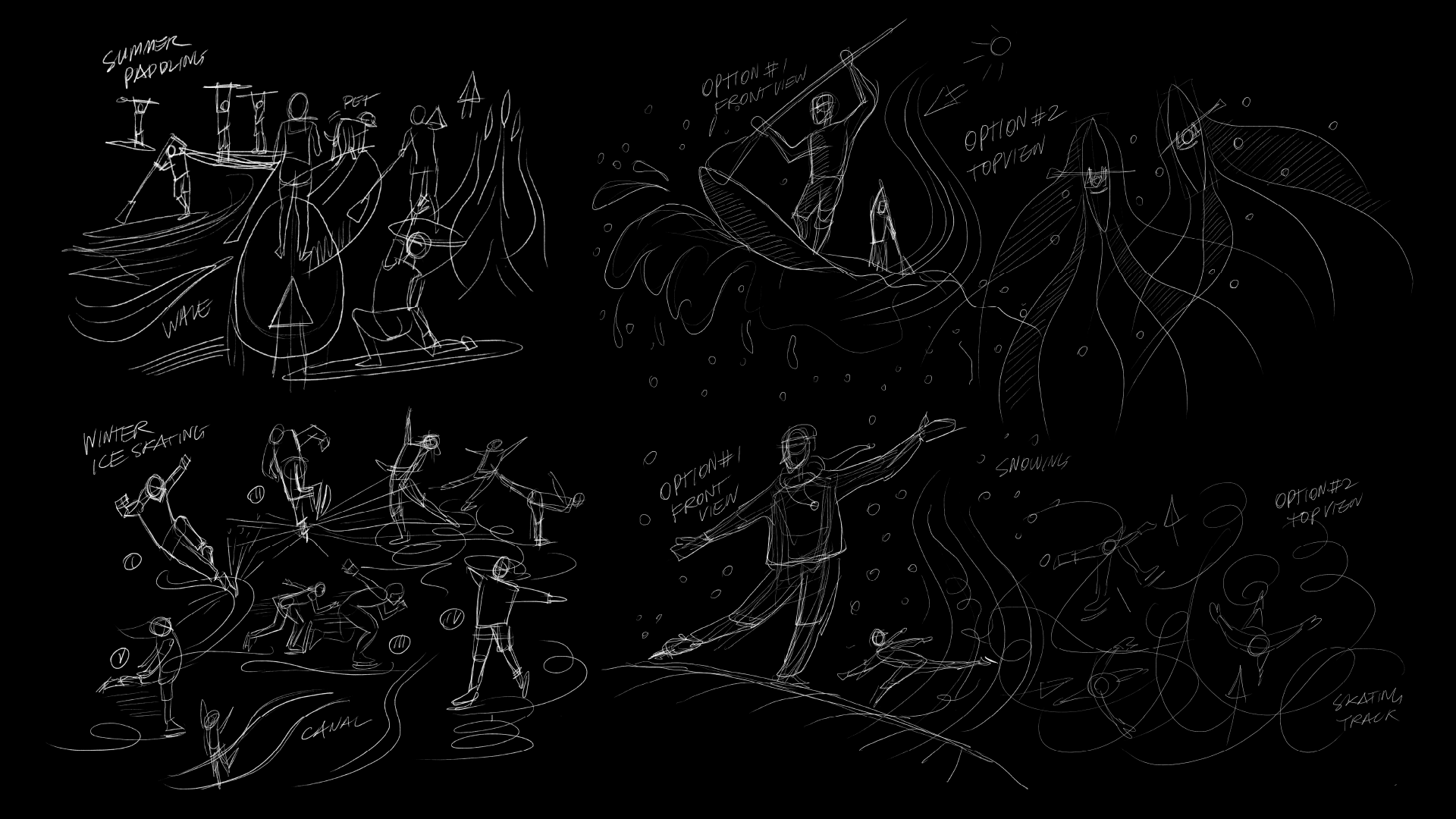
The core concept is inspired by the Rideau Canal’s dual identity across seasons. Summer represents paddling and outdoor energy, while winter reflects ice skating and calm stillness. Early sketching focused on abstract human figures, canal flow, and landmark integration, allowing the concept to evolve visually before moving into refined digital layouts.
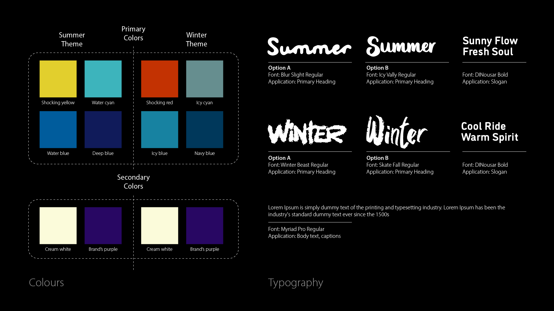
Two contrasting colour systems were developed to reflect seasonal mood. Summer uses yellow and cyan to suggest sunlight, water, and activity. Winter uses red accents with icy blue to evoke cold and warmth in contrast. Typeface choices support this idea: Blue Slight Regular suggests fluidity and melting ice, while Skate Fall Regular conveys a cozy winter tone.
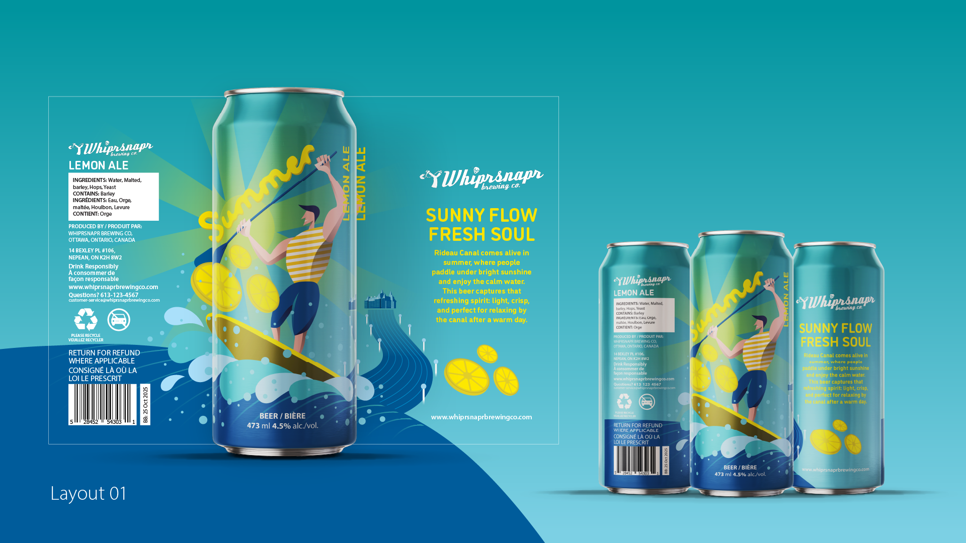
The summer label features an abstract paddling figure aligned with the canal’s flowing form. Curved shapes and bright colours emphasize movement and openness. The Rideau Canal and Fairmont Château Laurier are subtly integrated to anchor the design in Ottawa, reinforcing a sense of place while keeping the illustration playful and energetic.
The winter label interprets the Rideau Canal as a skating destination. A simplified skating figure, horizontal structure, and cooler colour palette express stability and calm. Snow, ice textures, and the Fairmont Château Laurier appear as visual anchors, creating a quiet, refined contrast to the summer label while maintaining a consistent overall system.