This assignment focuses on building a complete design system and applying it across multiple touchpoints. The objective is to create a consistent visual language that strengthens brand identity while improving user experience. Through this project, I explored how a system can translate concepts into scalable, real-world applications.
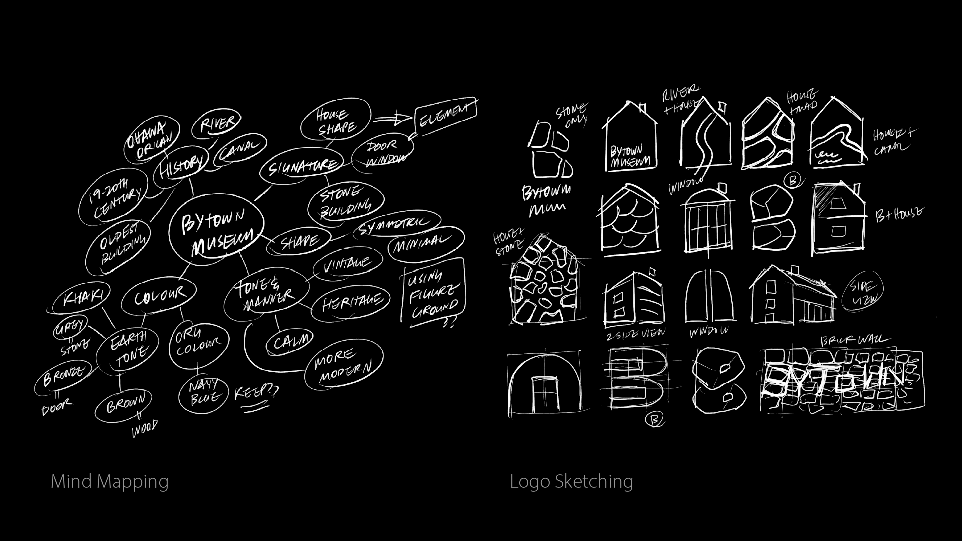
I chose the Bytown Museum because of my personal interest in museums and the opportunity to rethink a long-standing visual identity. I began with mind mapping to study its history, location, and architectural features. Logo sketches explored variations of the museum’s iconic stone building, combining door and window shapes with the initial “B” to form a symbol that feels architectural, minimal, and rooted in place.
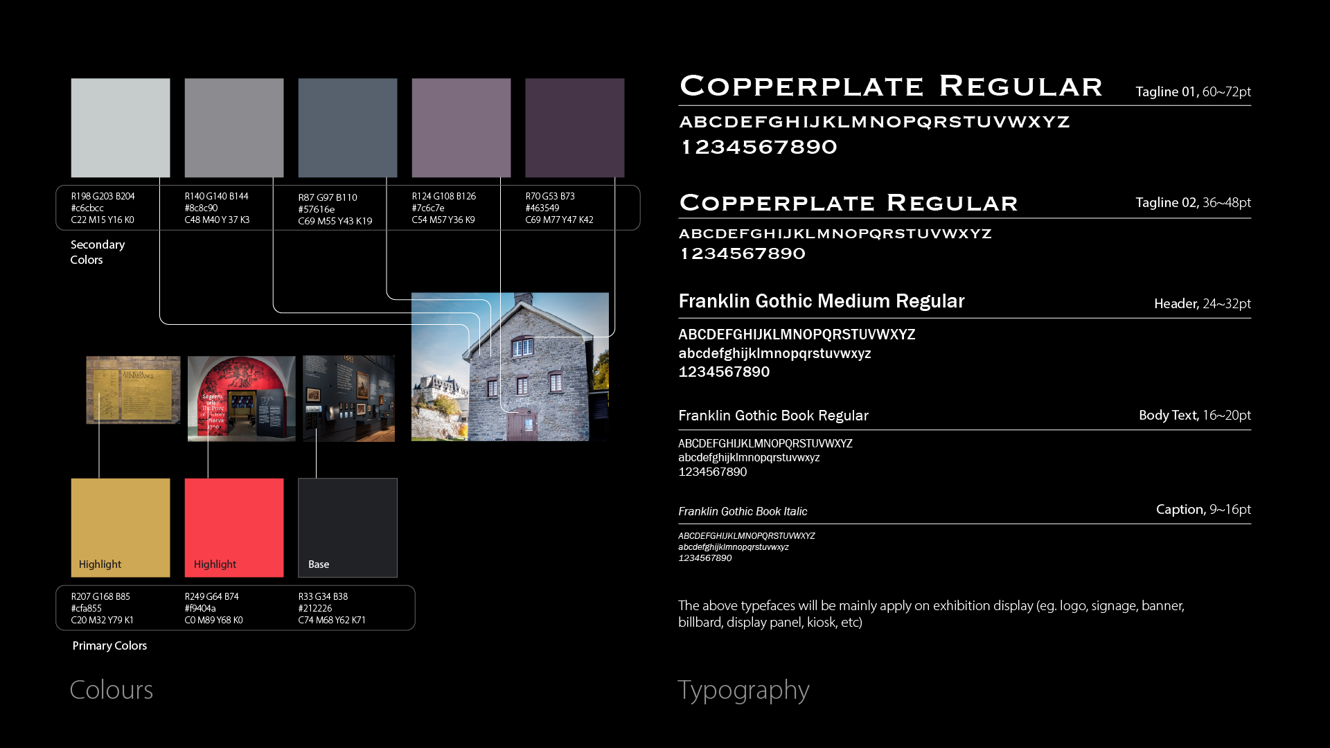
The colour palette is derived from the museum’s stone façade, using muted earth tones as secondary colours to reflect history and materiality. Gold, red, and dark grey were introduced as primary accents to add contrast and freshness. Typography balances tradition and clarity, supporting both exhibition content and wayfinding while maintaining a refined, institutional tone.
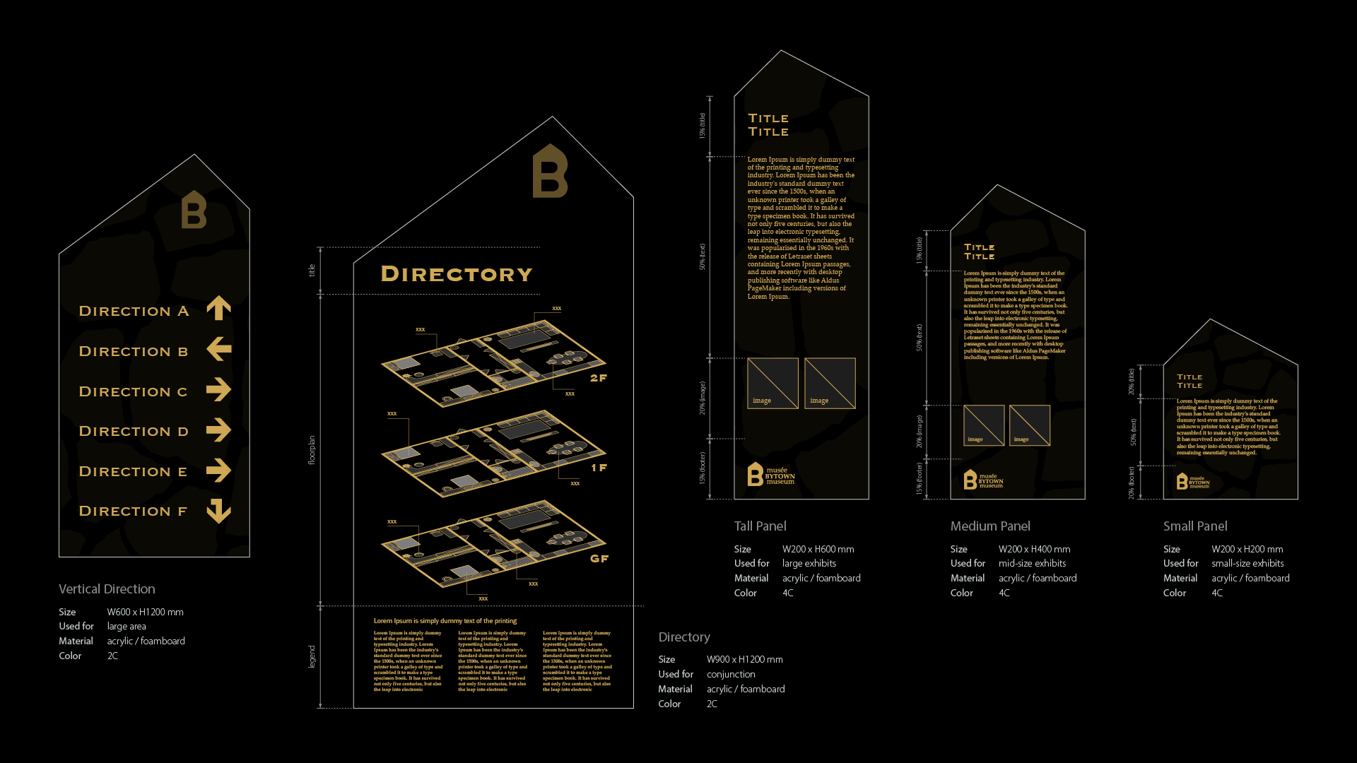
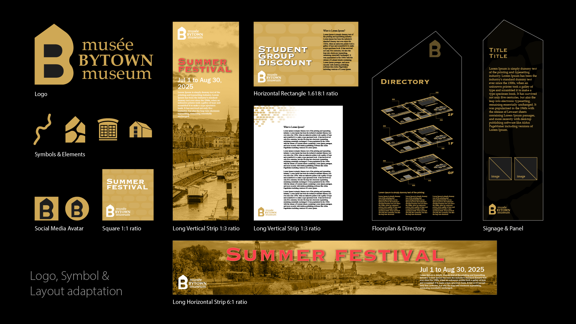
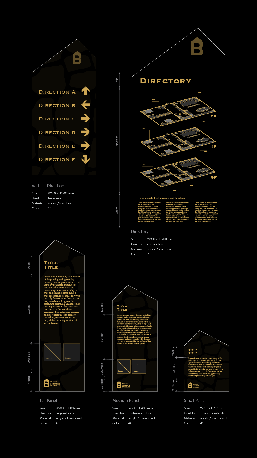
After finalizing the logo, I extracted visual elements such as stone textures, brick patterns, windows, and references to the Rideau Canal. These elements were developed into patterns, symbols, and layout systems adaptable across formats. The system supports square, horizontal, and vertical layouts, as well as directories, signage, and digital assets, ensuring consistency across environments.
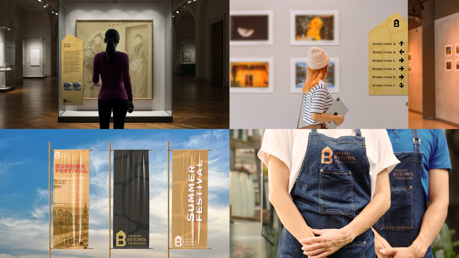
Mockups were created to test the design system in realistic contexts, including exhibition panels, wayfinding signs, banners, and uniforms. By placing the designs into simulated environments, I evaluated scale, readability, and visual impact. This step helped confirm that the system works cohesively in real-world museum settings.