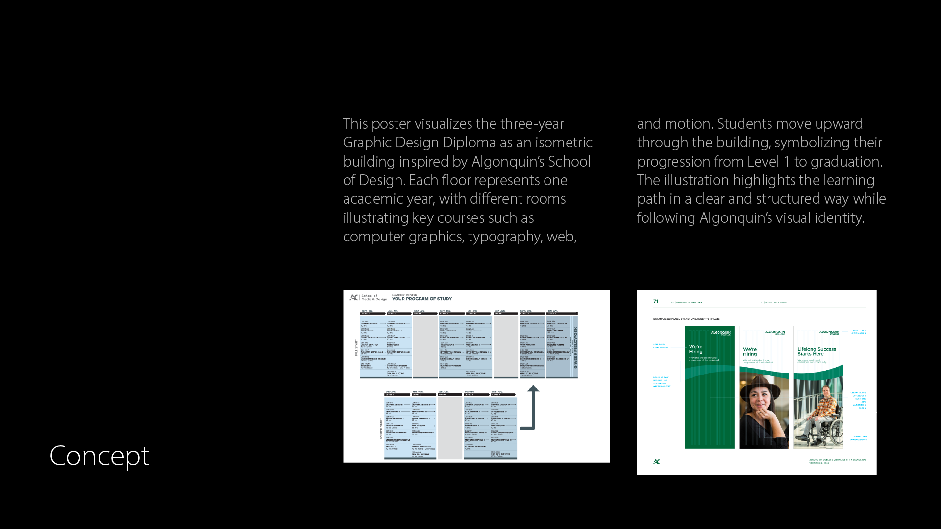
This project focuses on creating a tabloid-sized poster using isometric illustration as the main visual technique learned in Computer Graphics 05. The objective was to plan and execute a fully vector-based illustration where visuals lead the communication. The assignment emphasizes structure, clarity, and storytelling through illustration while applying technical skills developed throughout the course.
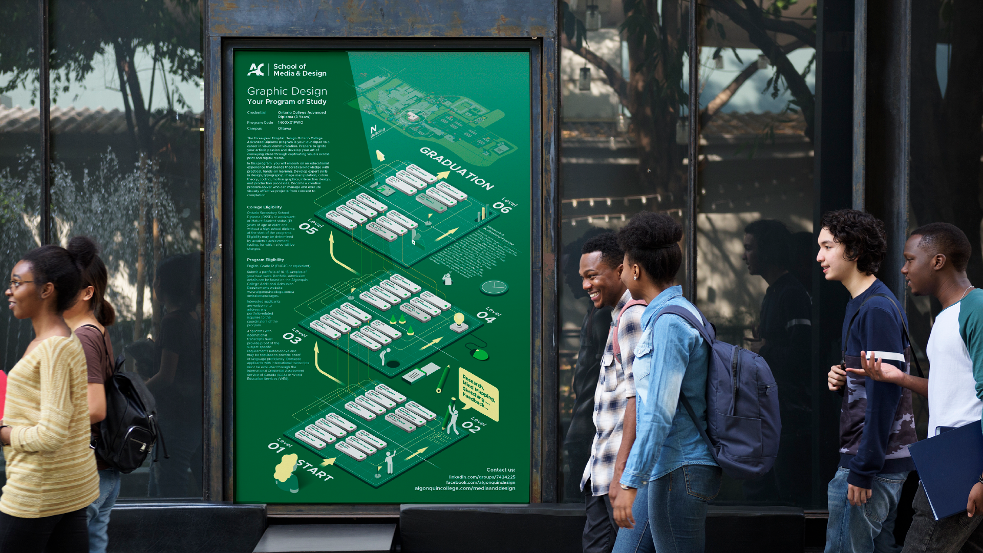
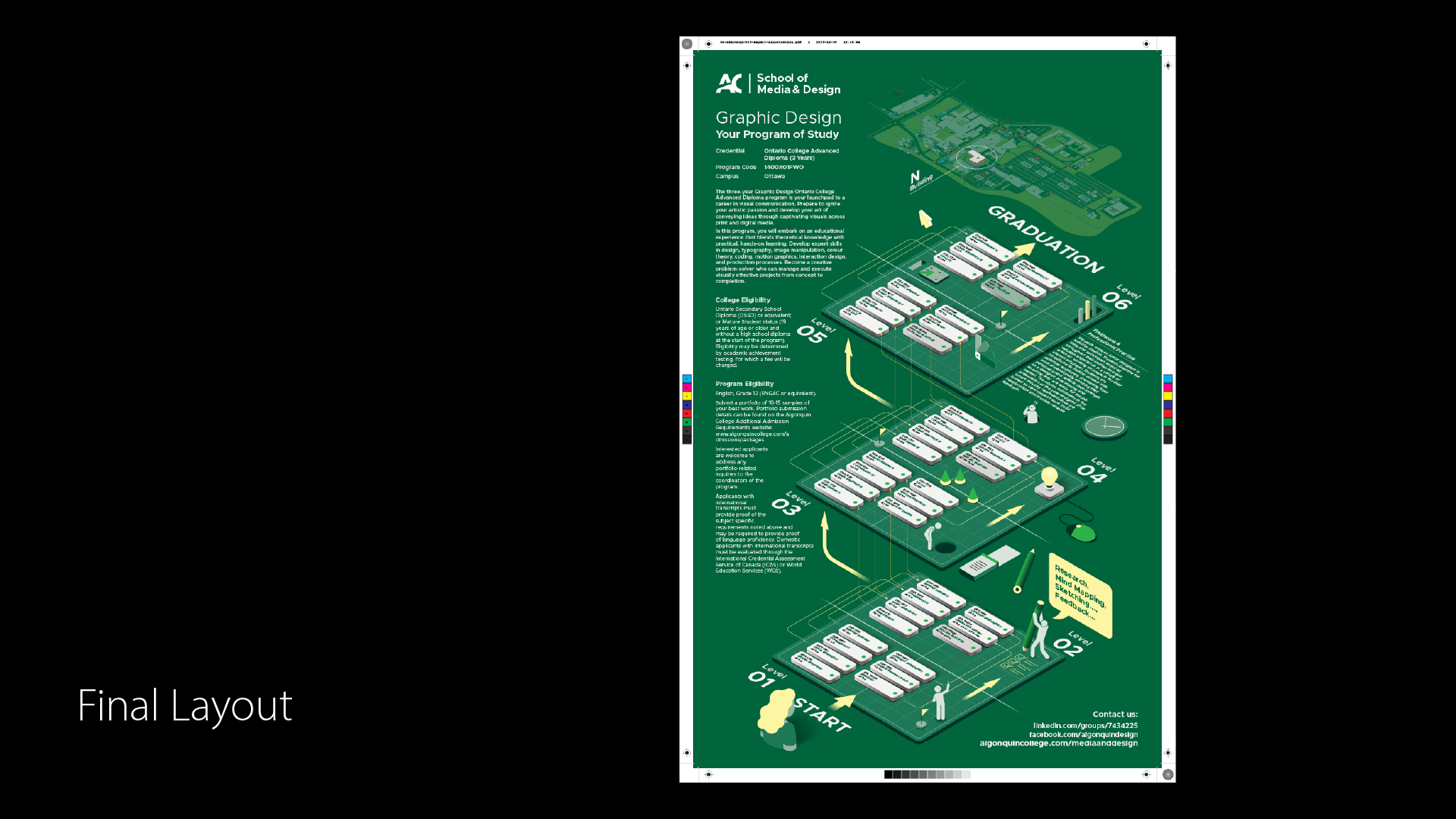
The concept is based on the three-year Graphic Design diploma program at Algonquin College, visualized as a structured pathway from entry level to graduation. I used the official program outline as content, transforming it into an isometric environment that represents progression, learning stages, and academic growth. The initial idea was to depict the N Building, where graphic design students study, as an isometric campus structure containing classrooms, students, and instructors. Each level represents one academic year, guiding viewers upward through the program. The design follows Algonquin College’s brand guidelines in color and tone to maintain institutional consistency. By framing education as a spatial journey, the poster helps prospective students quickly understand the structure, depth, and progression of the program.
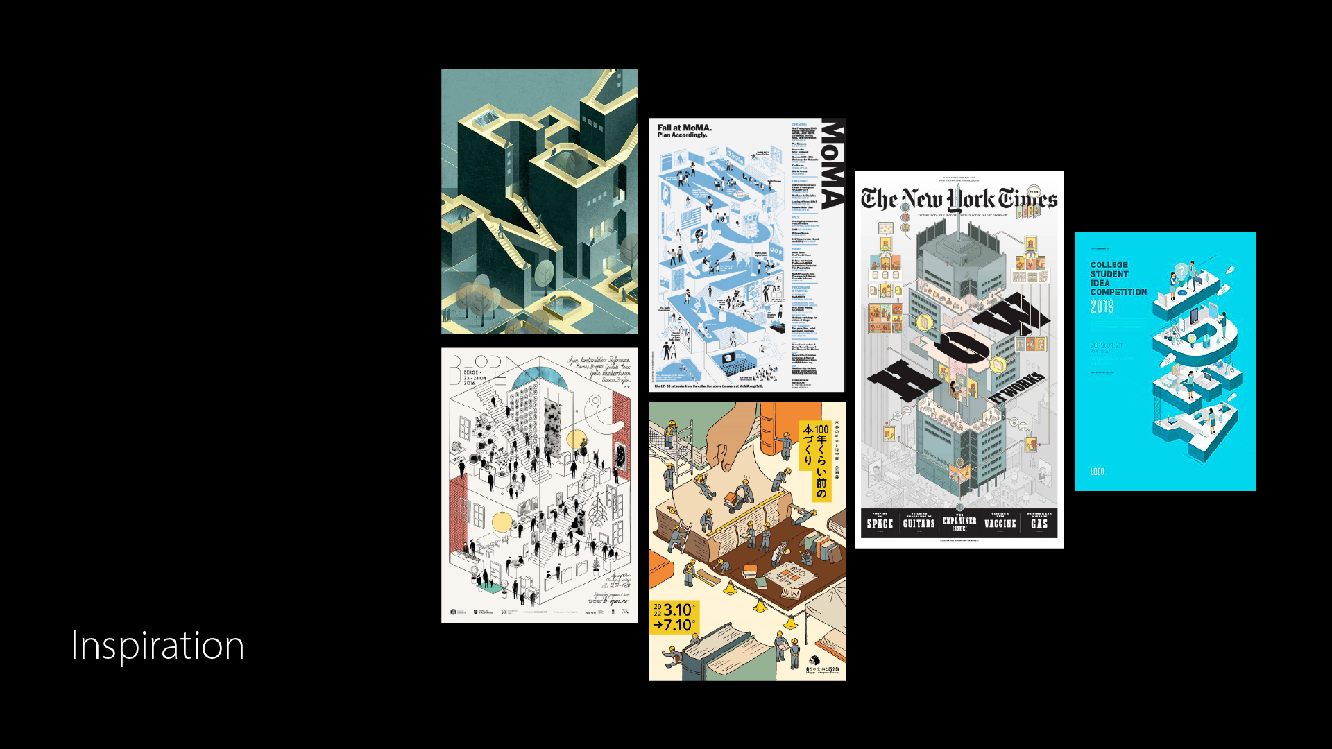
The visual inspiration came from editorial and informational posters that use isometric architecture to explain complex systems, such as museums, campuses, or organizations. Many references focused on architectural cutaways and layered environments, where viewers can visually “navigate” information. I was particularly drawn to designs that balance detail with clarity, using simplified forms, limited color palettes, and directional cues to guide the eye. These references influenced my decision to treat the poster more like a map or board game rather than a literal building illustration. The inspiration stage helped clarify that isometric illustration works best when it communicates relationships and flow, not realism. This guided my approach toward abstraction, consistency, and visual hierarchy rather than decorative complexity.
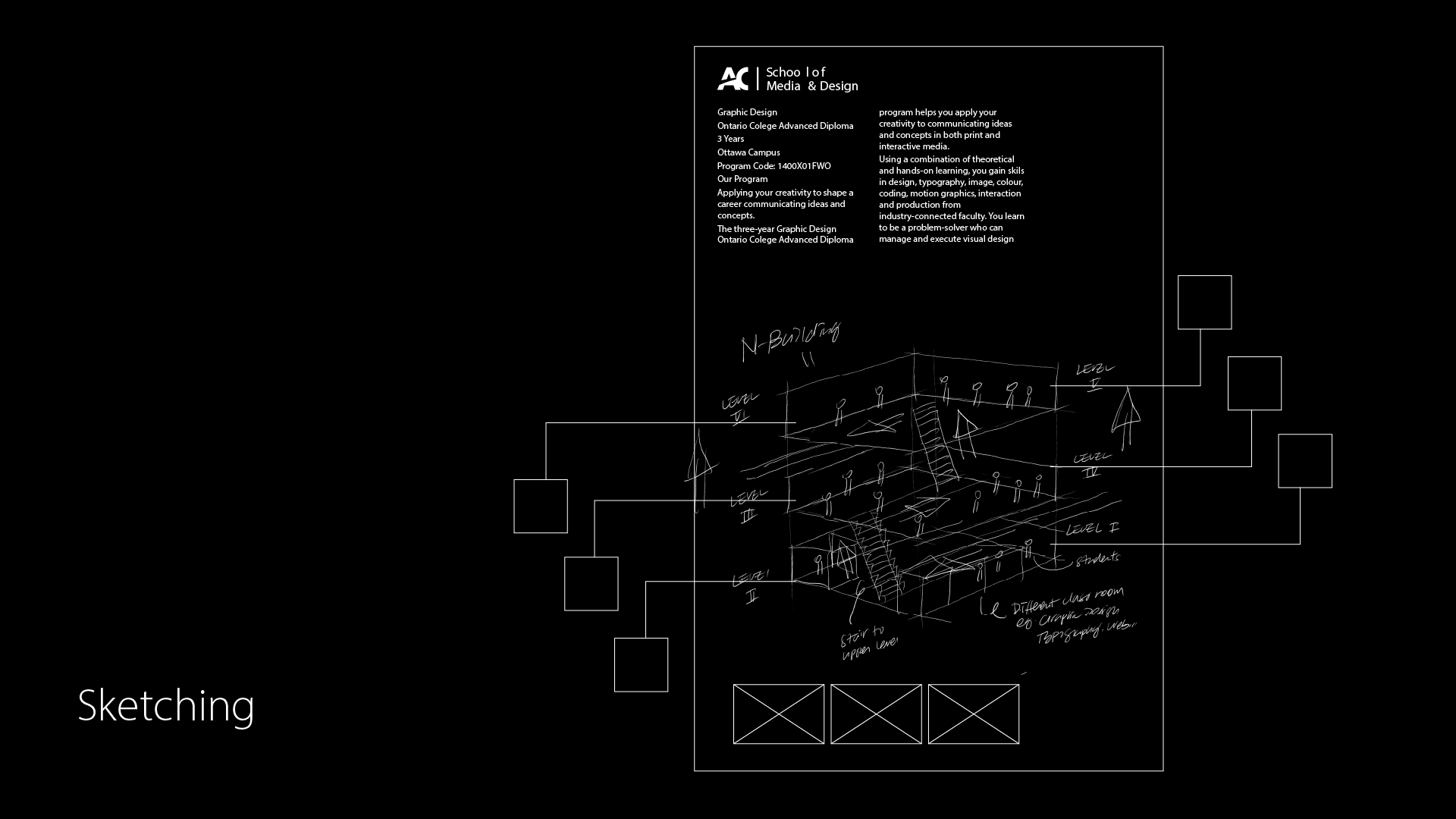
Sketching played a critical role in refining the composition. I initially explored a fully populated building with many students and instructors, but quickly realized that this created visual clutter and reduced legibility. The heavy course descriptions combined with dense illustration made the layout overwhelming. Through sketching, I tested different ways to reduce complexity, adjust spacing, and reorganize levels. This process helped me identify where to simplify forms, remove unnecessary characters, and leave intentional negative space. The sketches allowed me to evaluate balance between illustration and text early, preventing issues later in the digital stage. Ultimately, sketching helped shift the focus from literal representation to a clearer, more functional visual system.
In the final layout, the concept evolved from a traditional building structure into a “cutting mat” metaphor, inspired by my hands-on experience in first-year design classes. This approach better reflects the daily reality of graphic design students while maintaining the idea of progression. The overall color scheme uses Algonquin’s signature green, reinforcing institutional identity. The layered levels, arrows, and simplified course blocks resemble a board game, guiding viewers from “Start” to “Graduation.” Human figures were reduced to simple silhouettes to avoid distraction and maintain clarity. While the illustration successfully communicates structure and movement, the text content is dense. In future iterations, I would refine and reduce text to improve readability and visual balance.