This project explores how graphic design can support a local non-profit through a strategic awareness campaign. The objective was to develop a multi-channel campaign for a selected NGO, focusing on a clear communication goal, defined audience, and consistent visual system. The project emphasizes concept development, research, and real-world adaptability rather than purely aesthetic outcomes.
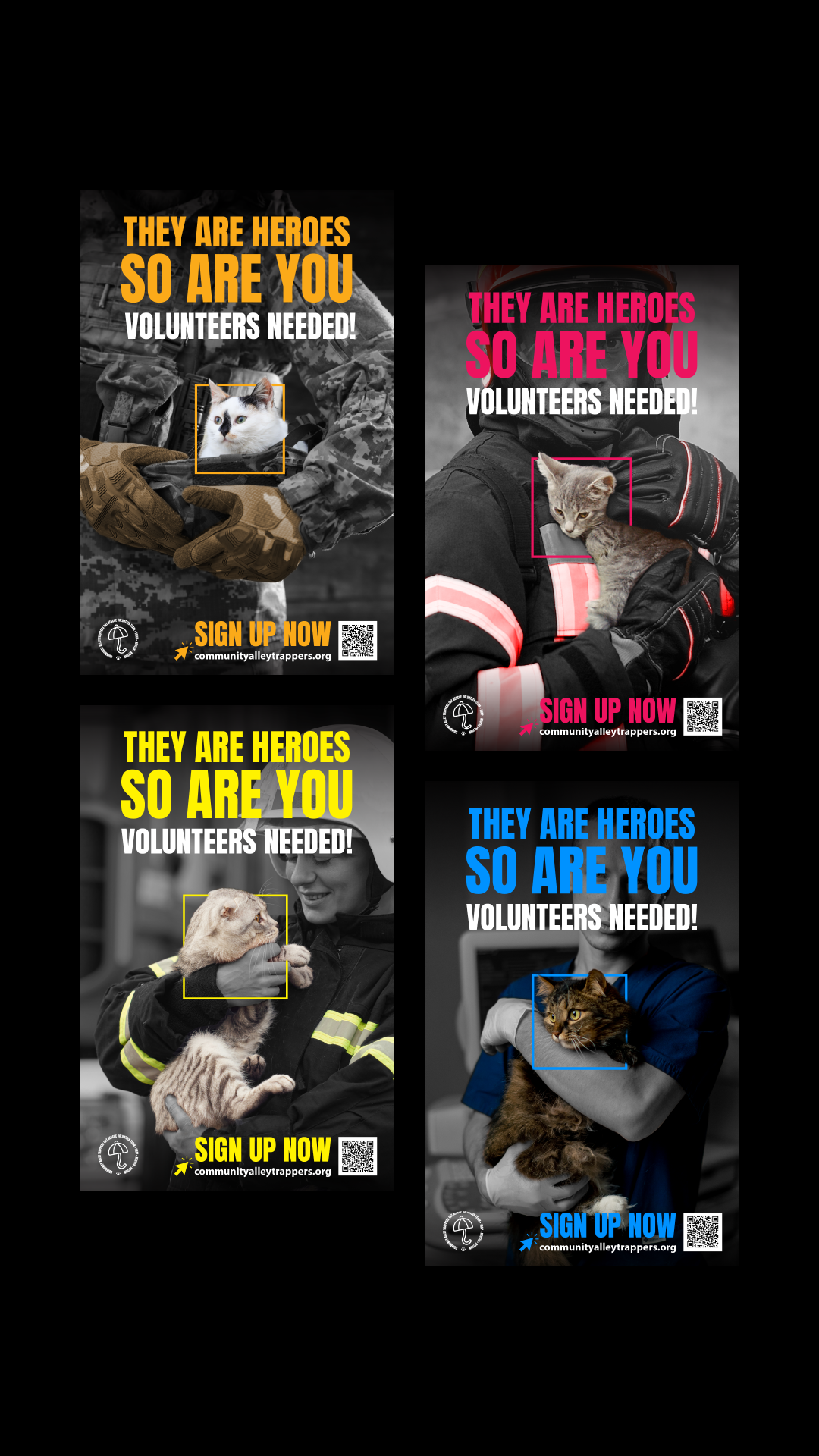
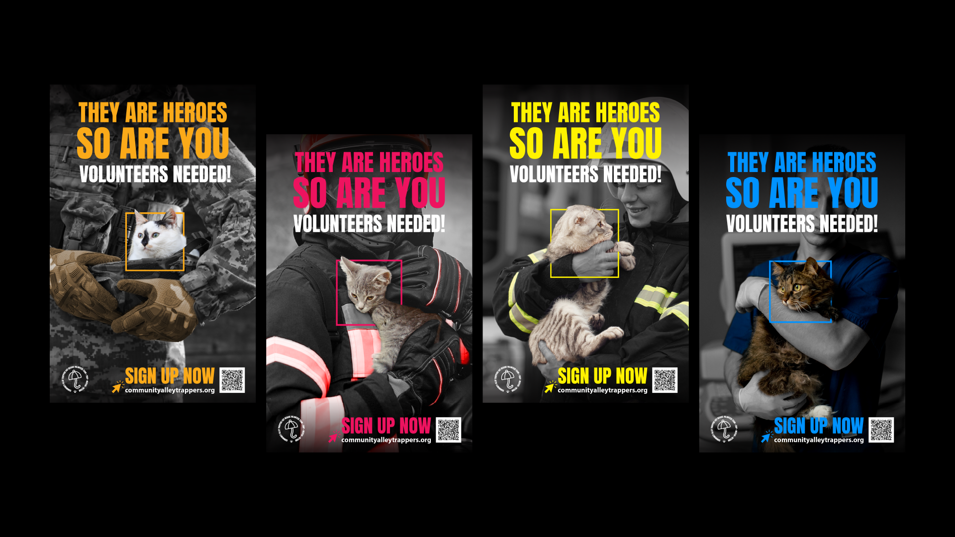
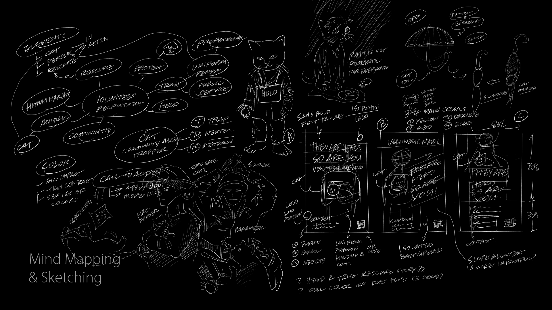
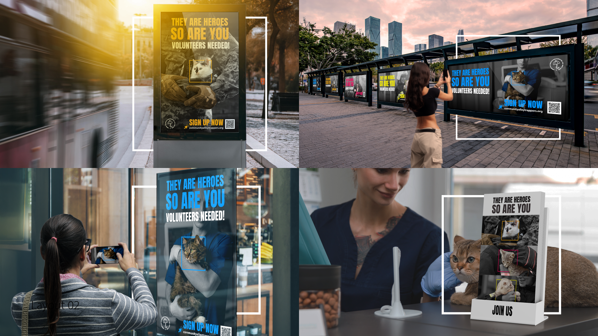
Community Alley Trappers was chosen for this project due to its strong local impact and reliance on volunteers. The campaign concept, “Everyone can be a hero,” reframes cat rescue as a shared civic responsibility rather than an act reserved for professionals. Early sketching explored visual metaphors of heroism using uniformed figures such as firefighters, police officers, soldiers, and medical staff. These figures represent care, trust, and action. During research, many animal rescue campaigns relied heavily on emotional imagery of suffering animals. This project deliberately avoids that approach, aiming instead to inspire participation through empowerment, dignity, and positive identification with the role of a volunteer.
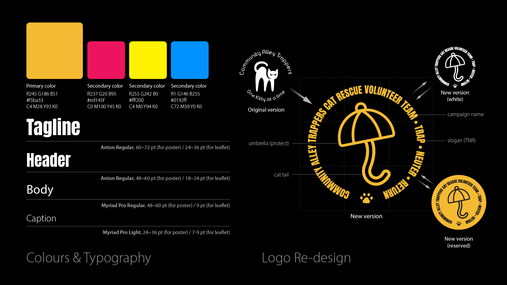
A bold, high-contrast color palette was developed to ensure strong visibility in public environments such as bus shelters and storefronts. Each color variation helps differentiate layouts while maintaining a unified campaign identity. The typeface Anton Regular was selected for its condensed structure and strong visual weight, supporting quick readability and a sense of urgency. The original CAT logo, while recognizable, did not clearly communicate rescue or volunteer action. For this campaign, a new logo was designed using an umbrella as a symbol of protection, with a curved handle shaped like a cat’s tail. This visual directly connects the idea of care with the act of rescue.
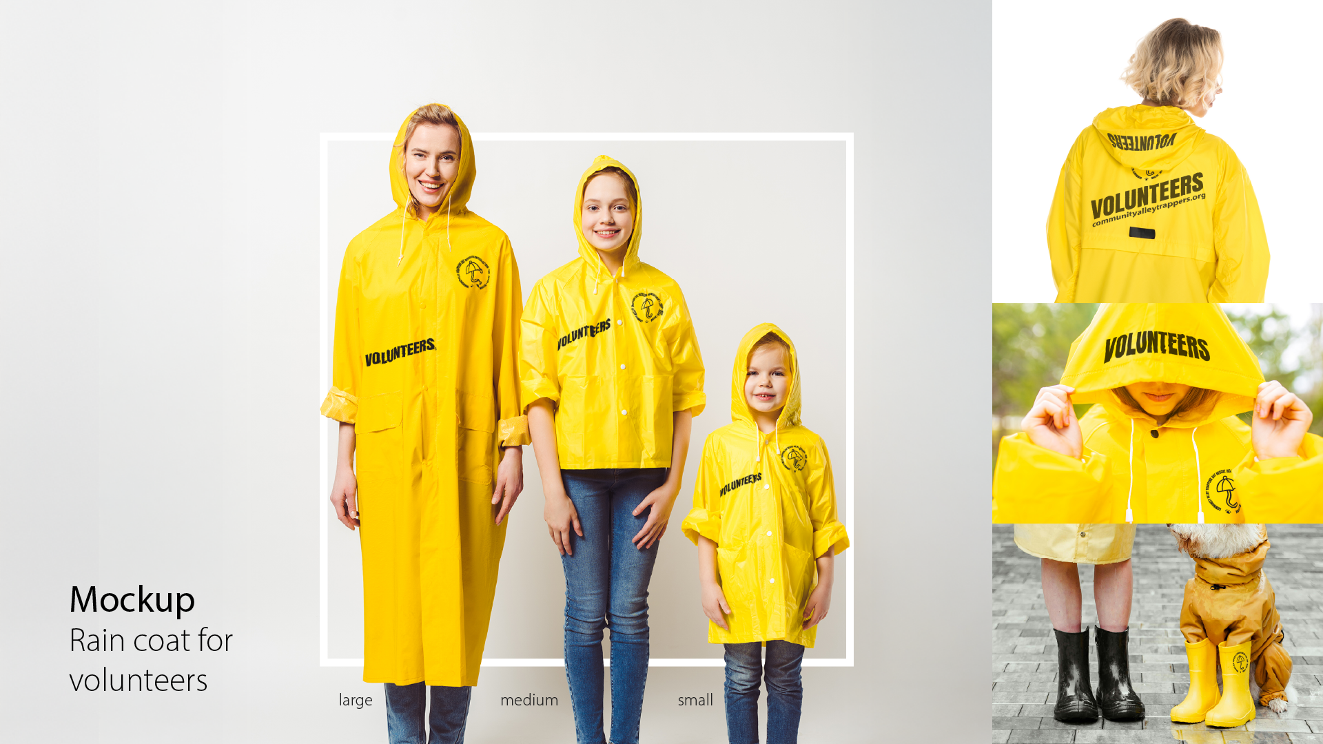
The yellow raincoat was introduced as a central mockup element to represent volunteers in a practical and symbolic way. High-visibility outerwear is commonly associated with safety, service, and outdoor rescue work, making it a strong visual shorthand for volunteer identity. Using the raincoat as a “uniform” helps ground the campaign in real-world contexts and reinforces the idea that volunteers are active protectors. The mockups demonstrate how the campaign identity extends beyond print into wearable items, strengthening credibility and suggesting how branding can support recognition and community presence.
The campaign was designed as a flexible visual system that adapts across multiple formats, including vertical posters, horizontal banners, leaflets, bus shelters, and clinic counters. A consistent layout structure ensures clarity while allowing variation in imagery and color. The recurring key visual of a uniformed person holding a rescued cat establishes emotional focus without relying on distress. Colored square frames around the cat help create visual rhythm and reinforce brand recognition. This adaptable system supports scalability while maintaining a consistent tone, making the campaign suitable for diverse public-facing environments.