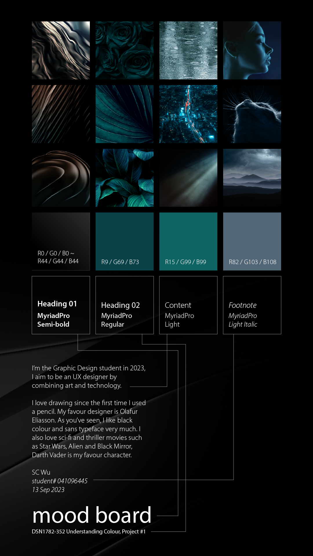
This course explores colour theory and its role in visual communication and consumer influence. I learned to create purposeful colour palettes, understand cultural and emotional associations, and apply colour strategies effectively across print and digital media to support design intent and user response.


I created an abstract typographic piece using my initial “B” in bold form at the bottom left. By combining primary, secondary, and tertiary colours, I explored vibrant contrasts and rhythm. The geometric layering emphasizes interplay between hues while keeping a balanced yet energetic visual impact across the entire composition.
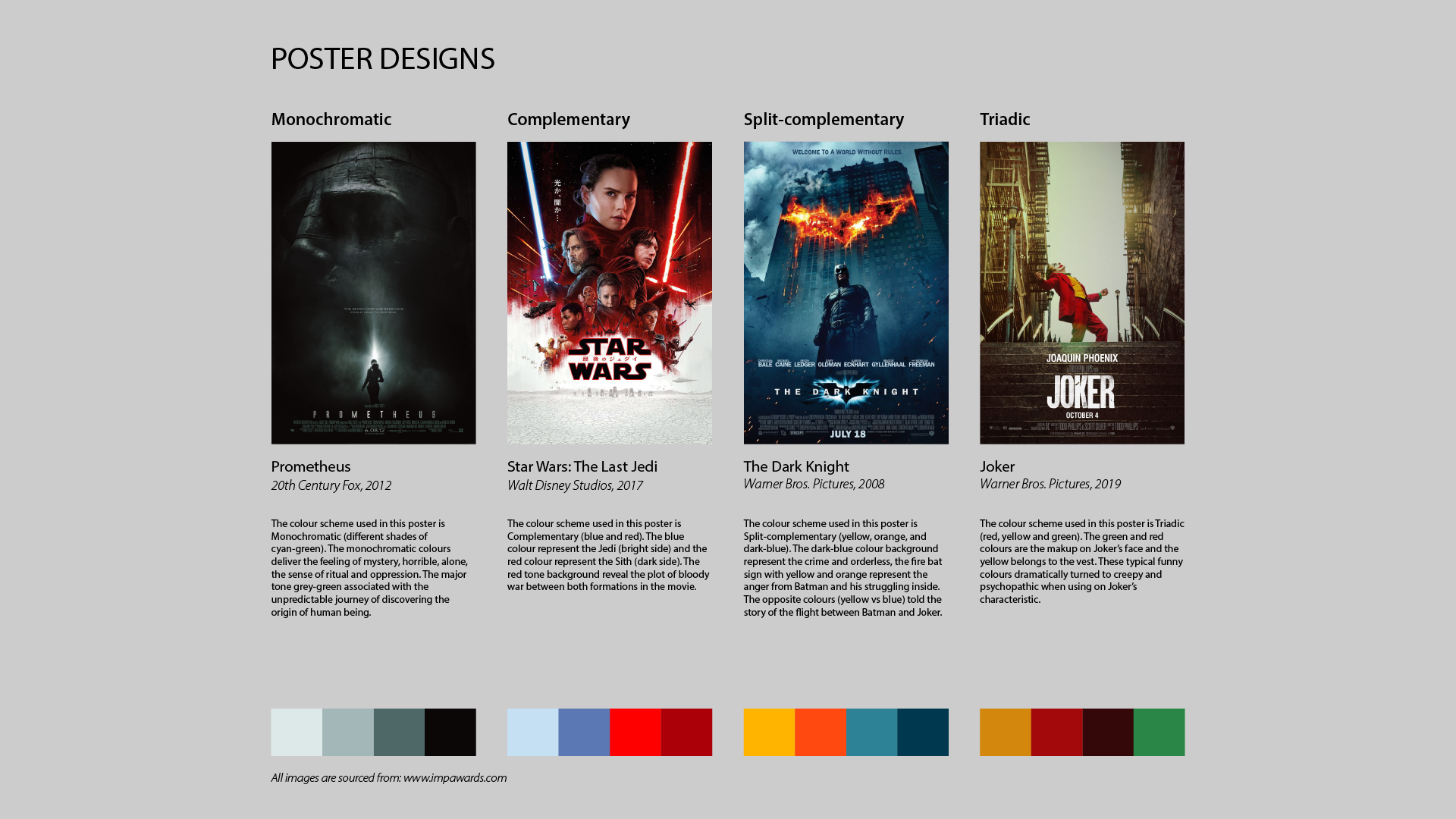
In this assignment, I selected 4 film posters to analyze colour harmony in real-world design. Each poster demonstrates a distinct scheme: Prometheus uses a monochromatic cyan-green palette to evoke mystery and isolation; The Last Jedi applies complementary red and blue to symbolize opposing forces; The Dark Knight employs a split-complementary scheme to highlight conflict and inner struggle; and Joker explores a triadic palette where traditionally cheerful colours — red, yellow, green — are subverted to create a disturbing, psychopathic mood. This study helped me understand how colour theory enhances storytelling, emotion, and visual impact in graphic communication.
In this assignment, I selected 4 book covers to explore different forms of colour contrast and temperature. The Swallows uses warm red tones to evoke tension and urgency. A Teaspoon of Earth and Sea applies cool blues and silhouettes to create a sense of melancholy. The Boy at the Back of the Class features high-contrast, vibrant colours that appeal to children and grab attention. The Fate of Fausto employs low-contrast pastel hues to evoke calmness and simplicity, reinforcing its picture book nature. This exercise deepened my understanding of how colour influences mood, meaning, and visual hierarchy in book cover design.
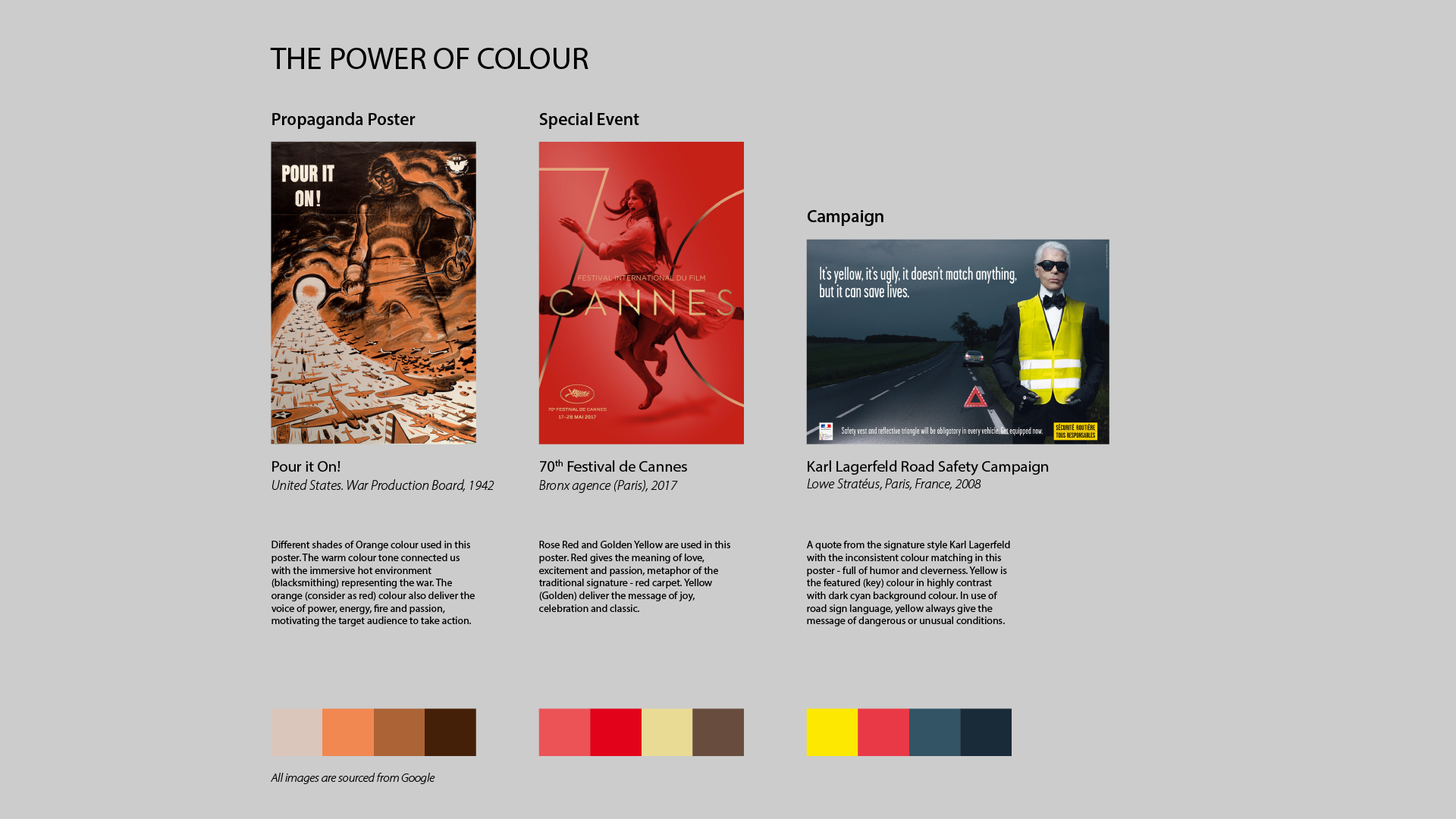
In this project, I analyzed 3 posters across different categories to explore how colour communicates intent. Pour it On! uses intense orange tones to evoke heat, urgency, and wartime effort. Festival de Cannes blends rose red and gold to express glamour, celebration, and tradition. Karl Lagerfeld Road Safety Campaign applies high-contrast yellow against cyan to signal caution while maintaining wit and visual irony.


