This course explores colour theory and its role in visual communication and consumer influence. I learned to create purposeful colour palettes, understand cultural and emotional associations, and apply colour strategies effectively across print and digital media to support design intent and user response.


I created 3 abstract patterns based on cultural colour traditions. Japan’s green and gold represent vitality and prestige, illustrated through the historic “Kamon” symbol. Portugal’s blue reflects loyalty and heritage, shown via Azulejo tile motifs. Russia’s red and black evoke patriotism and control, expressed through the bold Mezen folk pattern. Each design visually celebrates regional identity through meaningful colour use.
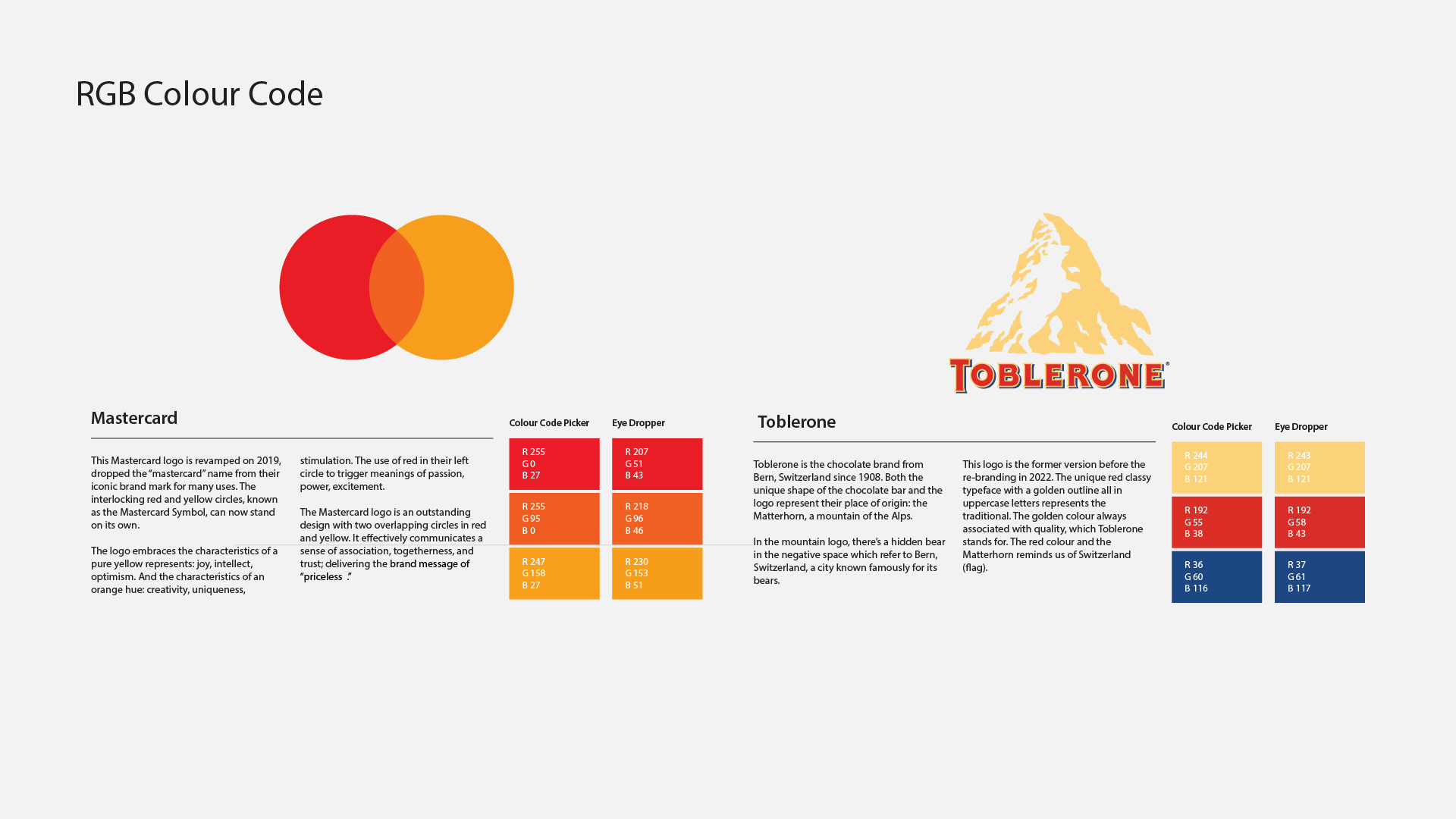
In this RGB exercise, I analyzed the colour values of two logos — Mastercard and Toblerone — using both online and Illustrator tools. Mastercard’s vibrant red, orange, and yellow represent excitement, creativity, and optimism, reinforcing its message of value and connection. Toblerone’s gold and red reflect tradition and quality, rooted in Swiss heritage and subtly referencing the iconic Matterhorn.
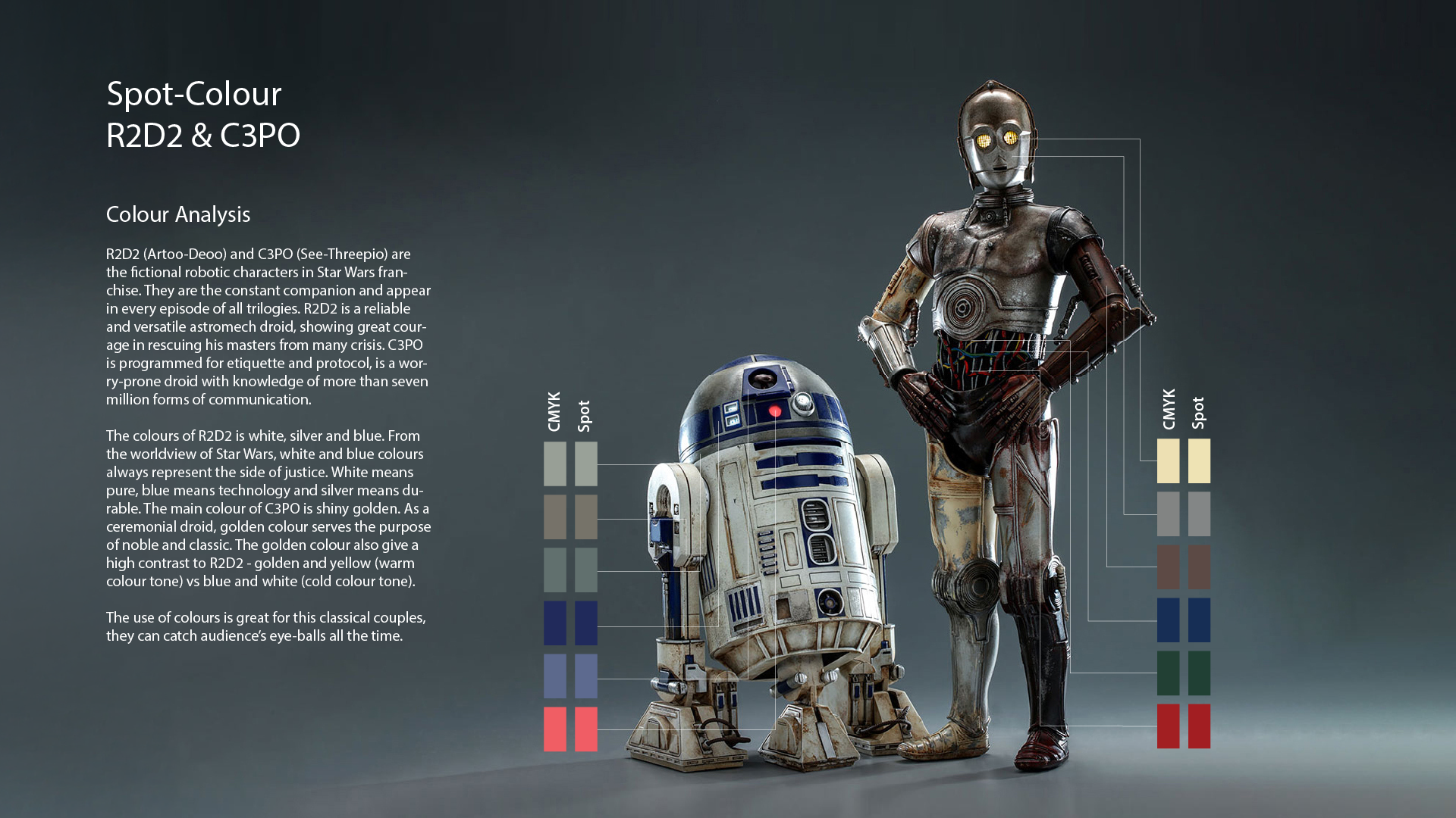
For this Pantone spot colour study, I analyzed the iconic droid duo R2D2 and C3PO from Star Wars. R2D2’s white, silver, and blue reflect purity, technology, and resilience — symbols of justice. C3PO’s rich gold tone conveys nobility and tradition. Their contrasting colour palettes — cool versus warm — create strong visual balance and help define their personalities as a classic, unforgettable pair.
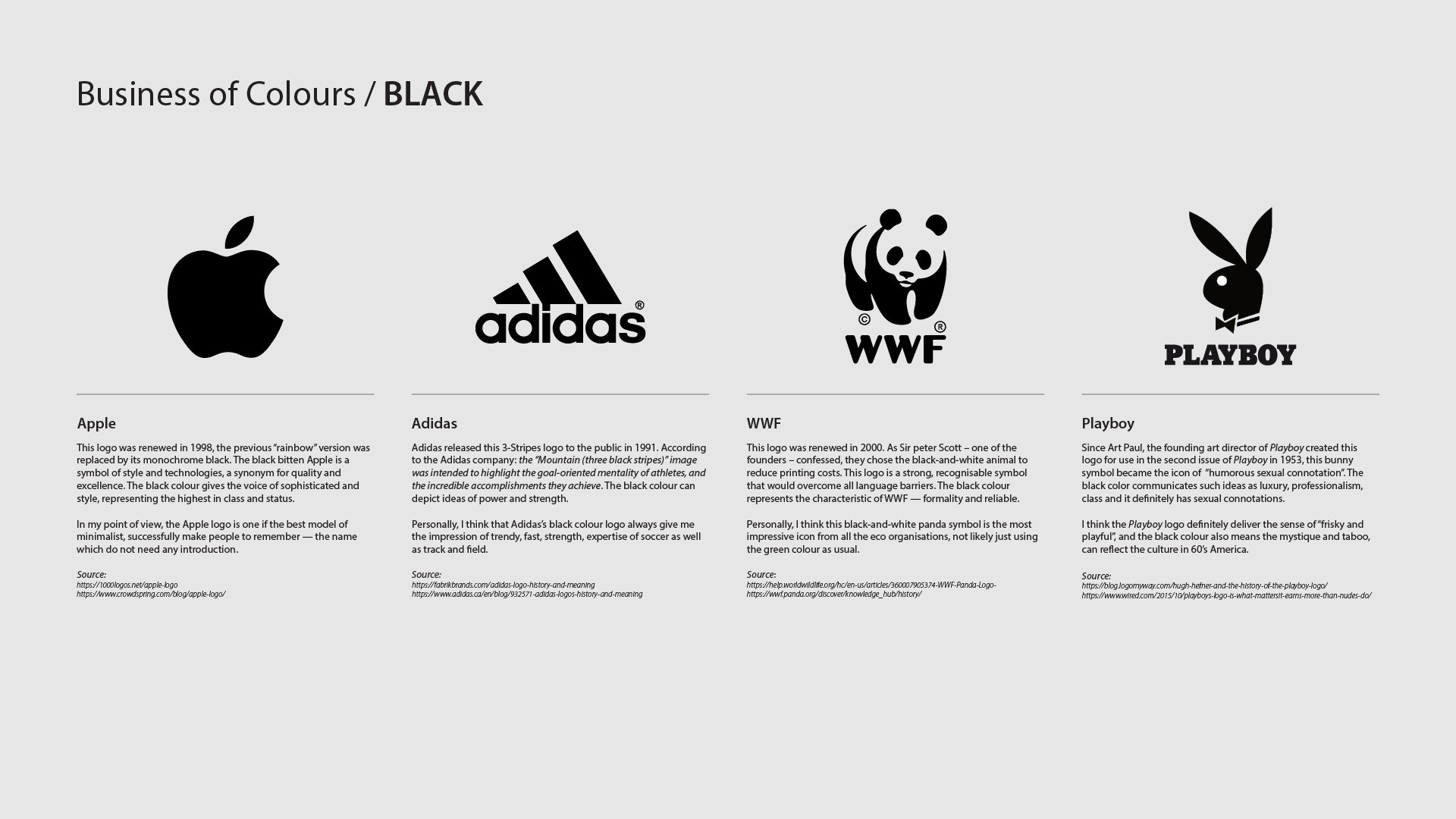
I explored how black is used across 4 diverse logos: Apple, Adidas, WWF, and Playboy. Each brand applies black to convey sophistication, power, reliability, or mystique. Despite different industries, black supports strong brand identity — minimalism for Apple, strength for Adidas, trust for WWF, and sensuality for Playboy. Research and personal analysis highlight black’s versatility in shaping brand perception.


