Design an 8.5×11” black-and-white poster using only type. Apply typographic hierarchy, spacing, alignment, and contrast to organize the provided text clearly and attractively — without altering content or order.


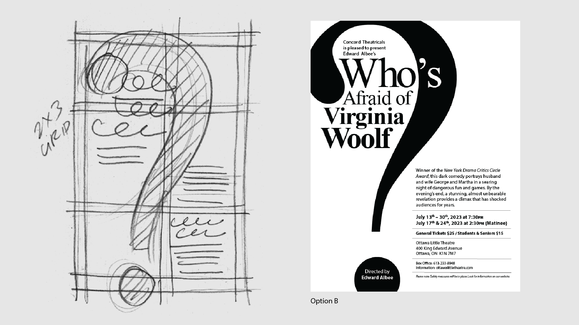
I began by exploring various grid systems — including 3×2, 2×3, and 3×3 layouts — to test how content could flow with strong typographic hierarchy. I evaluated contrast, alignment, and space distribution, then selected the 2 most effective options that best support readability while allowing for visual emphasis, such as a large question mark as a focal typographic element.
I used a loosely stacked headline to emphasize rhythm and unpredictability — echoing the play’s tension. A large outlined question mark anchors the right side, balancing the dense title on the left. The 3×2 grid supports clear hierarchy: title, director, synopsis, and ticket info flow in order, with contrast in weight, size, and spacing guiding the eye through the poster.
I used an oversized solid-black question mark as the central visual element. The title text wraps within its shape, reinforcing the theme while guiding the eye. This layout uses a 2×3 grid and generous negative space to create dramatic contrast and clarity. The lower half maintains clean hierarchy and balance, allowing the bold shape above to carry visual weight without overwhelming the supporting information.


