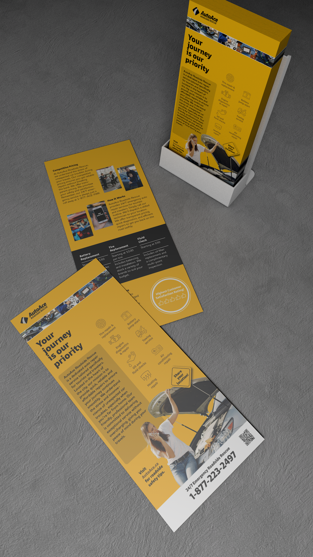
We were asked to design a vertical 4” × 9” rack card for AutoAce Roadside Rescue using a clear typographic hierarchy and a versatile sans-serif font. The layout must balance readability and visual appeal, using a two-column grid and combining text with supportive imagery to promote the service to tourists effectively.


In the very beginning, I selected typefaces based on function (call for help). I used Enra Sans Variable for all headings and labels to reflect strength, clarity, and urgency. For the body text, I chose Houschka Rounded to ensure high readability. I then selected images provided by the professor that clearly show real roadside situations and customer assistance.
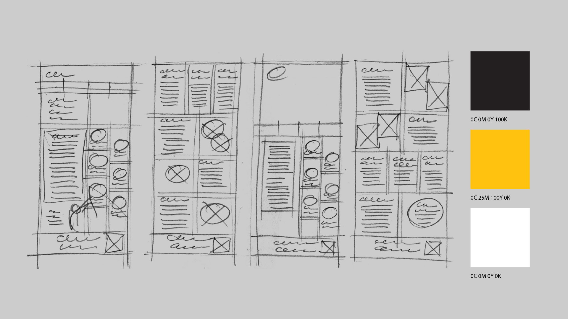
My 2nd step, I used a 2-column grid to organize the narrow page. I designed the reading flow to follow a left-right-left-right rhythm, placing each image beside its related text for quick scanning. To enhance usability, I broke the body copy into short blocks. I chose amber yellow, like a road sign, to help users locate the card in their car. Solid black ensures strong contrast and readability, while white provides visual balance.
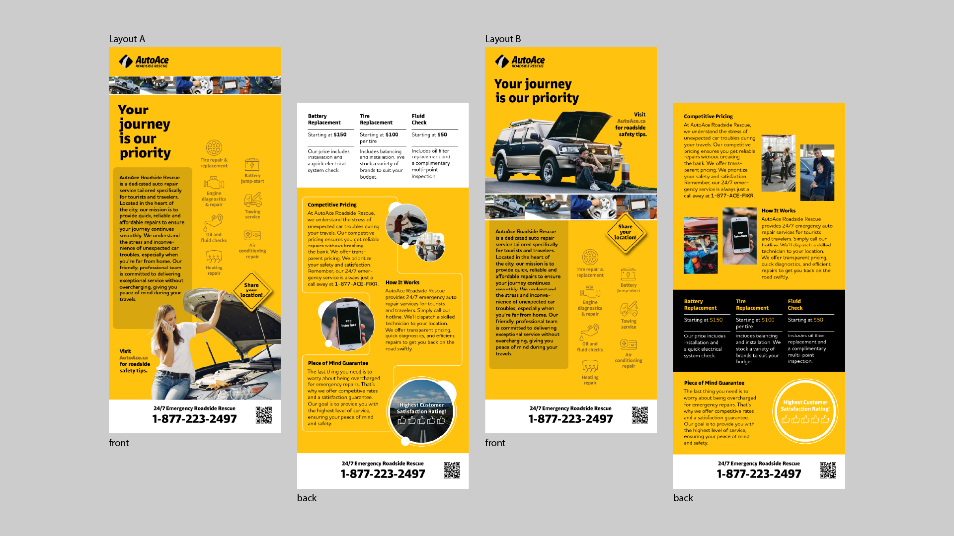
For the 3rd step, I created 2 layout options (A & B) using the same structure, tone and manner. The main difference is the lead image: version A uses a female in distress, the version B uses a male. I found the female image more convincing and relatable. Both versions maintain a clear hierarchy and consistent visual logic.
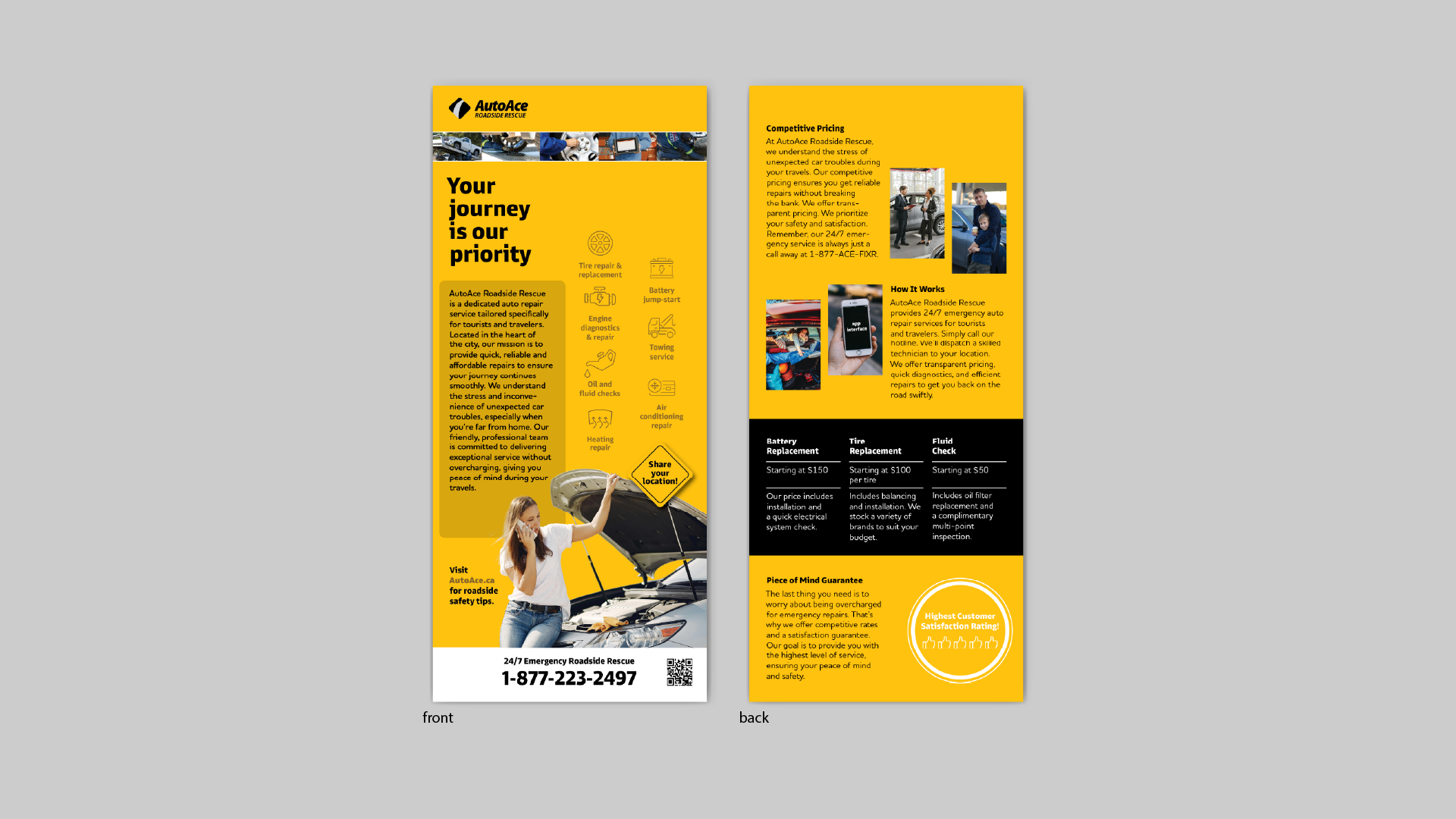
Finally I used option A (female lead image) for front and option B (more neat layout). Another challenge was creating a set of service icons. These illustrations help readers quickly understand each service at a glance.


